

I recently went through a two-stage interview process for a Junior Designer role in an events company. The second interview consisted of a 20 minute presentation of a Design Task I was asked to complete within in a week. Unfortunately, I didn't get the job but I had encouraging feedback about the work I did and am grateful to be able to present it as a case study.
The Brief:
Using the resources provided, please produce a suite of assets to promote our recent piece of “pillar content” - a 72-page report on sustainability practices in the events industry called The Regenerative Revolution – A New Paradigm for Event Management.
- A 1 to 2 page A4 design of the CEO's introduction to the report (copy is included)
- An email design to promote the report
- An infographic using a (small amount) of the data contained within the report
- 3-5 social media assets to promote the report
Resources:
- Introduction copy
- Link to company's media room with images and logos
- Full report
The Task:
Research
The first thing I did to start on this task was to look at various different assets designed and branded by the company. I wanted to pick out the visual elements such as colours, fonts, preferred shapes and design styles that had been used to tie the pieces together visually.
Analysis
I then noted down the various elements I found which created a "strong, bold and confident" brand look. I identified the fonts used for headlines and body text on their website and within the report. For the report itself, the overarching theme seemed to be to complement the brand language with stunning nature photography.
Ideation
I identified the key elements to include in each asset and then took some time to sketch ideas for the 2-page spread and social posts, and pulled out interesting information to turn into an infographic and said social posts.

Introduction Spread Design
I wanted to break up the body text over two pages to allow the reader some “breathing space” when reading as I’d seen done in the rest of the report. I placed the text on white text boxes and filled the background with nature photography. The photography then inspired my choice of accent colour. In version 1, I went with a warm orange to complement the earthy green of the plants. In version 2, I chose a cooler yellow to pop out against the light ocean blue.
In terms of placement of the different elements, I tried to keep visual hierarchy in mind so that readers eyes would follow the text naturally. I used bold capitals for the section headers so readers could easily skim the introduction for more information on its content before proceeding to read it fully. I also picked photography to help guide the users eyes, especially in version 2.
I overlapped the CEO's picture and role, and the quote with the other elements so that the spread would look cohesive rather than a random collection of elements. I used lines to further tie the spread in visually with the rest of the report.


Email Design
I was asked to design an email campaign promoting the report. For this, I picked out elements from the copy for the introduction that could be rewritten slightly to be more like an email.
I had three aims:
- make the reader interested in the topic and
- encourage them to read the report (or at least navigate to it for download) right from the email
- encourage them to read the report (or at least navigate to it for download) right from the email
- encourage the reader to start a conversation about the topic with the sender (the CEO) boosting engagement
I designed two calls to action. Version 1 is the first page of the report with a green frame and a pointer signifying the action required (the click). I also saw that an abbreviation of the report name would result in a 3x3 grid so I designed an alternative version 2 around this.


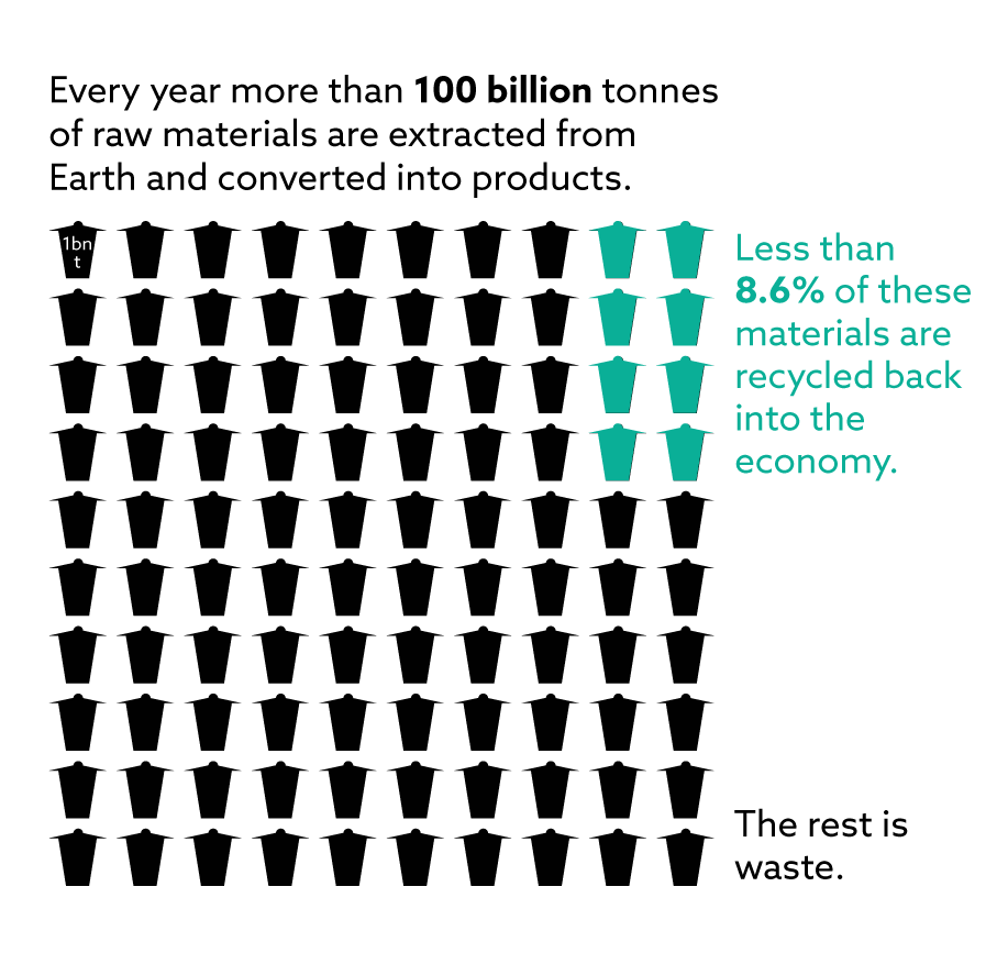
Infographic
For the infographic, there was lots of data in the report that I could’ve chosen but I chose a piece of data that just stunned me - that only 8.6% of all materials taken from the Earth are recycled.
I extracted the visual elements in the copy, such as “tonne” (in Germany, where I am from, that’s a garbage bin) and “waste”. I felt it would be impactful to see what 8% of 100 bins looks like so I arranged 100 bins on a 10x10 grid, then overlayed 8 bins in green to show the recycled portion.
I added some text to explain the graphic. Again, I used visual hierarchy to ensure readers would see the graphic first, then read from top left to bottom right.
Social Posts
For the social media posts, I had a few different ideas that could be turned into a series of posts of the same style. Inspiration came from:
1. An alliteration of words beginning with “R” in the executive summary of the report.
2. The use of nature photography as background and framed by white throughout the report.
3. A previous Facebook post by the company in a checkerboard style and a stunning picture of a jelly fish.
2. The use of nature photography as background and framed by white throughout the report.
3. A previous Facebook post by the company in a checkerboard style and a stunning picture of a jelly fish.
I designed all 3 posts in a square format and 4:3 to show I would be able to resize them.


As I said, unfortunately I didn't get the job but I enjoyed the task very much.
Happy to hear your feedback as always below 🙏


