
I wanted to create a static infographic using data from the government data repository at data.gov, so I chose to use the data that showed America’s historical spending patterns dating all of the way back to just after WWII. I then paired it with 20th century world history in order to draw a correlation between American government spending and its influence on the world at large.
I split the spending into two groups, economic and military, and write a brief synopsis on the state of the world during the selected time period. Within that synopsis I drew highlights to a timeline so that the user could better understand its place in time
I split the spending into two groups, economic and military, and write a brief synopsis on the state of the world during the selected time period. Within that synopsis I drew highlights to a timeline so that the user could better understand its place in time
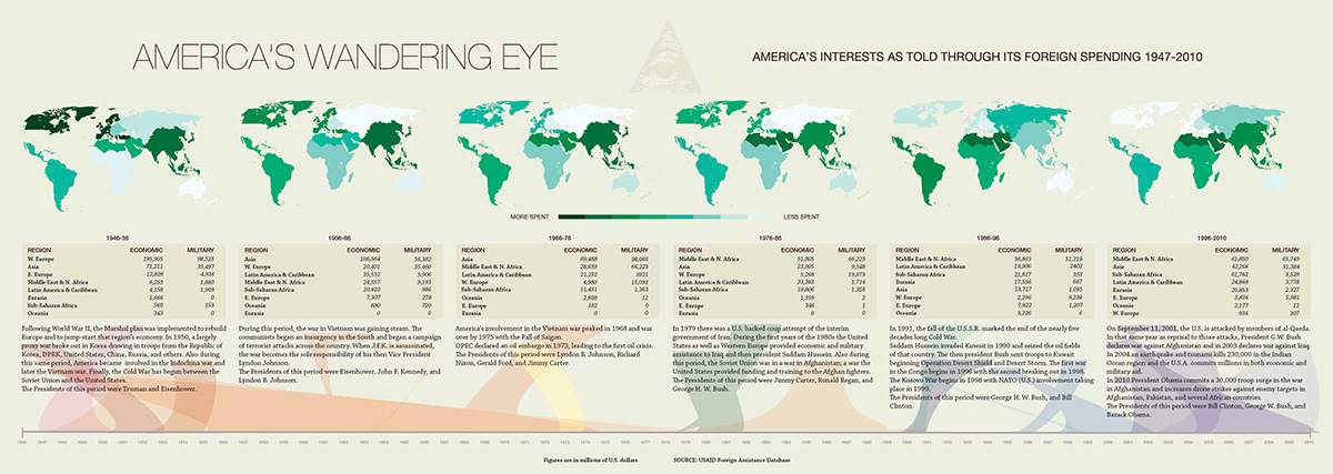
Full view of the inforgraphic
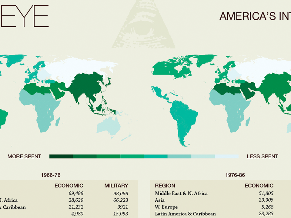
Detail view - The color key and heat map to be used as a snapshot view of the American government's interests.

Detail view - The amounts spent, a synopsis of world affairs, and a connection of the phrases to the timeline.


