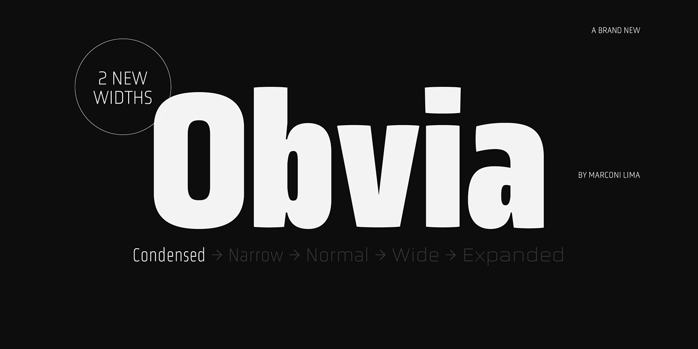
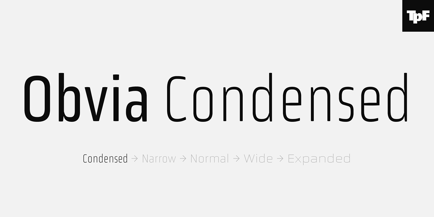


Obvia Condensed, a geohumanist type for all media
Obvia appeared as a result of direct observation on typefaces classified as geometric
and the plan to explore for the first time width axes expanding its usability.
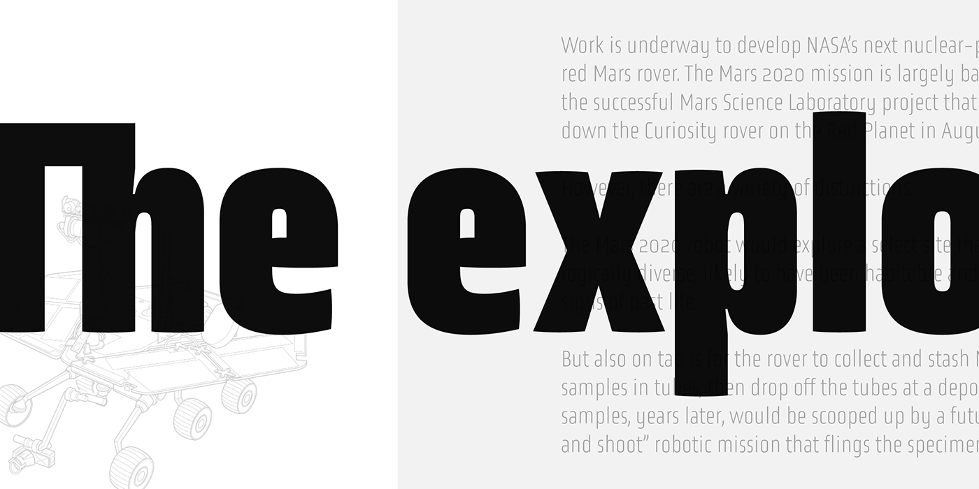
The idea behind Obvia’s design was to create a distancing from geometrically pure shapes,
in this case, square shapes. Then some details were added, such as subtle inktraps, concave
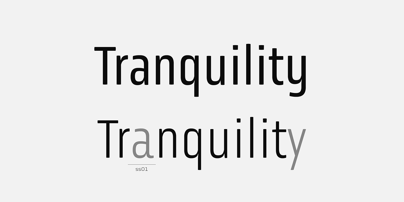
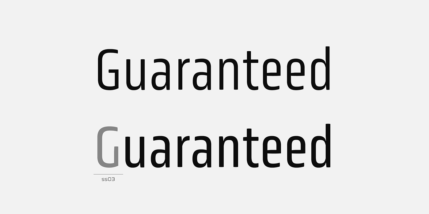
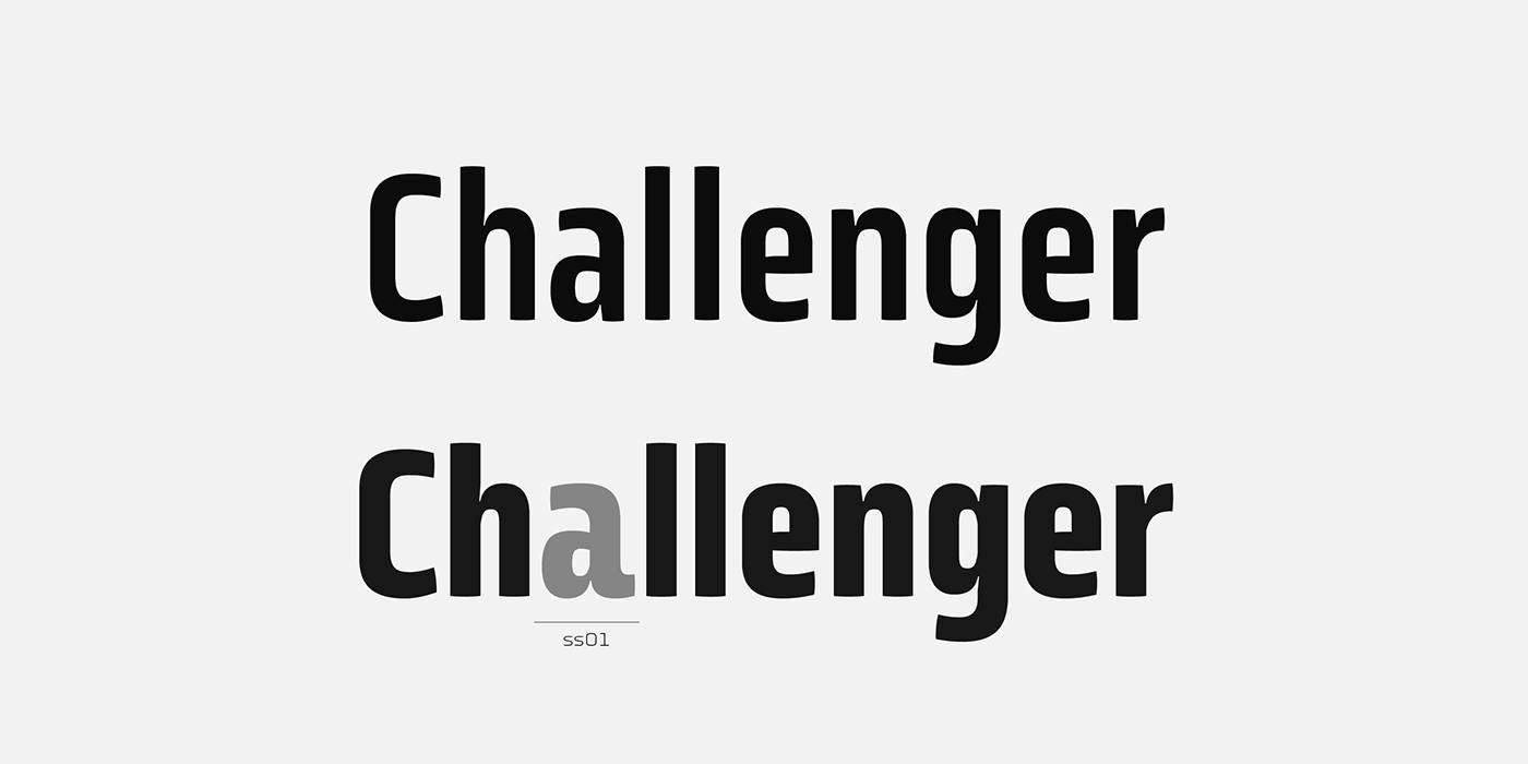
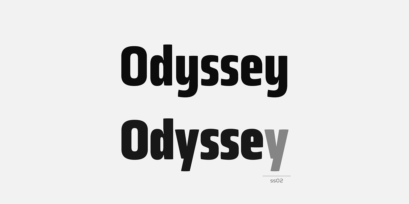
endings of the stems and carefully drawn alternate characters, giving a ‘geohumanist’ tone to the font.
This family of Obvia Condensed has 9 weights ranging from Thin to Black,
delivering a strong typographic identity, from the paper to the pixel.
Meet Obvia Family at Fontspring
