
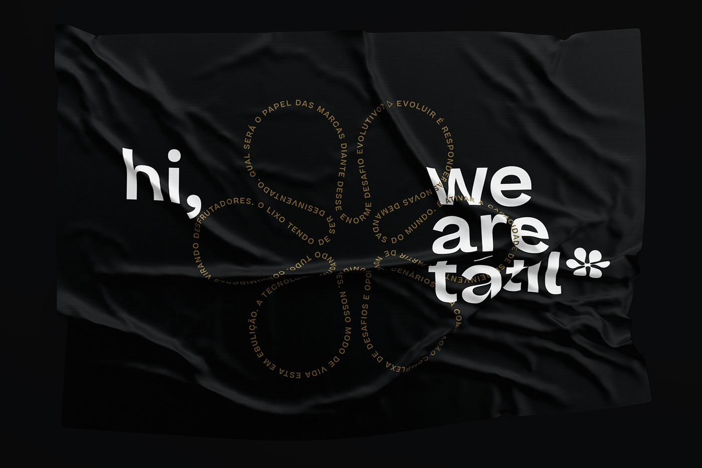
A new logo and identity for Tátil, one of the most relevant branding offices in Brazil today.
2019 was an important year for Tátil: it marked their 30th year in business. It was time to revisit their brand expressions in order for them to match not only the outstanding quality of Tátil’s work, but their current thinking, methods and processes.
It was time for a Brand evolution.
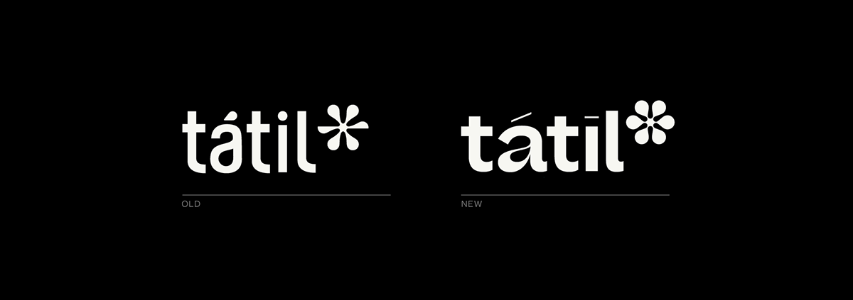
For this (highly collaborative) process, we delved into Tátil’s history and core truths.
30 years ago, sustainability was an unusual word. Back when nobody really talked about the use of recycled materials for packaging and product design, much less highlighting its ecological attributes, this was already Tátil’s main inspiration.

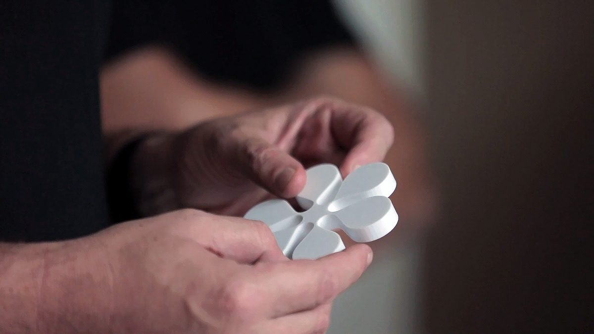
Recycled corrugated cardboard was strong, cheap, malleable and ecological. It was one of the go-to materials for Tátil’s first packaging and product design ideas.
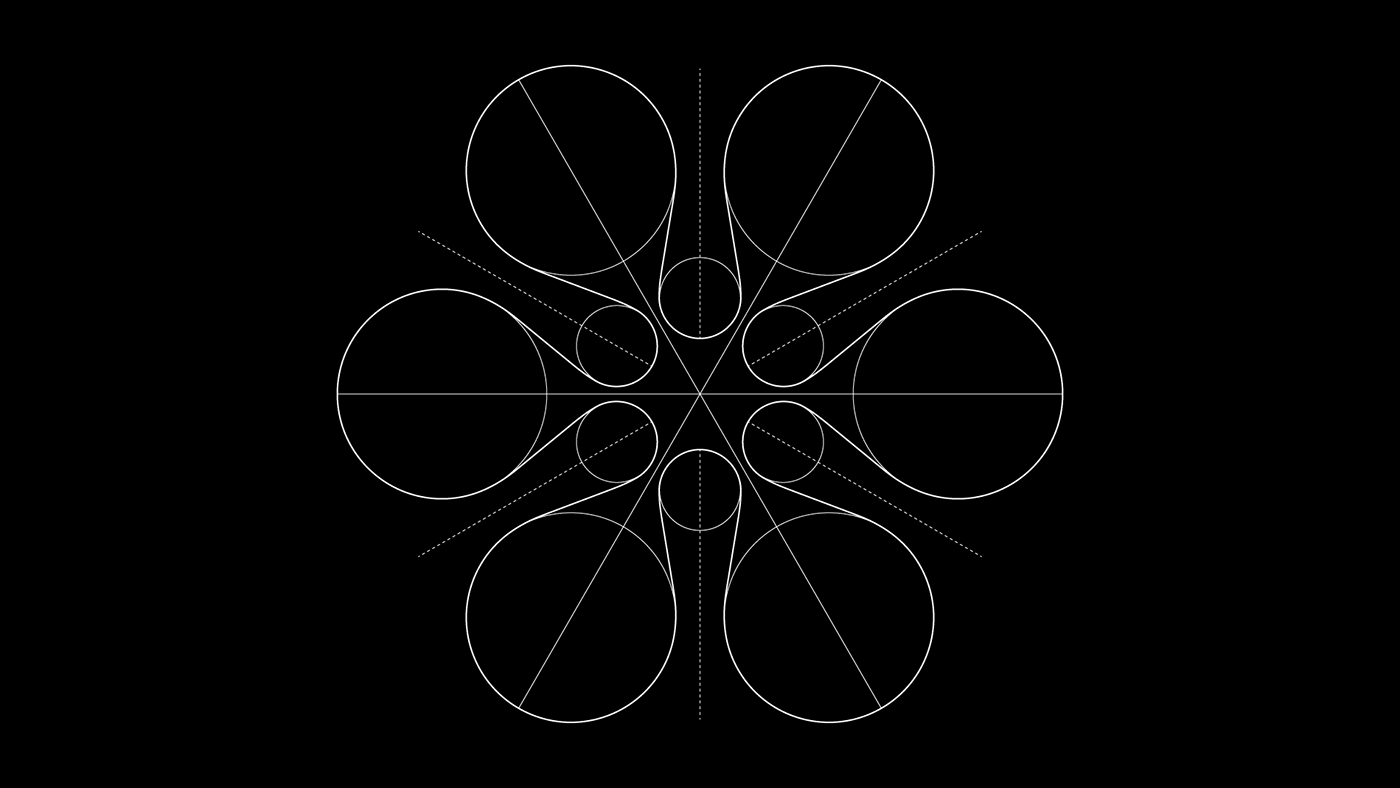
That’s why, 30 years later, here it was again — only this time, its unique material properties being used to shape the curves of a new, redesigned symbol. A process that was rich in experimentation, purpose and connection, just like Tátil’s approach to design, people and everything.








Creative Direction / Direção Criativa ––– Fred Gelli · Ricardo Bezerra · Renan Benvenutti
Project Manager & Production ––– Paula Mello
Designers ––– Daniel Escudeiro · Eduardo Mattos (macula.cc) · Thai Gomes
Copy / Conteúdo ––– Ana Cunha
3D ––– Paulo Ferreira · Caê Silva
Processing / Programming ––– Marlus Araújo
Video & Motion ––– Malícia Visual
Print Production / Produção Gráfica ––– Newman Nascimento
Physical Mocks ––– Acarlex Vilar
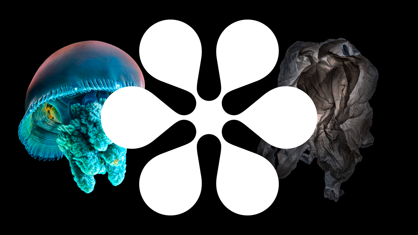
Some images are copyrighted by their creators and are used for creative concept boards only.


