INFOCUS Marketing's main business is association membership list management. As such, we also tend to manage the attendee lists of our associations' tradeshows. Since we also provide design, print, mail and email services, the program of Exhibitor Express was born. The program is exclusively for exhibitors to come to us for all of their marketing needs for their tradeshows. I was responsible for creating the logo for the program, as well as creating 8 postcard templates for exhibitors to choose from.

Sketch one.
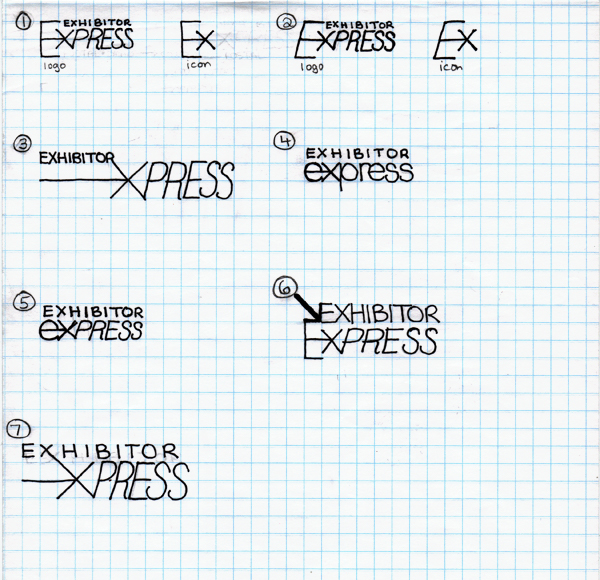
Going into this design, I had a pretty firm idea of what I wanted to do. I wanted the logo to reflect the company logo (with the intention that you'd see Exhibitor Express and automatically know that it was an offering of INFOCUS Marketing). Because I had such a clear idea of what I wanted to do, I didn't explore many options in my first round of sketches. (Lesson learned, however!)
Going into this design, I had a pretty firm idea of what I wanted to do. I wanted the logo to reflect the company logo (with the intention that you'd see Exhibitor Express and automatically know that it was an offering of INFOCUS Marketing). Because I had such a clear idea of what I wanted to do, I didn't explore many options in my first round of sketches. (Lesson learned, however!)
Concept one.
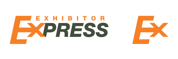
This was my first fleshed-out concept. The critiques received that pushed me back to the drawing board were that "exhibitor" was too hard to read at small sizes, it felt like a similar type-treatment as Fed-Ex, and a local printing company's logo was similar.
This was my first fleshed-out concept. The critiques received that pushed me back to the drawing board were that "exhibitor" was too hard to read at small sizes, it felt like a similar type-treatment as Fed-Ex, and a local printing company's logo was similar.
Sketch two.
Going back to the sketchpad, I tried to come up with different visual solutions that still echoed our company logo a bit. I ended up going on to conceptualize a modified version of number five.
Going back to the sketchpad, I tried to come up with different visual solutions that still echoed our company logo a bit. I ended up going on to conceptualize a modified version of number five.
Concept two.
Critiques of this concept were that it too closely resembled the company logo, and didn't express the speed of service that we wanted to show. At this point, I was a little bit at a loss. I took a few days' break to clear my thinking, and went back to the drawing board one last time.
Critiques of this concept were that it too closely resembled the company logo, and didn't express the speed of service that we wanted to show. At this point, I was a little bit at a loss. I took a few days' break to clear my thinking, and went back to the drawing board one last time.
Sketch three.
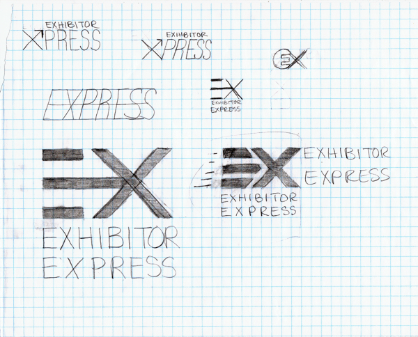
I explored an option that a coworker suggested (in the upper left corner), but thought that the visual representation of the speed of service was still missing. I started to experiment with the possibility of removing the stem of the "E" to create stronger forward movement. After a meeting to go over the new sketches, we decided to move forward with the bottom right option.
I explored an option that a coworker suggested (in the upper left corner), but thought that the visual representation of the speed of service was still missing. I started to experiment with the possibility of removing the stem of the "E" to create stronger forward movement. After a meeting to go over the new sketches, we decided to move forward with the bottom right option.
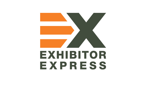
Concept three: final.
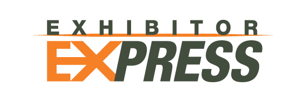
This is the final, approved logo. The negative space between the "E" and the "X" creates a stylized arrow (which does harken back to the company logo slightly). I removed the stem of the "E" to create a visually "faster" mark, which results in the three bars dually serving as the "E" and as motion marks for the "X." The colors chosen are the gray of our company logo and the orange of the company that we acquired last summer.
This is the final, approved logo. The negative space between the "E" and the "X" creates a stylized arrow (which does harken back to the company logo slightly). I removed the stem of the "E" to create a visually "faster" mark, which results in the three bars dually serving as the "E" and as motion marks for the "X." The colors chosen are the gray of our company logo and the orange of the company that we acquired last summer.
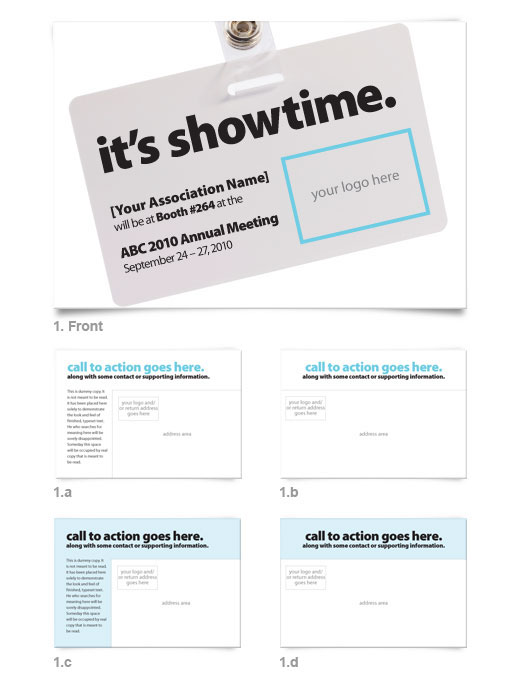
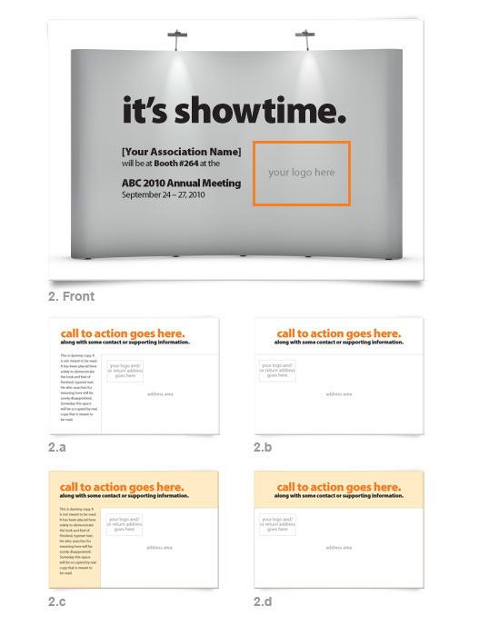
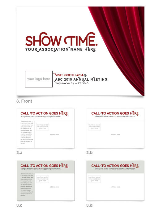
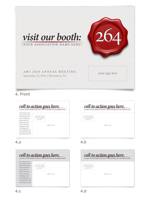
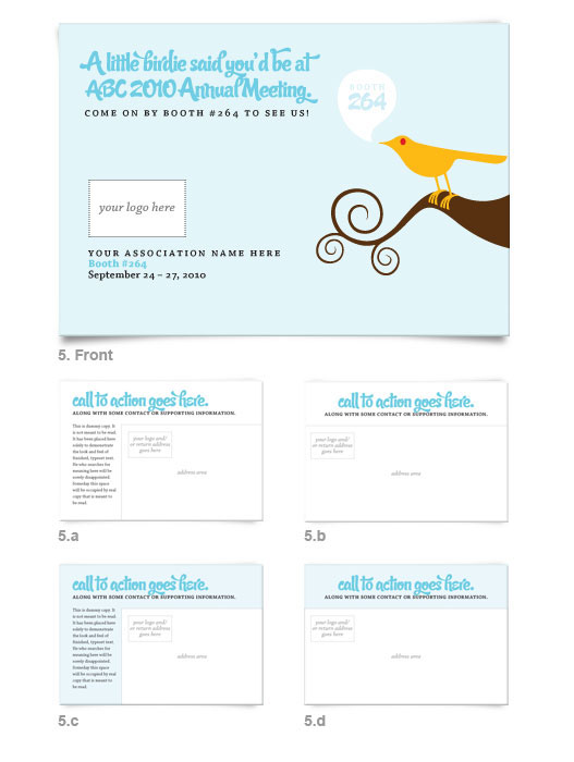
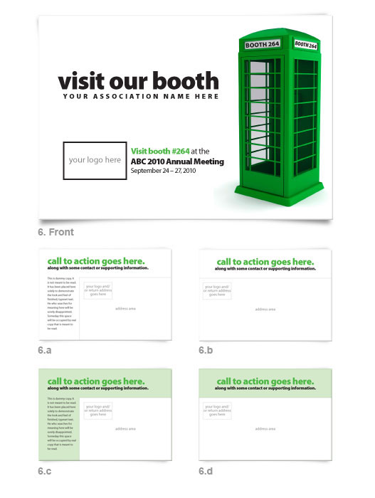
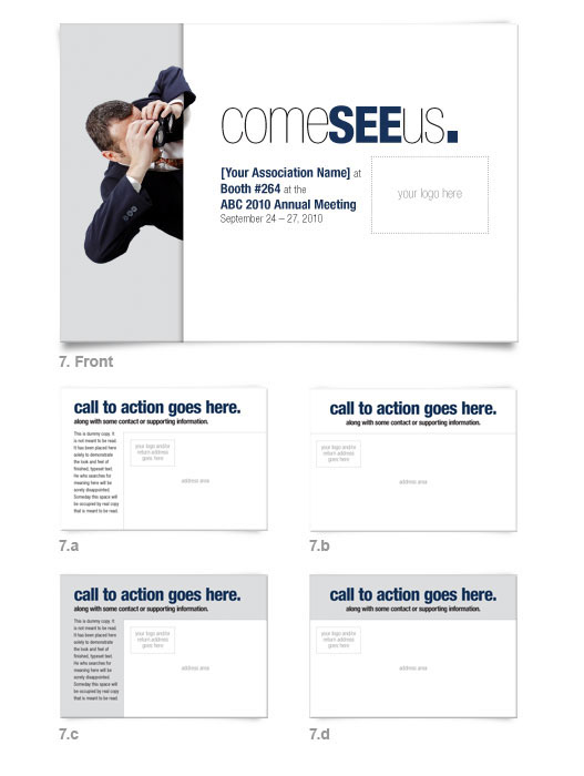
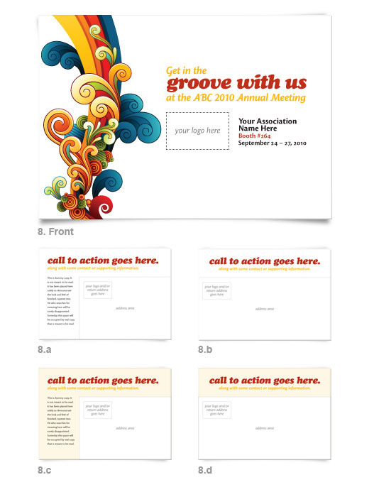
Postcard templates.
The following are the 8 postcard templates that I designed specifically for exhibitors to use when they come to us for their mailing list, design, print, and direct mail campaign. The headlines for each were written by me. Each card is customizable.
The following are the 8 postcard templates that I designed specifically for exhibitors to use when they come to us for their mailing list, design, print, and direct mail campaign. The headlines for each were written by me. Each card is customizable.