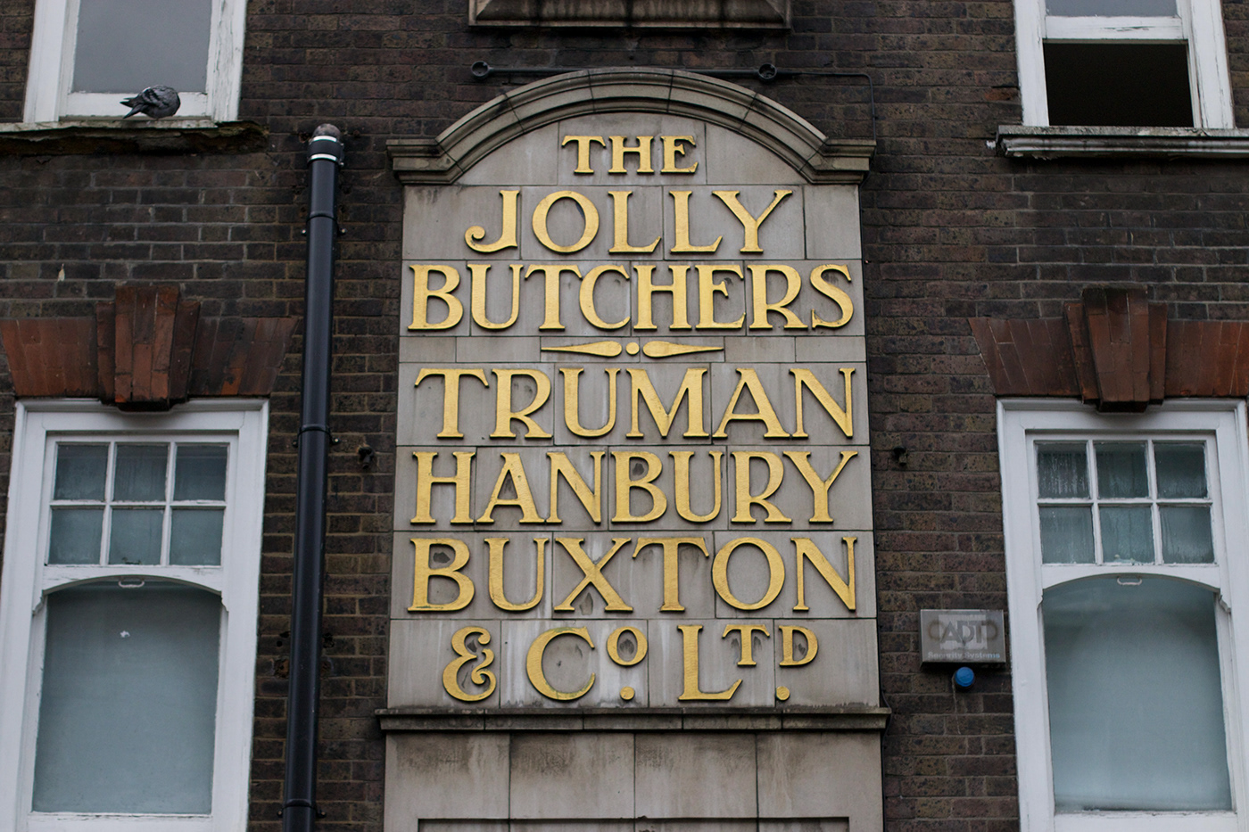
Brick’s foundations lie in the signage of three prominent pubs in London’s East End, The Jolly Butchers (Brick Lane – now closed), The Royal Oak (Columbia Road), and The Prince Albert (Acton Street). Referencing their Art Deco traits, with a trace of Art Nouveau heritage, Brick is Fermín Guerrero’s re-interpretation and continuation of the vernaculars elegant gestures, brought into the 21st century.
Guerrero first discovered the vernacular of Brick Lane street during one of his visits to London, in 2015, while studying Typeface Design in Reading. It wasn’t until several years later that the collective forms and development of the design began to materialise.
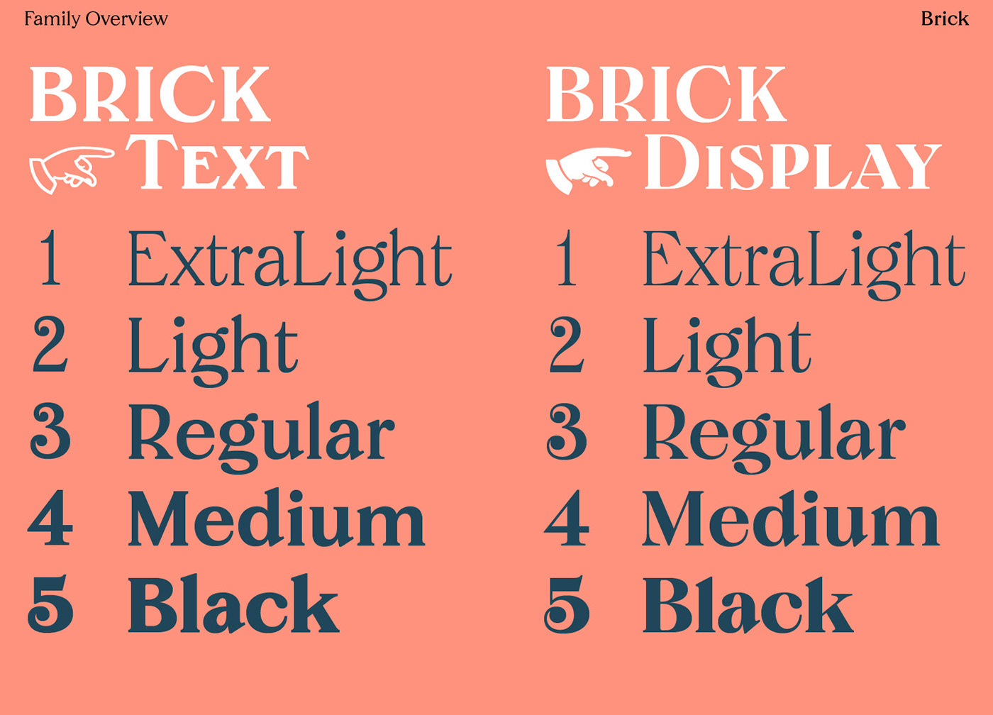


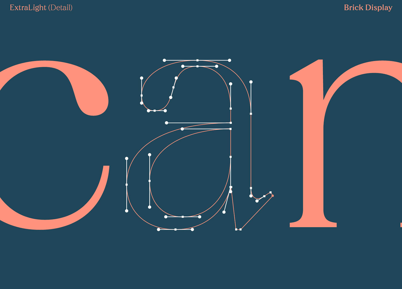
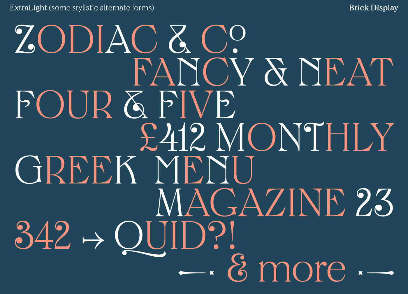
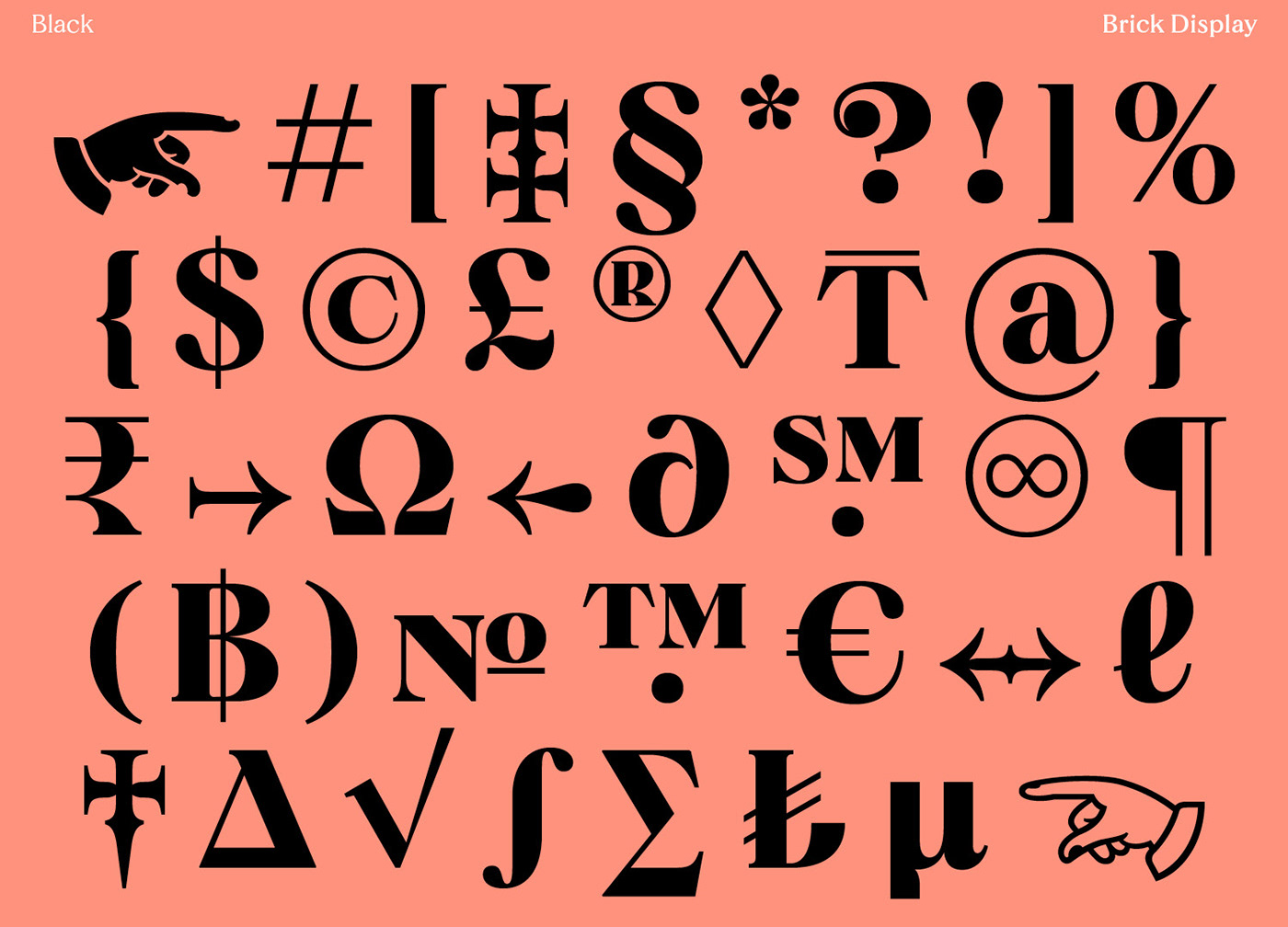
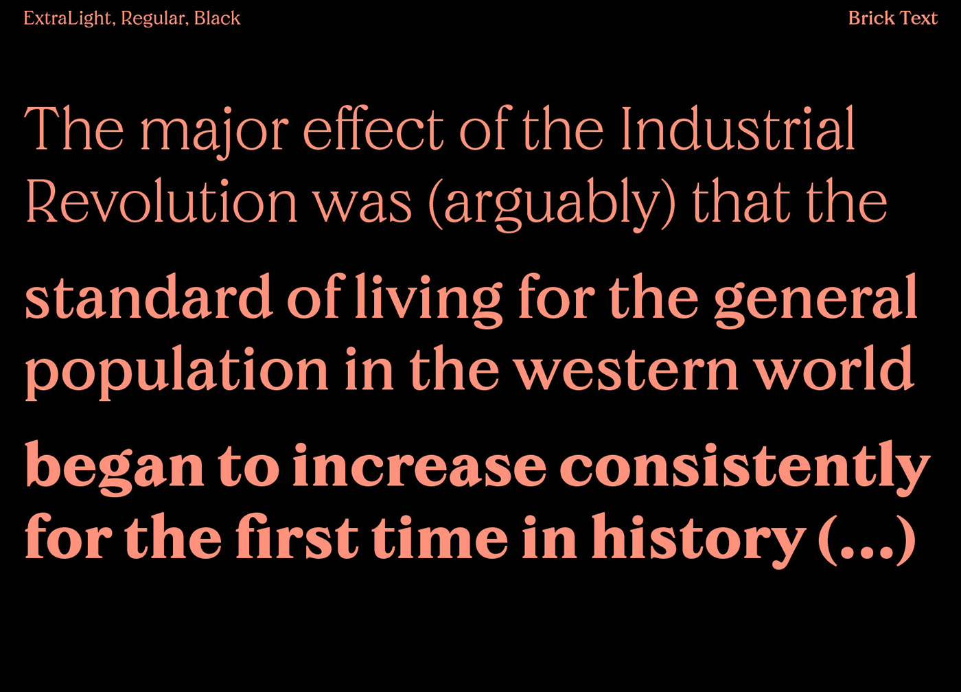
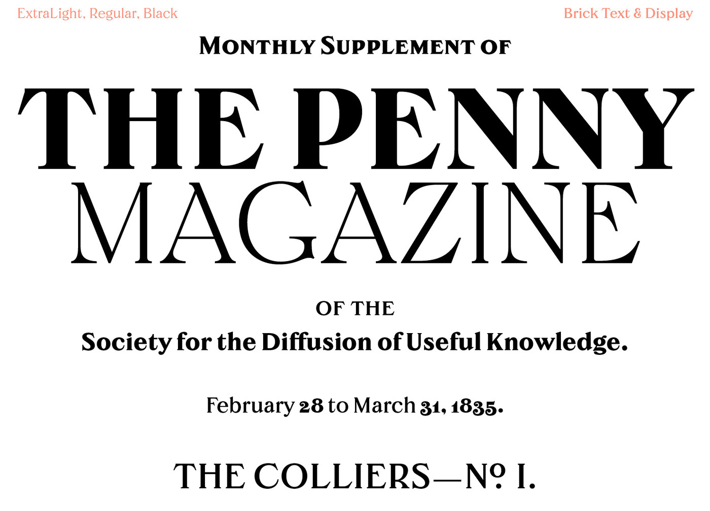

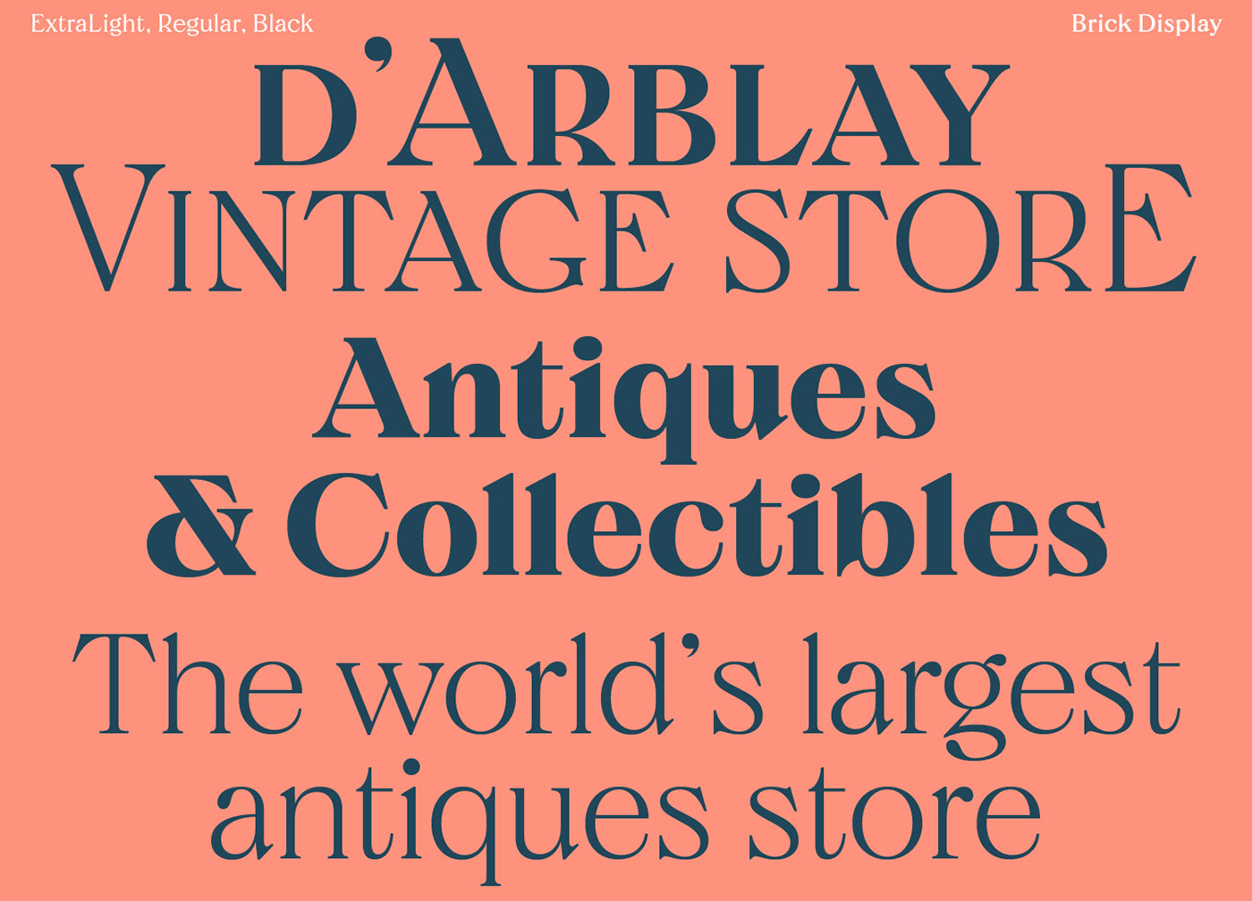

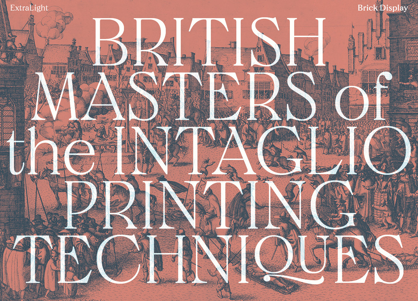

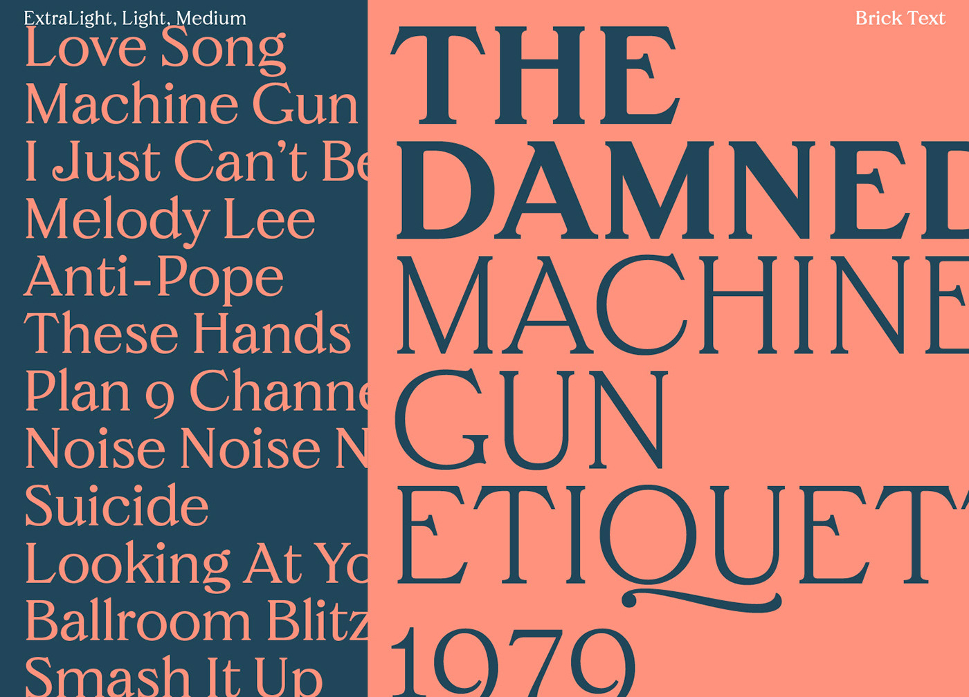
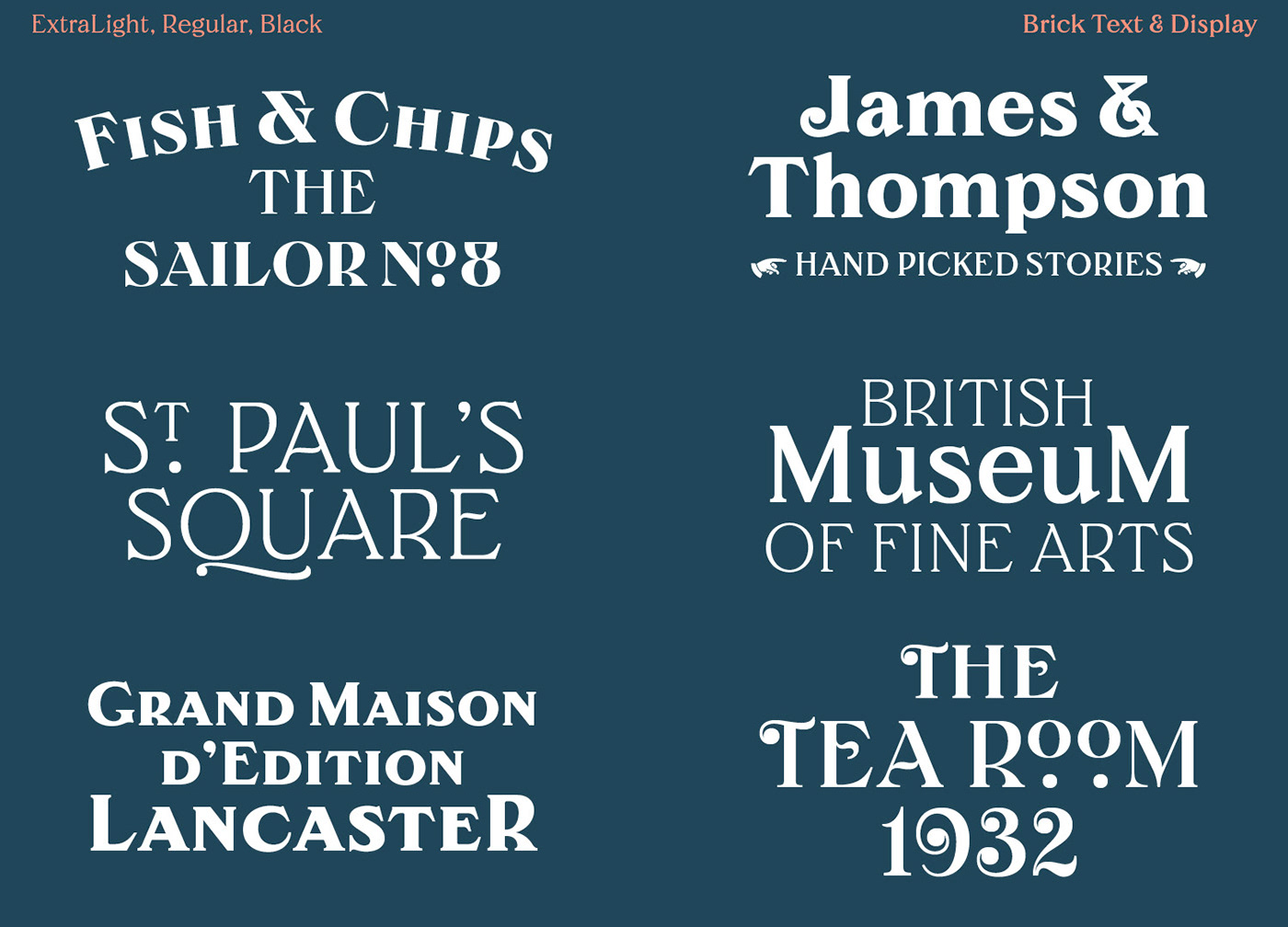
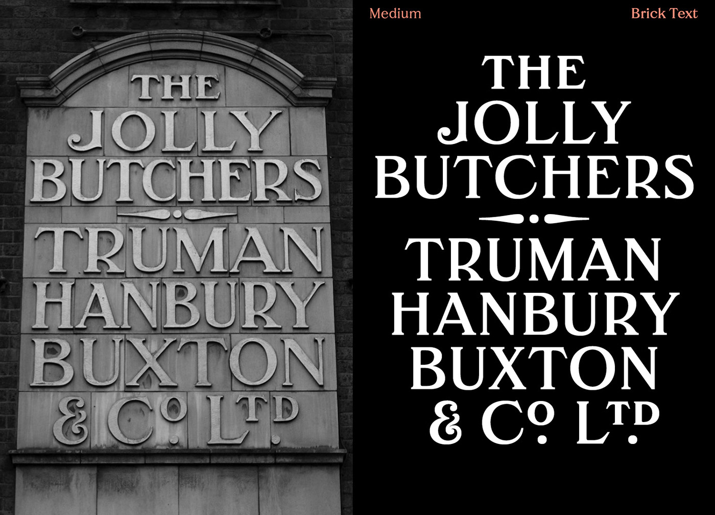
Brick is now available in five weights (ExtraLight, Light, Regular, Medium & Black), across two optical sizes (Text & Display). It is available to license at Colophon Foundry – here, in both Standard (‘STD’) and Professional (‘PRO’) versions. The latter encapsulates the prominent Truman brewery’s unique personality through an exhaustive series of OpenType features and stylistic alternates available within the PRO variant.
If you want to know more about Brick's development, don't miss the article I wrote with Colophon, where you can learn a lot more – here.