Spot Illustration done For Three Floyds brewing beer bottle label.


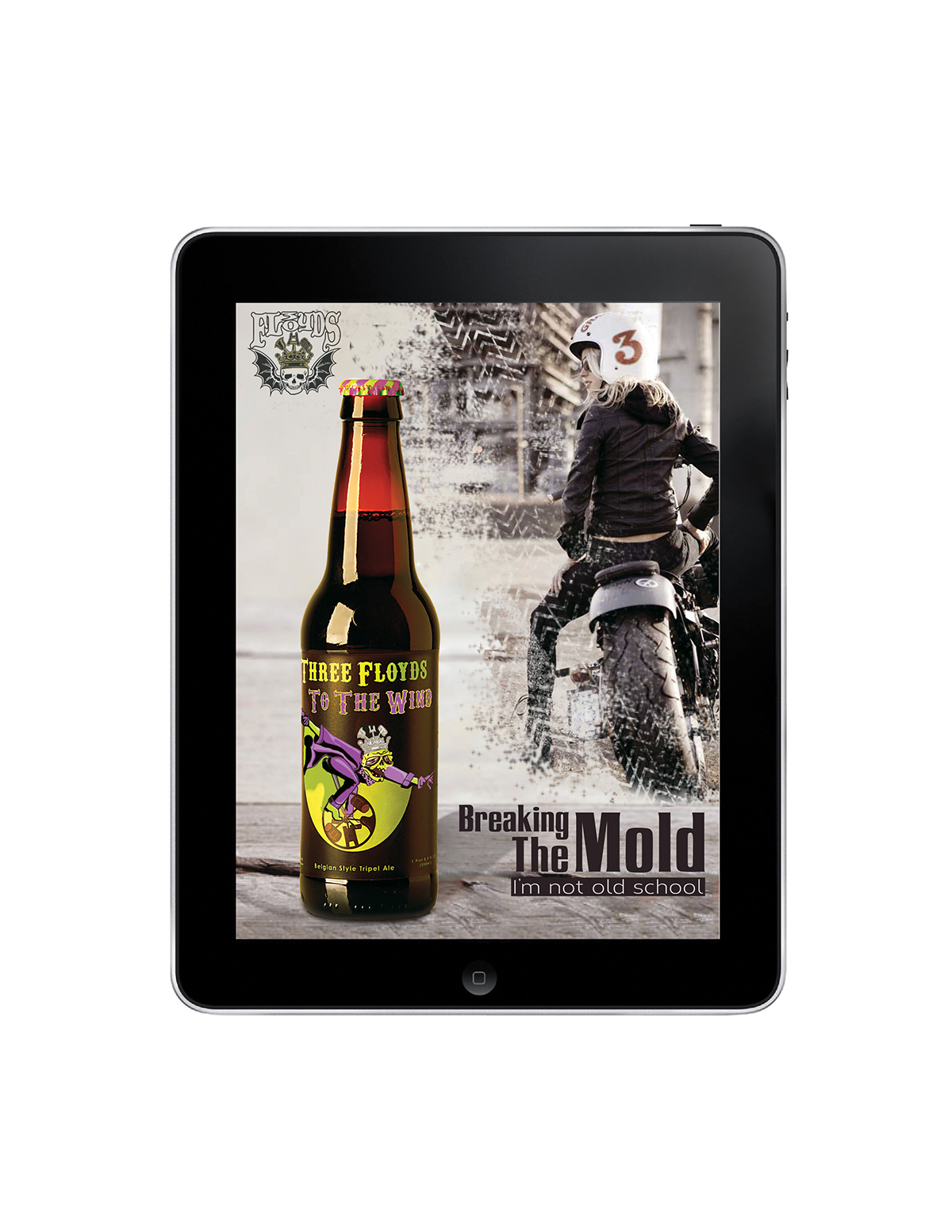
I created this 4 pack limited edition diecut design for the packaging of the beer brand.


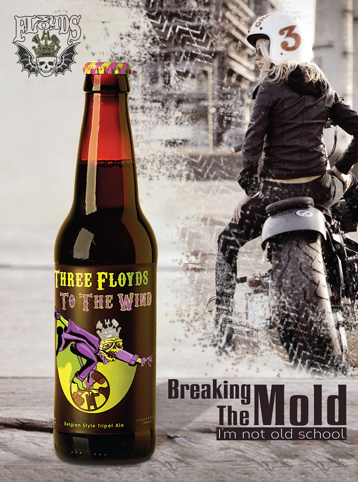
Have you ever craved a beer that might loosen the ropes a bit? Or for a lack of a better phrase, get you "three sheets to the wind"? ....Yes please! Well then I have the brew in mind for you...
Introducing Three Floyds To The Wind. Our Trippel Belgian Style Ale (pronounced triple) opens with a bold blast of hops that slowly gives way to the fruity esters implied by our Belgian yeast strain. In the Belgian tradition of brewing singles, doubles and triples, Trippel is the strongest with the longest fermentation. Remarkably smooth and complex, with a note of spice and a trace of coriander, leaving you with that after taste of bananna nut-bread.
This concept craft beer was designed from the ground up . From the name to the illustration and on down the road to the packaging...The special seasonal collectors 4 pack Packaging was set fourth with flair ...this beer is guaranteed to make you the coolest one at the party. Three Floyds brewing is out of Munster, Indiana, and word has it that the folks down there in Munster have spotted suspicious zombies out riding unicycles!


