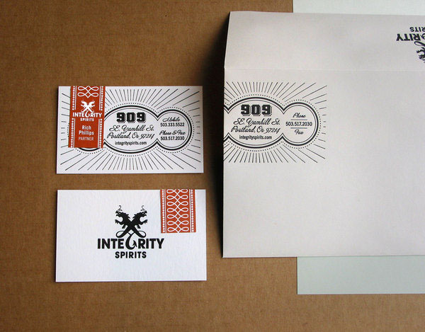
The logo for Integrity Spirits is a channeling of the mythos of the two founders, Rich and Kieran, into visual design. The two founders are long time best friends. They are yin and yang. They are unified in a passionate commitment to the distillation of spirits. And they’re into dragons. This logo is really Rich and Kieran’s album cover. It’s what they’re about. It’s them.
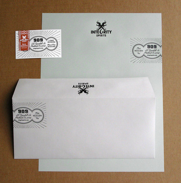
The business papers reflect the hand-crafted quality of the spirits. All designs are one color, letterpressed, and use hand applied labels for personalization. The hand applied labels were designed to echo the look of the security seal placed over the caps of their vodka and gin bottles.