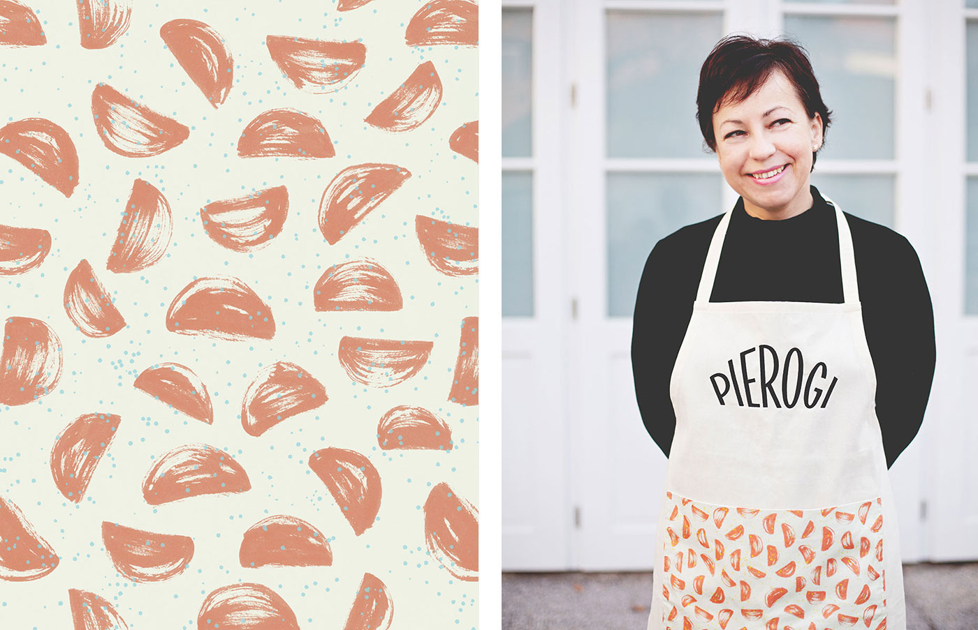
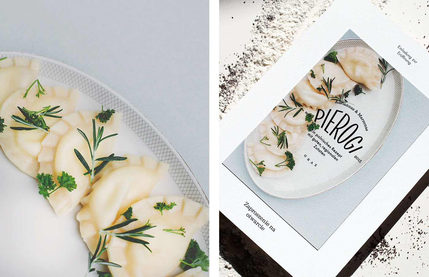
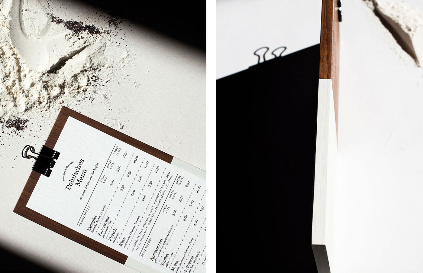
Adriannas & Marzenas Pierogi is a small but charming polish restaurant in Graz. The name already gives away what the restaurant is about: Pierogi the well-known polish speciality.
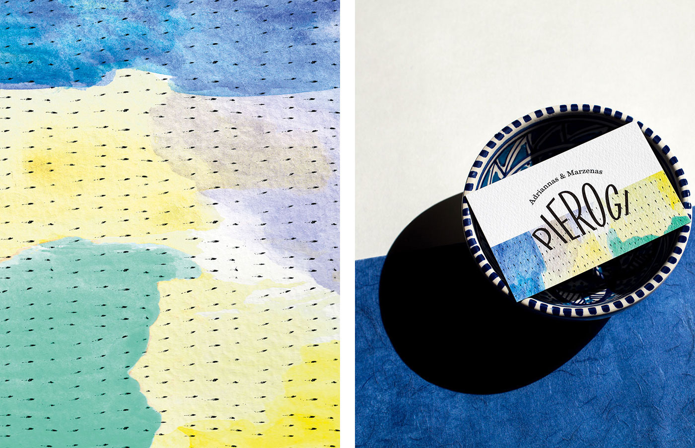
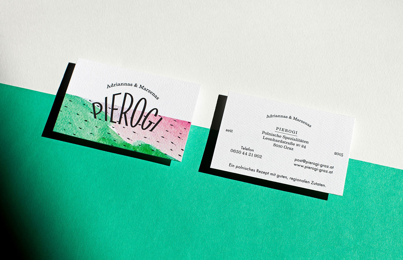
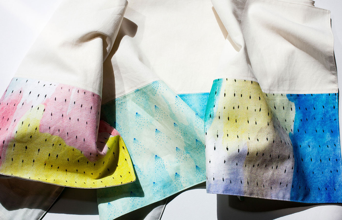
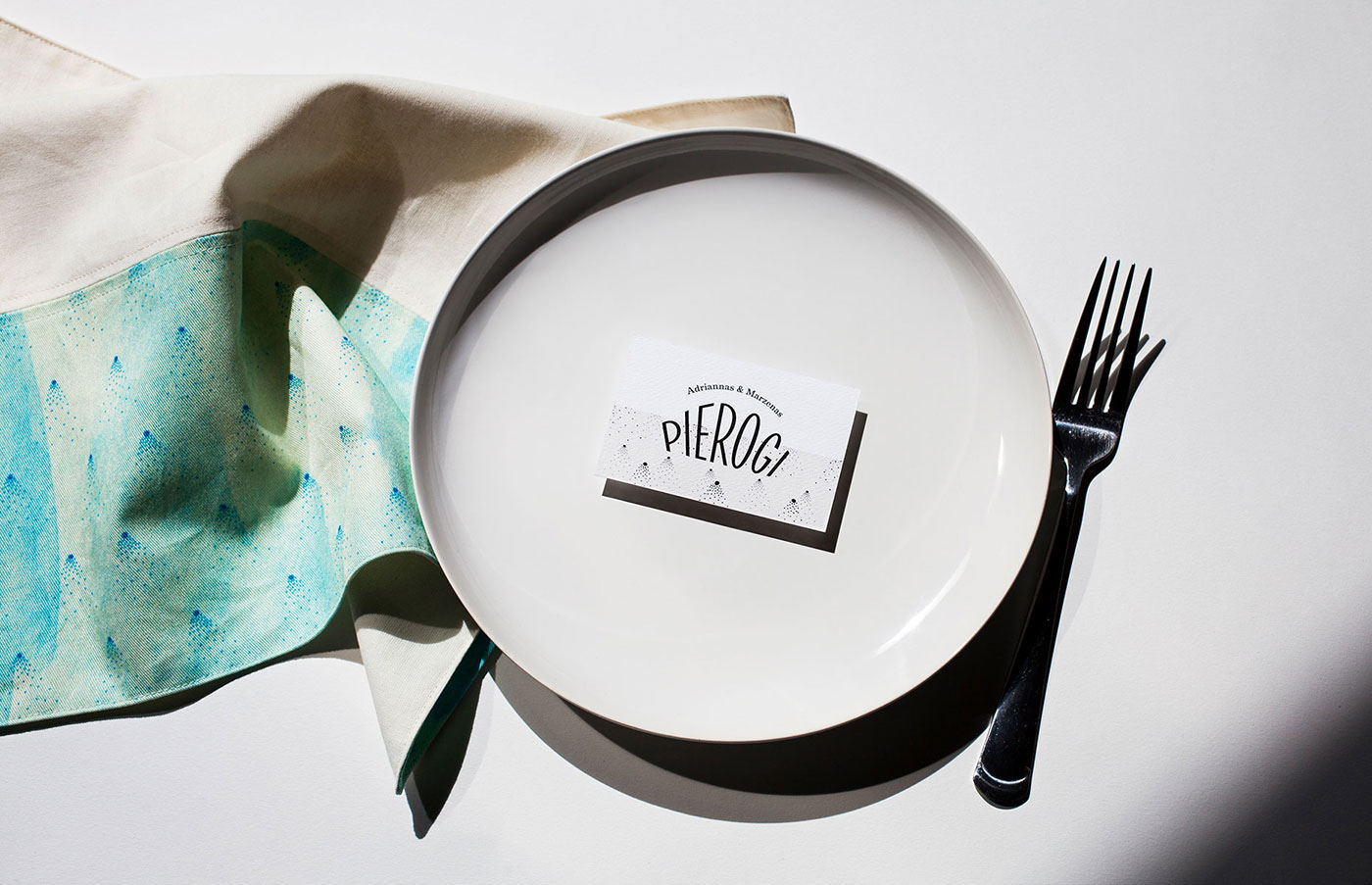
The idea of sperating the areas – like the polish flag – in combination with the semicular Perogi shape create a strong visual composition that communicates the origin and the product in a simple and reduced way. The various and vibrant illustrations display the varities and fillings of Pierogis that came to Adriannas & Marzenas mind – from sweet to spicy.
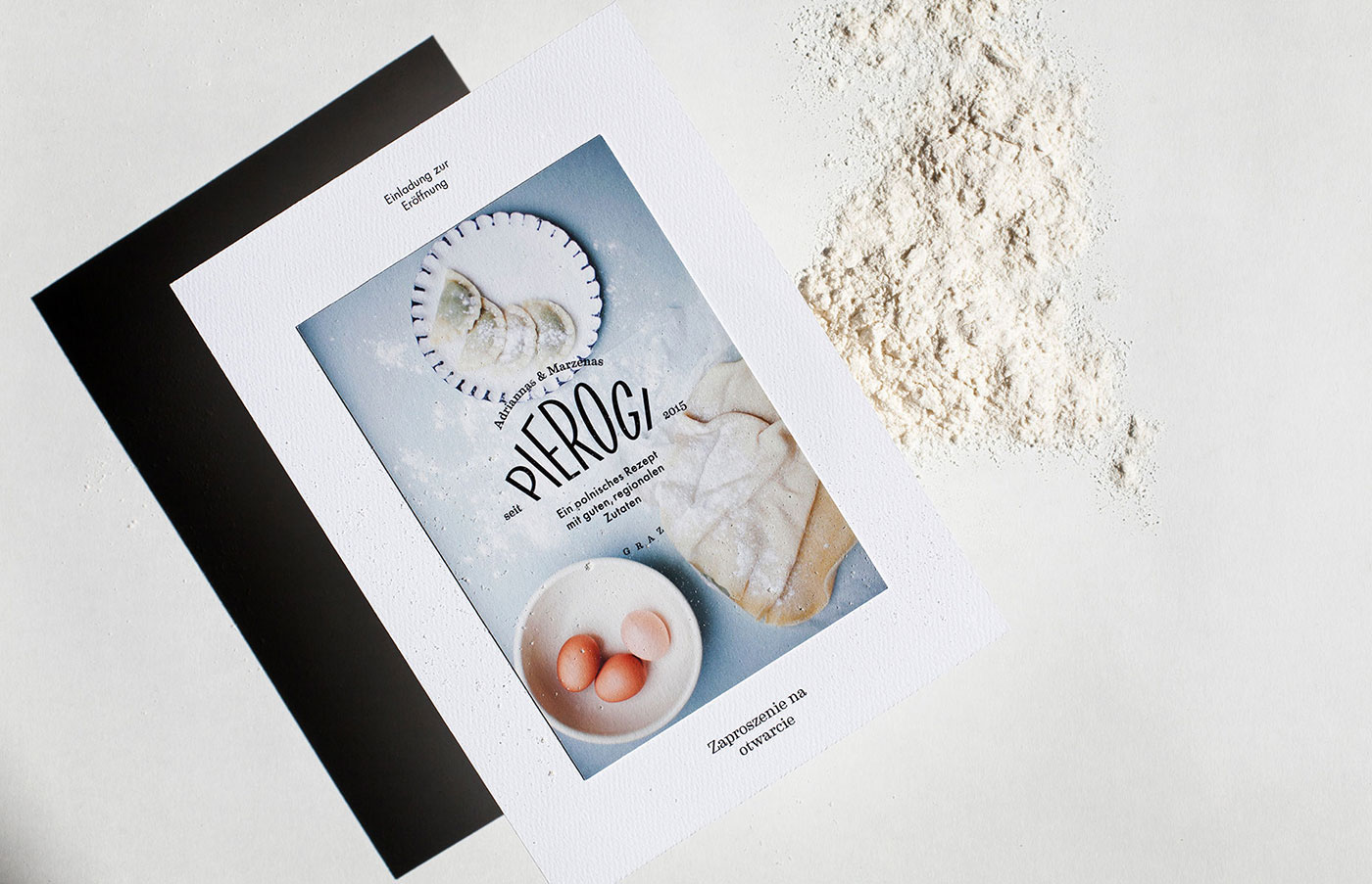
The reduced and bright imaginary shows the delicious bite in an authentic way and extends the friendly and bright new visual identity. Finally, Smaznego.
www.studiobruch.com