


CLICK HERE to see the wallpaper-size image! (1920x1080)


May 2014: This is one of the first images I rendered of the little guy. It shows all the main elements in place, basic studio lighting, correct displacements and two standard grey shaders for key contrasts. This is the kind of image I like to get before deciding if I go on with a personal project; in this case, the answer was obviously yes.

Here's a character sheet I elaborated with the previous render and a view from the back. It helped me to get all the main parts and the proportions right. MATHEMATICAL!

Here are some of my inspirations for this project! I don't know where the left one is from, but the middle one comes from the hilarious episode TIME SANDWICH (Adventure Time S05-E33). Finally, on the right is my old Gameboy Color from Xmas 1998, which was a great reference for reproducing realistic details and materials. I can't believe it's still working!

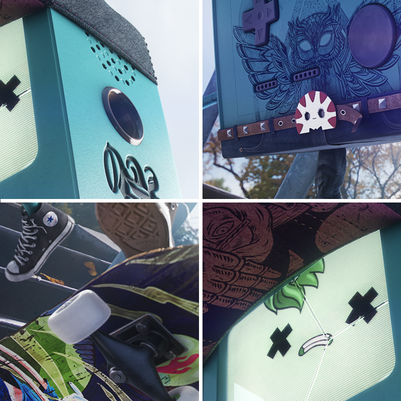
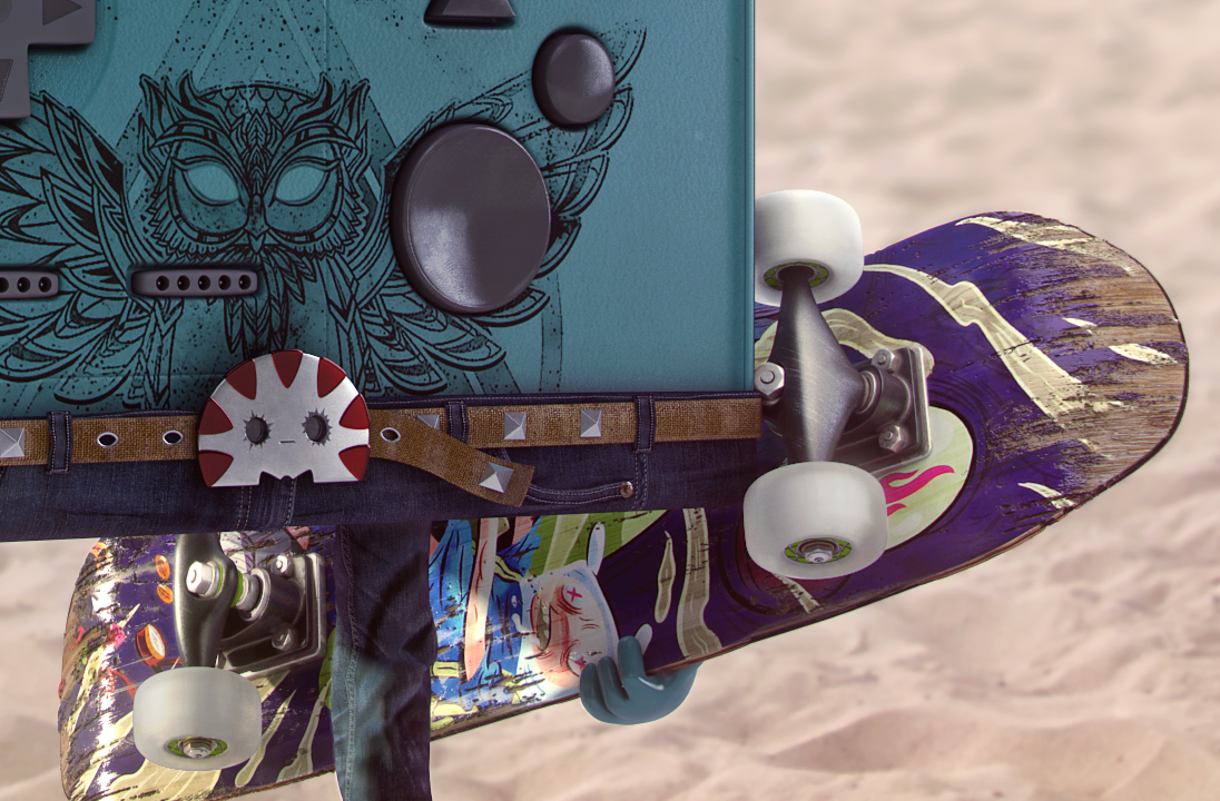
July 2014: Things were starting to fall in place with better lighting, more clothing and some context. Peppermint Butler even makes an appearance as the belt buckle! (Peppermint Buckle?) I've been studying a lot about lighting, from JOHN CARMACK's talks to RENDERMAN UNIVERSITY (Pixar's technical stuff), so I tried to apply some of that knowledge here. Without knowing exactly why, I wasn't quite satisfied though. I decided to keep it that way for now and to continue with some animation tests and texturing.

THE CHEAP TRICK
Most of the various holes were pushed by displacement maps crafted with insane precision. In this case, the whiter the shape, the deeper it sinks into the mesh. Blurring parts of the image created more or less pronounced bevels of incredibly fine quality.
August 2014: I had to go back in my workflow and remodel some parts of the body, but I was finally able to create a simple walk cycle. I tried to be faithful of how BMO walks in the series and to portray some lightness in him. The legs and feet are rigged with bones while the rest is mostly controlled by dummy objects linked to proper pivots. Again, it could have been better, but at this point it was really satisfying to see some movement! The lighting is pretty much the same as before, only composited and tinted differently. Oh, and I finally made a choice for his main tattoo: a stylized an serious interpretation of the Cosmic Owl.

THE LIGHTING SETUPS
I knew from the start that I wanted to feature BMO with strong light sources coming from the back instead of the front. This way, I could generate some nice speculars on his side while keeping the front panel in the shadows, emphasizing his luminous and reflective face. This is the type of lighting I really like to work with since it creates a kind of glowing and
dramatic look without suffering from any detail loss on the most important features. The lights were put in place very early in the development of the project; I often do this before even starting the texturing process. After all, lights affect materials, not the other way around.
To get technical, here's what the setups consist of:
- Vray Sun (KEY light): Nothing fancy here, the size was set to 8 so the shadows look sharp at contact point and then get smoother as they stretch.
- Vray Light (Dome) (FILL light): Realistic HDRI maps were inserted here to give the desired global illumination and tint to the whole scenes, plus add a few details to the reflections. The chosen HDRI skies are obviously similar to the background images planned for post-production, thus helping the integration of the 3D renders.
- Vray Light (Plane) (BACK light): The famous rim lights were used here to create a bright outline on the character. This is a great trick to make a subject stand out from any eventual background.
- Vray Light (Plane) (KICK light): Acting as softboxes, they were added there to support the fill light and generate more specular and reflective accents.

October 2014: After many -many- tests with a mix of SSS & Vray shaders for BMO's body, I finally opted for a simple Vray material giving a slight impression of translucency. It was hard to tweak to perfection, but in the end it saved a lot of rendering time. Since BMO is rectangular, the SSS didn't enhance the result much and its contribution was achievable with other means anyway (keep reading, I'm explaining that later!).
Wristbands and more tattoos were added to the right arm, and some glossy wood was applied to the pseudo-ear-stretches below the speakers. Many cloth-like textures were also created for the cap, belt and pants (not finished here). It was much harder than I expected!
A LITTLE BIT MORE ON LIGHTING
Obviously, the 3D models here are pretty simple, so most of my attention went to create interesting lighting rigs and materials (which is my cup of tea, after all). I've seen beginners
claim that lighting is mostly easy and unimportant, and then wonder why their work doesn't stand out, look realistic, or convey the right message.
Light brings life; it defines shapes, creates atmospheres, moods, alters colours and tints. It creates mystery by showing and hiding things from the eye. It makes things glow with verve. It tells stories and evokes feelings, consciously or not. I can't stress this enough:
Light brings life; it defines shapes, creates atmospheres, moods, alters colours and tints. It creates mystery by showing and hiding things from the eye. It makes things glow with verve. It tells stories and evokes feelings, consciously or not. I can't stress this enough:
Light changes everything
Let's look at some shots from Pixar's MONSTERS UNIVERSITY

(1) A bright, colorful and sunny day is obviously well suited for a first day of school, as Mike, full of hope, explores the campus that will bring him a step closer to his life-long dream.
(2) What a dramatic shot! Our two protagonists are vividly lighted in the background while a menacing character stands tall in the shadows of the foreground. Only a rim light reveals her silhouette as the triggering factor of the whole movie happens right before our eyes.
(3) Nothing goes better with boredom and despair than a dull cloudy day.
(4) I think this is the mood that made the strongest impression on me. It instantly reminds of any typical war movie or whatever when the guys start training in the early morning. It's no coincidence that this soft low light desaturates everything and tints the whole scene in a green palette, even turning Mike's blue cap into a greenish hat reinforcing the idea of the tough military training.

November 2014: (Back to BMO) This render was so exciting to see! Colours were fixed, lights were tweaked, materials are now more complex and sharp, etc. The jeans are also WAY better looking! I took the time to unwrap the meshes and create very detailed and nuanced maps from pictures I snapped of my own stuff at home. With this technique, the results were instantly improved and looked way more realistic.
The screen/face is also more interesting and more characteristic of this interpretation of BMO. I made it slightly cracked like in the episode BMO LOST (Adventure Time S05-E17), and it gave me the idea to add his pal BUBBLE to the scene. Their contrasting facial expressions created an interesting dynamic that I decided to consider for the final renders. Finally, post-production is less harsh here, giving a smoother overall look. Less is more, as usual.

COMPLEX MATERIALS
These are some of the materials that were applied to the final models. Essentially, they were all adjusted with a mix of UVW mapping, unwraps and blends. They generally include the following handmade texture maps (shown here in the top-right corner): diffuse, reflection, normal and bump. For specific cases, I also had to make some displacement, specular, self-illumination and opacity maps. Each of them has unique fresnel properties bound to different glossiness values based on data collection and sheer observation.

December 2014: At last, the definitive renders! The shoes and skateboard were finally textured and some adjustments were made to Bubble's shader, which was insanely time-consuming for Vray. For once, I was satisfied with the other stuff, so it mostly remained untouched. I really liked the interaction of the two characters (left), but it seemed a bit too static for the theme, so I decided to try a more dynamic pose on BMO (right). Within minutes, I knew it was killer, and I was done a few hours later thanks to my rig of bones and dummy objects from last August.
A MOST IMPORTANT SIDENOTE
All of this (lighting, texturing, rendering, etc.) was performed and computed through the Ô-feared-by-all LINEAR WORKFLOW (LWF), and thus a gamma of 2.2. I've put some very useful links on the subject, among others, at the very end of this page. You will notice that everything I've done so far (just as what comes next) is consistant with techniques focused on photorealism.
Although achieving realism was not the goal of this project, it's primordial to master the principles attached to it just as knowing human anatomy is mandatory for drawing or animating characters. These principles are mostly related to photography, optics and physics, which are the key fields of study for creating plausible and coherent scenes.
I would therefore suggest to anyone wanting to reach the top of his game to get into those subjects once he is comfortable with the basics of the softwares he's using. It is truly useful and satisfying to add this kind of knowledge to any artistic workflow, digital or not.

A FISTFUL OF RENDER PASSES
A total of 14 different 32bit EXR passes were outputted during the final renders in order to keep the full exposure range computed and to have an optimal flexibility later in post-production. I even modified some of these by hand to get the exact details I wanted to see happening, especially when it came to complex physical effects like caustics, volume light (atmosphere) and depth of field (Zdepth).
The one seen here on the far right is a fresnel/falloff pass which helped me to fake some SSS/translucency in some areas. The produced effect is also useful for adding a cartoonish look to the materials by generating gradients that often bring out the edges of the shapes. Recently, I noticed that Nintendo brilliantly applied this idea to their characters in SUPER SMASH BROS WII as they sometimes do since Mario Galaxy.
The one seen here on the far right is a fresnel/falloff pass which helped me to fake some SSS/translucency in some areas. The produced effect is also useful for adding a cartoonish look to the materials by generating gradients that often bring out the edges of the shapes. Recently, I noticed that Nintendo brilliantly applied this idea to their characters in SUPER SMASH BROS WII as they sometimes do since Mario Galaxy.
Finally having everything I needed from 3dsmax, I then proceeded in After Effects, which is -in my opinion- more efficient at handling 32bit data than Photoshop.
POST-PRODUCTION
This is probably one of my favourite things to do (along with lighting); at this point everything finally comes together! The process here was broken in 4 steps:
Step 1 (After Effects): The first thing to do was compositing the render passes over the backgrounds. This step was crucial for a seemingly flawless integration of the 3D renders in the selected photographies. It was mostly done by tweaking things like shadows and reflections on specific parts of the image, getting some light occlusion on the ground, and adding tints from the global illumination on plausible areas. All this was mandatory to achieve a believable blending of the whole thing.
Step 2 (After Effects): Many effects and color corrections were added to unify and improve the images, along with glows, flares, depth of field blurs and vignetting. Because I always edit 32bit images in a non-destructive 32bit environment, none of these operations were degrading or removing any data of the pixels. By doing so, I assured myself of always working with the cleanest and most adaptable solutions before rendering the not-quite-final uncompressed images (PSD). Yes, in theory, the illustrations could have been considered done after all this, but a bit of Photoshop was still necessary for enhancing the outcome even more and refining some last-minute details.
Step 3 (Photoshop): Time to get picky! Anything that seemed slightly incorrect for my eyes got adjusted, from blending more parts of render passes to changing tones and contrasts here and there. All those tiny things were easier to make in Photoshop due simply to masks and brush tools.
Step 4 (Photoshop): This final step was essentially the same as the one before, but I let a couple of hours pass between them. This way, I could get a fresh, objective angle on my own work, which I believe is an important part of any creative workflow. Only then, my images were finished.

WHEN CREDIT IS DUE
The skateboard features an amazing piece by LOGAN FAERBER drawn for Kaboom's 11th Adventure Time comic book. The Cosmic Owl is an altered version of MAIRA VEGA's t-shirt concept for Design By Humans. Tip of the hat to those terrific artists!

3D World Magazine - Issue 194 (May 2015)


Great response from the social medias :) Tumblr went insane thanks to PIXALRY!


