Visual kitchen
Graphic Design Contest
Graphic Design Contest
Graphic design is a particular genre of art. The designers are told in most cases what to cook in our visual kitchen. Possibilities seem often limited when the client sets up the boundaries. It is our intellectual challenge how to manage to demolish these boundaries and how to push our limits for the beholders staisfaction.
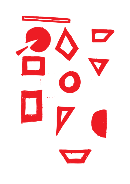
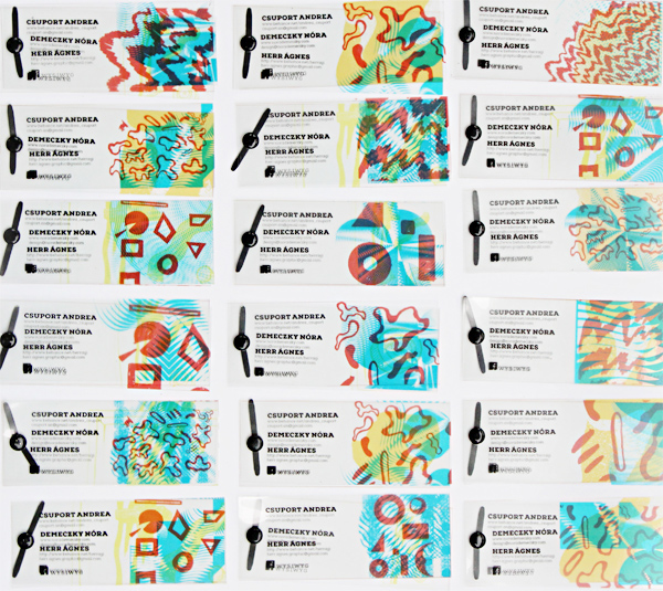
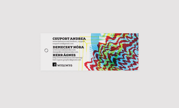
The ingredients are given, to set up the „menu” is up to the designer. Is there any free space for a good „chef”, who is more than willing to cook himself into our visual diet. The „same” can be so many ways „different”. Let's see then how many visual-dish can be created from the same and limited ingredients that are as follows:
Typeface: Nexa Slab family. Colours: Pantone proc Black, Pantone 032, Pantone 123, Pantone proc Blue or their CMYK separation in 100% density. Forms: geometric or hand drawn forms (or both).
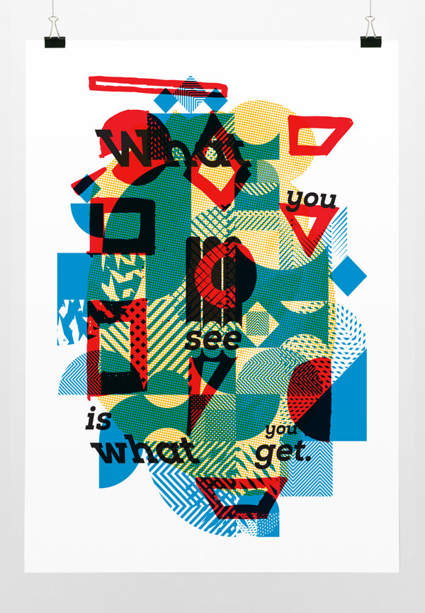
What you see is what you get
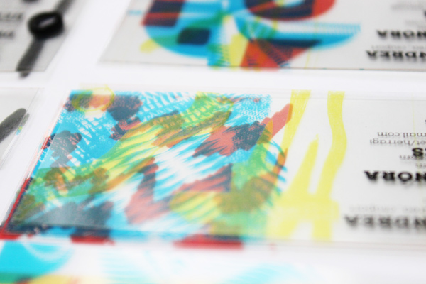
Our poster
is a result of a common cooking in which we cooked our own world with the below-mentioned “ingredients”. Each layer is designed by one of us and represents one particular color. Our title is: “What you see is what you get” – which expression comes from the world of IT. The original meaning might be interpreted as what we can see on our screens will be seen after printing the document itself. This statement is true from different points of view, since the more spectators the more meanings and processing forms are possible.
The poster is exhibited until Nov 28, 2013 at Design Terminal, Budapest.