
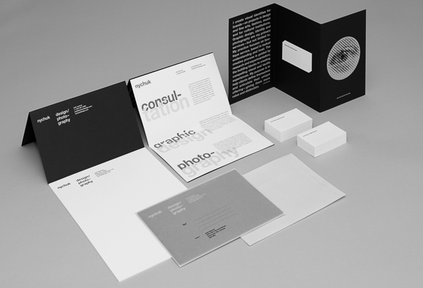
Identity for personal stationery package developed for correspondence and self promotional purposes. The piece conceals information, requiring participation by the recipient in order to access it.
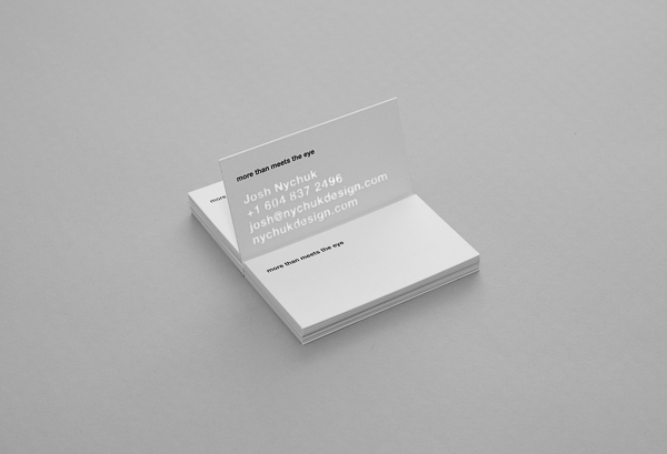
Business card
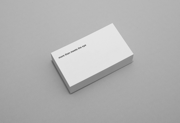
When facing downward you can only see the printed idiom “more than meets the eye” implying a hidden message or beyond what is initially perceived. When held up to a light source (daylight works fine) the contact information is revealed. A testament to minimalism, and a curiosity for what lies beneath the surface.
When facing downward you can only see the printed idiom “more than meets the eye” implying a hidden message or beyond what is initially perceived. When held up to a light source (daylight works fine) the contact information is revealed. A testament to minimalism, and a curiosity for what lies beneath the surface.
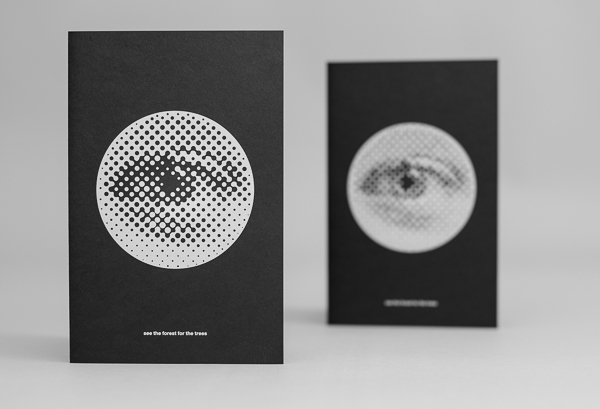
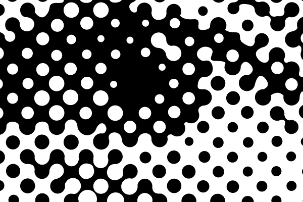
The symbol of the eye, is created through a reprographic technique called halftone. As the scale or depth-of-field changes the eye comes in and out of focus.
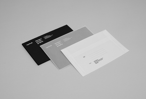
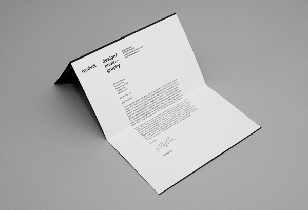
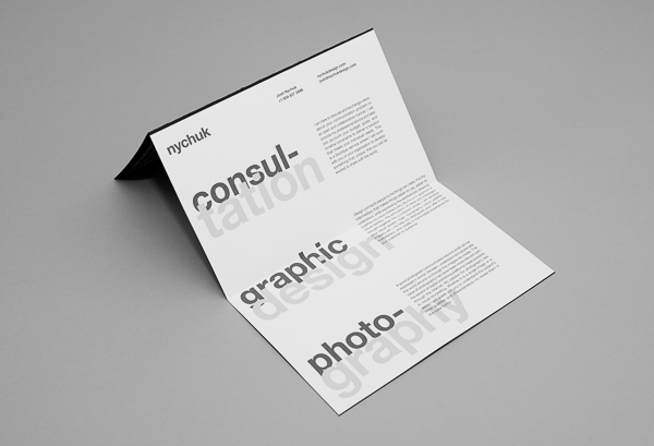
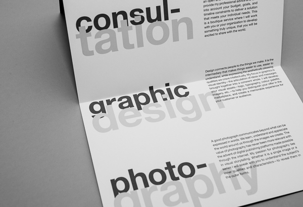
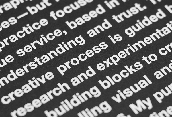
The identity does not make use of a formalistic logo, and instead is largely recognized through typography and technique.