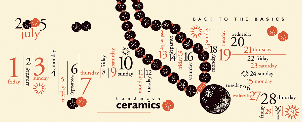
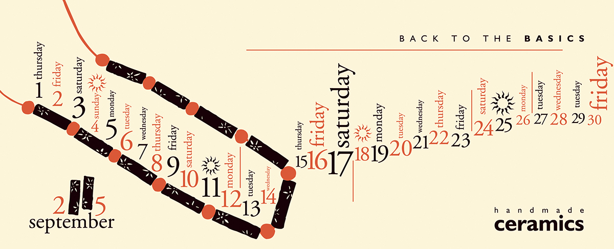
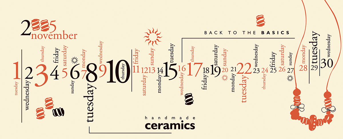
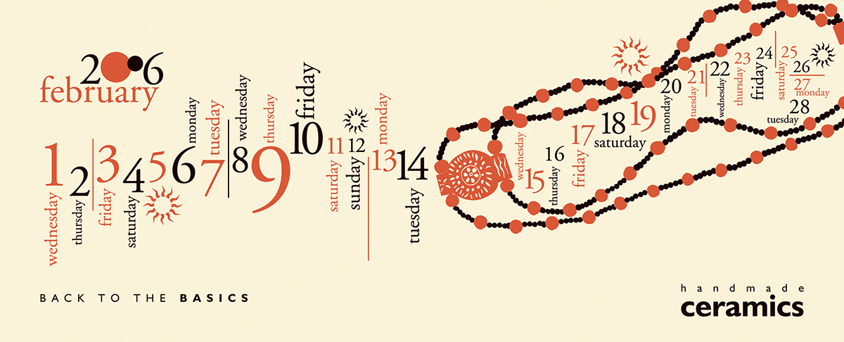
The prime motto of this calendar, focusing on theterracotta jewelry design, is a salute to the exemplary skills of the jewelrydesigner, Purvi. To maintain the originality of her creations, the actualjewelry pieces have been re-drawn. The color group has been kept tertiary, onpurpose, to maintain the sync with the original creation. And to furtheraugment the elegance of the creation, the calendar has been screen printed oncream colored paper. For the treatment, typography is a deliberate choice as itis very contemporary form of graphic designing and perfectly complements theartist’s jewelry creations. Hence, the calendar is an attempt to feature ‘theearthly context’ of every artistic impression.