
YCN Fedrigoni Brief
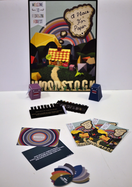
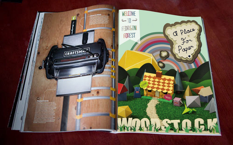
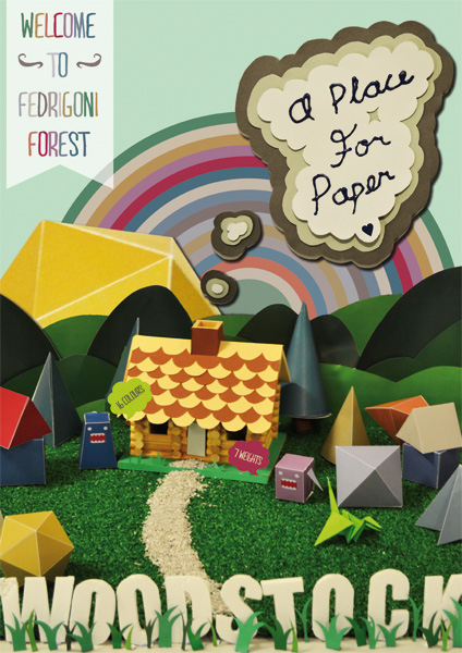
This is my response to a briefset by Fedrigoni UK. They produce luxury paper for high end use. I suppose Istarted out with the clichéd idea of making things out of paper, but why not,Fedrigoni are a paper company, and interacting with paper is what the consumershould do, it stated that their paper’s were versatile and could bend and fold,so the ultimate goal would be to show this in action. I came up with the ideaof making a forest scene after I found this amazing little log cabin for sale,and thought that it would be the perfect accompaniment to the paper. After all,paper comes from trees. To make it more playful, I cut out roof tiles and grassto add to the house. Smoke comes out of the chimney advertising the company’stagline, ‘A Place For Paper’, which ties in well with the use of the house.
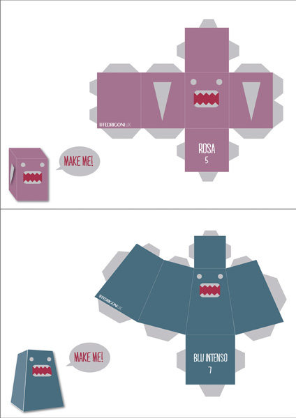
After setting the scene, time wastakien to photograph it form numerous angles, trying to capture that perfectview. Once found, came the task ofediting the images on Photoshop, I cut out and added extra hills to thebackground, as well as cutting out a shape and using it as the Sun. The rainbowcame from an earlier idea, but I decided to keep it as an additional extra togo out as advertising postcards, promoting the paper range. The monsters in thescene are part of the various ‘creatures’ you might find in a forest. If theidea was finalised, more of these monsters could be designed and made to gowith each colour in the range, or any other range for that matter.
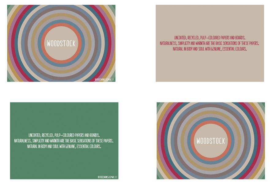
I had to choose one ofFedrigoni's new paper ranges and create a campaign aimed at mainly the luxuryand fashion industries. I chose to do the Woodstock paper range, at first, forall the imagery I got from the name (60s, psychedelia, hippy, trippy,kaleidoscopic, rainbows), but then, I came to like the papers themselves.Everything about this piece is inspired by nature, the forest, the rainbow,circles, clouds, leaves.
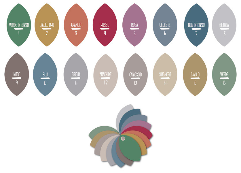
I wanted to show off the range ina colour swatch so the consumer could interact and play and feel the product,before going further and requesting samples. However, I didn’t want to use theusual swatches you might find elsewhere, so after looking at some samples, andkeeping in theme with the idea of nature, I came up with the idea of usingleaves as a template, with the information on the leaves, regarding colour anda number. The number would correspond to anything else the colour is put on,but perhaps doesn’t have room for the name.
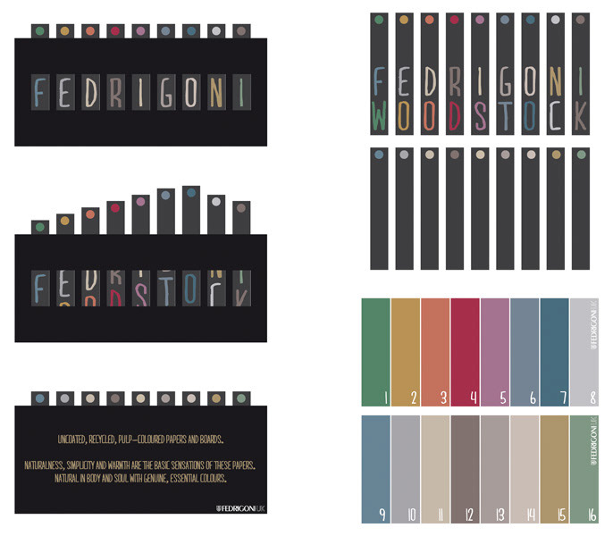
The Fedrigoni ‘game’ is designedas a piece of direct mail that would go out to prospective buyers of the paper.The idea behind it, is to pull up the strips of card, to reveal the hiddenword. I was very fortunate as to having the same the number of letters in thewords Fedrigoni and Woodstock, and the number of colours worked out well too.
After setting the scene, time wastakien to photograph it form numerous angles, trying to capture that perfectview. Once found, came the task ofediting the images on Photoshop, I cut out and added extra hills to thebackground, as well as cutting out a shape and using it as the Sun. The rainbowcame from an earlier idea, but I decided to keep it as an additional extra togo out as advertising postcards, promoting the paper range. The monsters in thescene are part of the various ‘creatures’ you might find in a forest. If theidea was finalised, more of these monsters could be designed and made to gowith each colour in the range, or any other range for that matter.
I had to choose one ofFedrigoni's new paper ranges and create a campaign aimed at mainly the luxuryand fashion industries. I chose to do the Woodstock paper range, at first, forall the imagery I got from the name (60s, psychedelia, hippy, trippy,kaleidoscopic, rainbows), but then, I came to like the papers themselves.Everything about this piece is inspired by nature, the forest, the rainbow,circles, clouds, leaves.
I wanted to show off the range ina colour swatch so the consumer could interact and play and feel the product,before going further and requesting samples. However, I didn’t want to use theusual swatches you might find elsewhere, so after looking at some samples, andkeeping in theme with the idea of nature, I came up with the idea of usingleaves as a template, with the information on the leaves, regarding colour anda number. The number would correspond to anything else the colour is put on,but perhaps doesn’t have room for the name.
The Fedrigoni ‘game’ is designedas a piece of direct mail that would go out to prospective buyers of the paper.The idea behind it, is to pull up the strips of card, to reveal the hiddenword. I was very fortunate as to having the same the number of letters in thewords Fedrigoni and Woodstock, and the number of colours worked out well too.


