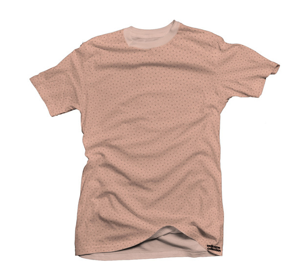

This is my final major project from the university. We were given an opportunity to create promotional materials for an upcoming exhibition at Wellcome Collection. We could amend corporate guidelines and be a bit more creative and experimental. I came up with the logo and a pattern that is supposed to be the main vehicle of the whole identity and can be applied to lots of different things.
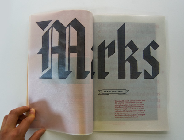
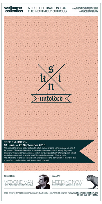
The logo draws inspiration from tattoo art, specifically from sailor tattoos and those that were popular in punk/hardcore movement in early 80’s, but with contemporary feel to it. I wanted it to relate to a wide audience, to those who immediately will recognize the origins (adults) and to those who are younger and relate to modern design and fashion.
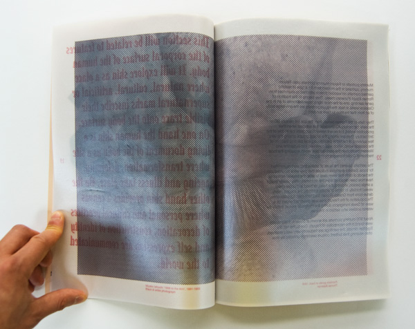
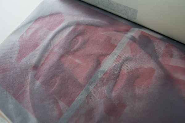
The pattern is an interpretation of a real skin texture, but it has a regularity of a mathematical pattern. At the same time it captures the feel of the whole show, as it both relates to skin as something common and skin as a subject of scientific research. It is very real-like, but at the same time it has a sterile medical touch to it.
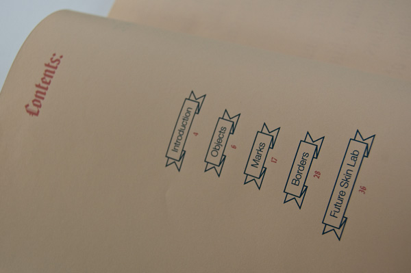
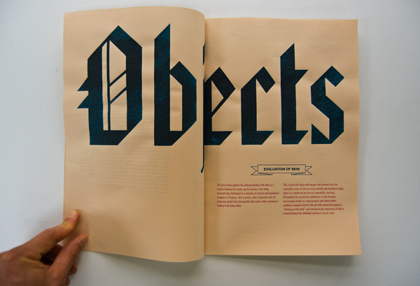
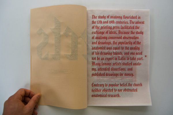
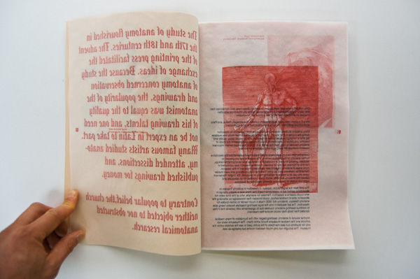
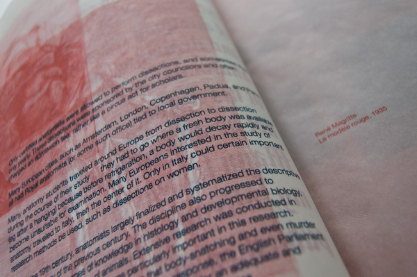
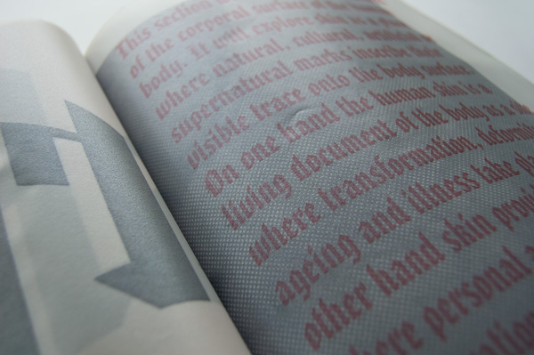
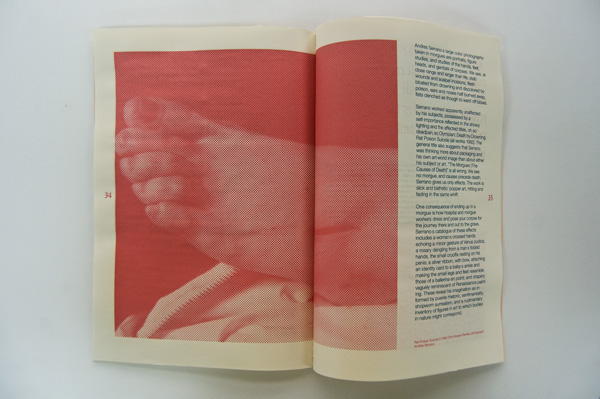
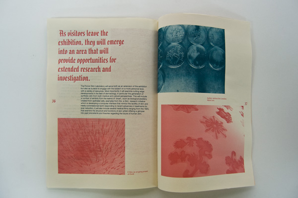
The booklet is folded A3 size (size of a page is A4). It also features the pattern on the front so you actually get “under the skin” to read the information. Under the cover it also relates to tattoo art (fonts) and layers of skin (different paper stock for all three parts of the exhibition). Booklet utilizes only 2 colors for printing both text and illustration.
The logo draws inspiration from tattoo art, specifically from sailor tattoos and those that were popular in punk/hardcore movement in early 80’s, but with contemporary feel to it. I wanted it to relate to a wide audience, to those who immediately will recognize the origins (adults) and to those who are younger and relate to modern design and fashion.
The pattern is an interpretation of a real skin texture, but it has a regularity of a mathematical pattern. At the same time it captures the feel of the whole show, as it both relates to skin as something common and skin as a subject of scientific research. It is very real-like, but at the same time it has a sterile medical touch to it.
The booklet is folded A3 size (size of a page is A4). It also features the pattern on the front so you actually get “under the skin” to read the information. Under the cover it also relates to tattoo art (fonts) and layers of skin (different paper stock for all three parts of the exhibition). Booklet utilizes only 2 colors for printing both text and illustration.