
“How do you visualize the change in access to drinking water in the past decade, and highlight the states that need attention?”
Based on the Indian Census data, Mint (a leading Indian newspaper) ran a story around the lack of drinking water access to households in India. As part of the Information Visualization module at NID, I was asked to critique and suggest alternate representations.

Some of the points discussed during the critique:
Text that doesn't explain the graphic, inconsistent scale, discrete scales leading to different conclusions for states like Chhattisgarh, and exaggerated scale for the bubbles.
After the critique, I decided to first explore the data and understand how each state has fared. I also found that while states like Mizoram had improved a lot, the focus should be on states with high population where policies that worked have led to high change, whereas some states have a huge population left thirsty. Tap Water data was taken from Census (2001 & 2011), and Population data from Census (2011).
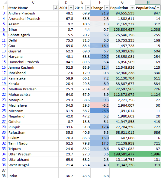
Exploring the data set in Excel.
Based on the data available, I sketched different representations, weighing pros & cons of each. Since Mint has a more serious audience (than other dailies like Times of India and Hindustan Times), I decided to move away from map based visualizations and focus on highlighting the data more than the geographical location of each state.

First set of sketches: Map based, more academic, and more visual & abstract representations
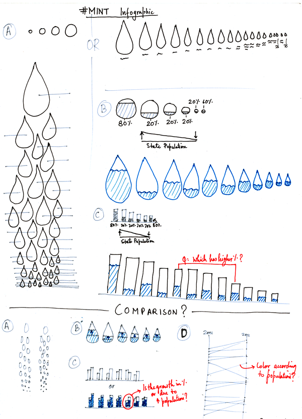
Second set of sketches, with more emphasis on representations that lets one compare & evaluate different states the best. Common flaws like inability to compare areas and showing ambigous parts of a whole were discussed.
Based on the niche audience & opportunities that each visual representation offered, I decided to use a slopegraph to emphasize more on the change, rather than just the two data points.
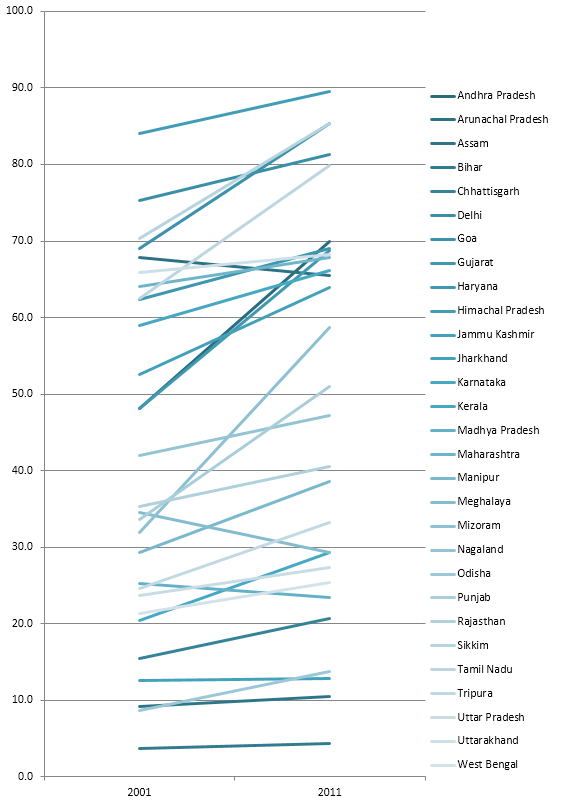
Slopegraph created in Excel

Slopegraph made in Processing, using color to highlight the change & later the population.

Final Poster created in Illustrator after arranging labels and adding legend.
In this representation, states with high population stand out: while states like Tamil Nadu & Andhra Pradesh highlight policies working well, states such as Uttar Pradesh & Bihar beg for more attention. Such a visualization would work well with a set of stories focused on each state and how the past decade has seen some policies work and some fail.
Final discussions revolved mainly around how such representations work well for this niche audience, but would not work so well for common audience who might get overwhelmed with the sheer number of lines. Another feedback was around the use of color, and how an alternative would be to use a single hue with varying lightness instead of using a gradient.


