

Vidalia Corporate Identity
Clean Lines + Natural Elements
Clean Lines + Natural Elements
The following documents are part of a graphic design class project. For this project, I was required to create a fictional company and design corporate identity documents, advertisements and brochures for the company. I chose to create a restaurant specializing in organic and local food. Because the company's main focus is on the importance of nature and simple food, I wanted the logo and all corporate documents to be based on simple and natural elements.


The Logo
This is the official logo for Vidalia. I chose to go with a simple and natural color scheme. I also chose to incorporate simple elements like clean lines and shapes, as well as natural elements like leaves and branches. I wanted to create interest by separating the "V" shape and incorporating the leaved branches, and the two lines within the "V" give the logo another dimension.


Business Card
The business card is meant to be one that can be distributed by any member or employee of the company. It incorporates the full logo on the front along with clean elements like the dotted lines. I chose to place the words "FARM | FRESH | FOOD" to give customers a sense of what the company values are. I also chose to stick with the natural color scheme of the company. The back of the business card includes repeated elements to create interest and give the card a connected feel.

Letterhead
The letterhead is designed to create brand recognition among customers. It includes the full logo as well as the repeated element of the leaved branch.


Envelope
The envelope is designed to create some repetition and brand recognition among customers in conjunction with the other corporate identity documents. The logo, color and font schemes are all duplicated within the envelope.
Magazine Advertisement
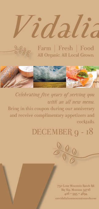
The magazine advertisement incorporates brand elements like colors, fonts and logo parts. The branches are placed to draw the reader's attention to the center information which is most important. As you can see, they are both pointing toward the bulk of the text in the advertisement. This gives the reader a sense of direction within the ad and an understanding of how to read the ad. The advertisement would be run during the company's fifth anniversary - the dates of which are included. The advertisement gives a bit of background information about the company for potential and new customers. It also includes a call to action, giving customers the opportunity to bring in the advertisement for a discount during the anniversary.
Magazine Advertisement Take Two
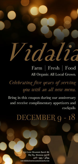
After I created the first magazine advertisement (see above), I began learning more about Photoshop and decided to create another advertisement that could be placed in a magazine. I think this advertisement looks much more professional and more like an actual ad you might see in a magazine for a restaurant. In Photoshop, I used the gradient tool to make the lights blend nicely with the black background. The advertisement still uses the colors I chose to represent the company's overall brand and it has the same natural organic feel. While the lights create business at the top and bottom of the ad, the important material is in the center and is unaffected by the lights. The lights also serve to keep the viewer within the advertisement and draw them to the center where they will see the necessary information.

Newspaper Advertisement
The newspaper advertisement was created in celebration of the restaurant's fifth anniversary. The advertisement is geared more toward current customers or people who are already aware of the restaurant. I chose to incorporate elements from other corporate identity documents like the Japanese dotted lines from the business card. The branches in this advertisement do something very different than in the magazine ad, separating the ad into similar sets of information - a function of grouping and proximity. Also included in the newspaper advertisement is a call to action, allowing customers who see the advertisement to bring it in for a discount during the anniversary dates, which are also included. The advertisement includes elements from the company logo to generate brand recognition among customers.


Brochure
The brochure for Vidalia would be placed in major travel locations like airports, travel bureaus and other main tourist hubs. The goal of the brochure is to give potential customers a general idea of what the company values are. I chose to incorporate the simple onion element because, for one, it represents the name of the company, and it also represents the layers or dimensions of the company. I also chose to stick with the same color and font schemes that run throughout the corporate identity documents. Included in the brochure is a call to action, in which potential customers can bring the brochure in and receive a discount on their purchases.


The Menu
The menu is designed to supplement the brochure, either being placed inside the folded brochure or beside it in a brochure stand. It includes the same elements as the brochure including color and font schemes. The purpose of this is to create a connection between the two and allow potential customers to gain more information about the company. This particular menu is not meant to be a full menu, but its goal is to give potential customers a general idea of what types of food the company serves. As in the brochure, the menu also includes a call to action to entice potential customers to try the restaurant.


