Lookbook brochure for the 2012 winter collection
Date: 2012
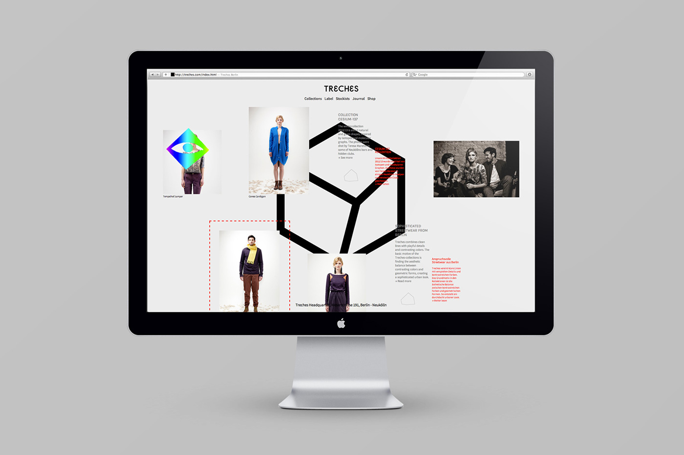
Treches combines clean lines with playful details and contrasting colors. Their basic motive of the collections is to find an aesthetic balance through geometric forms, creating a sophisticated urban look. Treches make high-quality streetwear, and are also striving to make the choice of buying organic and fair clothing an easier one. The identity reflects the means from which Treches are creating their clothing line by abstracting the body into an three-dimensional shape and playing with alternative solutions and forms.
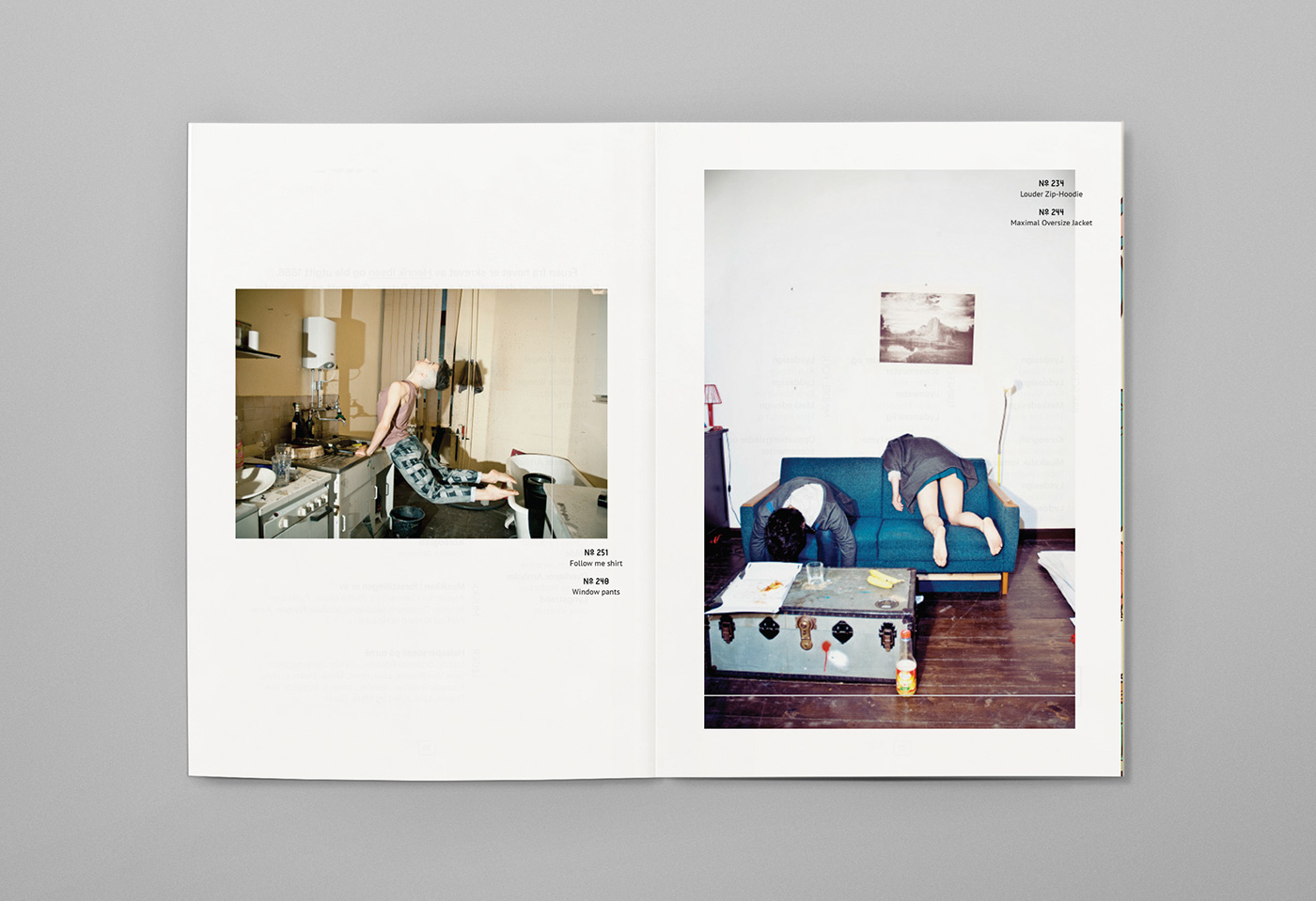
A spread from the Look book brochure for "Escape Summer 2013" collection.
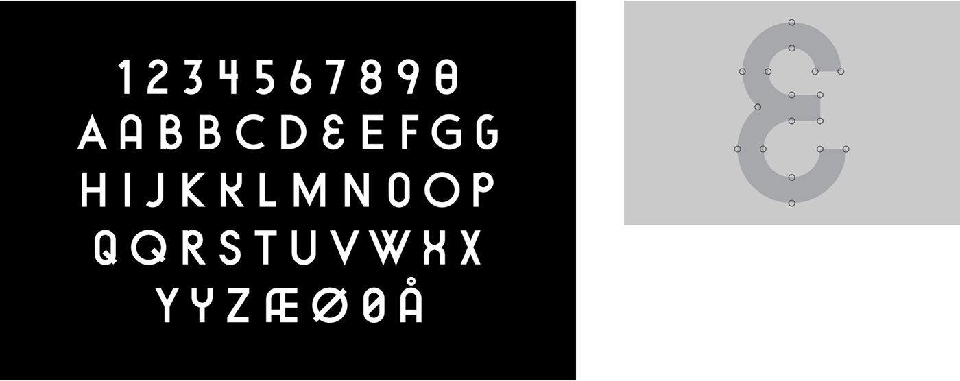
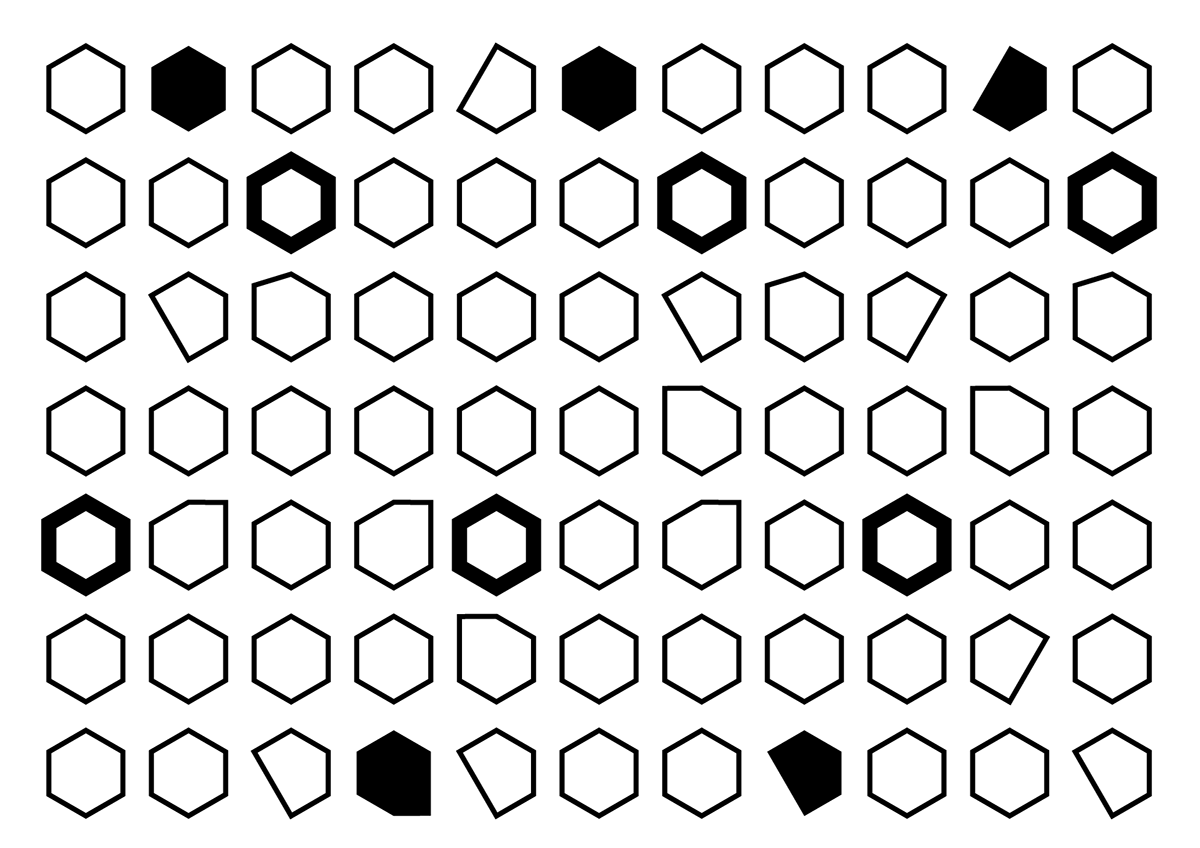
BB CESIUM is a Neo-grotesque Display font made exclusively for Treches. Its based on the geometric shapes of Treches' clothing design, combined with ideas taken from street signs around Neukölln, Berlin. The font exhists in a positive version made for details, and a negative version made for big headers and shorter texts