


I started this project by just browsing various sites with free data sets for ideas or wait till a data set struck me. Then I came across the opendatatoronto website, which was full of free data sets on everything in Toronto. I focused here because these data sets establish a cultural relevance and would intrigue people. I ended up choosing to use a dataset that was collected from 2012 which had every parking ticket given out in the year and lots of relevant meta data. It had the date, time, fine, location and description of how the law was broken. The problem I encountered with this data set was the sheer scale of it. I could not practically map the 2.5 million entries so I decided to base the data around an average day. After doing some research I found a website that mapped this data geographically, so I decided to focus on the time aspect, like the best and worst time to park.
My infographic encompasses a more data visualization way of interpreting the data because I give the tools for the users to find their own correlations. I did this because people like to connect the dots and have that feeling of discovery, so I did not explicitly say when is or is not the best time to park. When I think of time I think of clocks, which are in round and an intuitive way to display time. I chose a 24hour clock because I did not want to confuse people with 2 circles or a.m./p.m.. The circle implies revolution and looping, like time always resetting back to 1. This is why I displayed the data radially instead of in a linear form. The metaphor I included in the design also plays of the clock because I am comparing a clock to the no parking sign. The sign is an instant signifier of what I am showing so I did not think it was necessary for a literal title. Obviously I chose red to stay true to the meaning of the no parking sign.
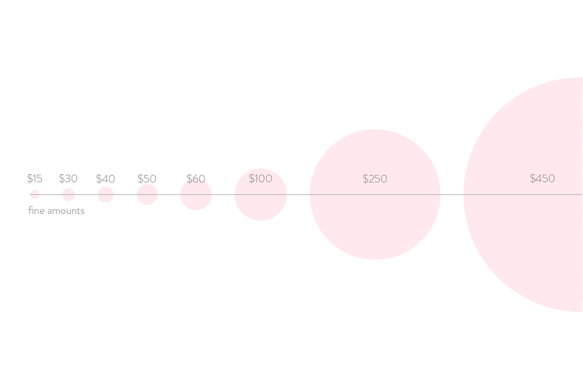
In order to make the visualization I had to use the computer for a little help because I had to draw 8000 circles at varying sizes on a radial axis. I started by extracting an average of tickets in a day and had to format the time from hh:mm to total minutes in the day (ie: 1:05 = 65). Then I went into processing and wrote some code to pull the data from the .csv I compiled. Each column of the data such as time, fine, location was assigned to a variable. I would then draw a sphere for every row in the file with represented every ticket in that day. I then pulled the fine variable and put it as the ellipse size an mapped the minutes to a radial axis to show when the tickets were given out. Each circle is at 1% opacity so when overlaid it creates a very intriguing heat map of sorts that shows when the most tickets were given out buy the size of their fine. I felt it was necessary to include a scale legend and a short description because the visualization is a 1 of a kind way of looking at the data so it may not be immediately apparent to some. As for the creation of the design I wanted to break all the order that I see in other infographics so I positioned the plot off center and used elements to balance it, creating a dynamic composition.