While I was a part of Sparklin, one fine day we received a call from a very panicked Nikhil of MediaNama to create the branding for the #NAMA conference; followed by the following mail along with the idea behind it
"There's very little time, so I'm now basically looking at a wavy, mesh like design going across the screen on the backdrop made up of several hashtags. multiple elements defined with hashes."
Brief 1:
Keywords: Dynamic | Digital | Hashtag | Multiple Conversations


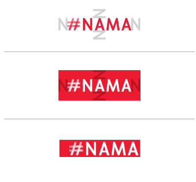
We worked on re-inventing the hashtag & chose some minimal typefaces that would compliment it. We sent the first draft of branding out in just about a day.
Choosing a Typeface

After the first draft was out, we revisited our brief & decided to add more value to it.
The idea behind #NAMA is essentially “digital thought leadership” which meant that the branding had to also represent decisiveness, stability & progress along with just portraying the digital space.
Revised Brief 2
Keywords: decisiveness | Stability | Progress | Digital Conversations
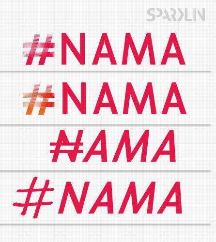
After much thought the font, the symbol & the font were finalized.

Stage Backdrop:
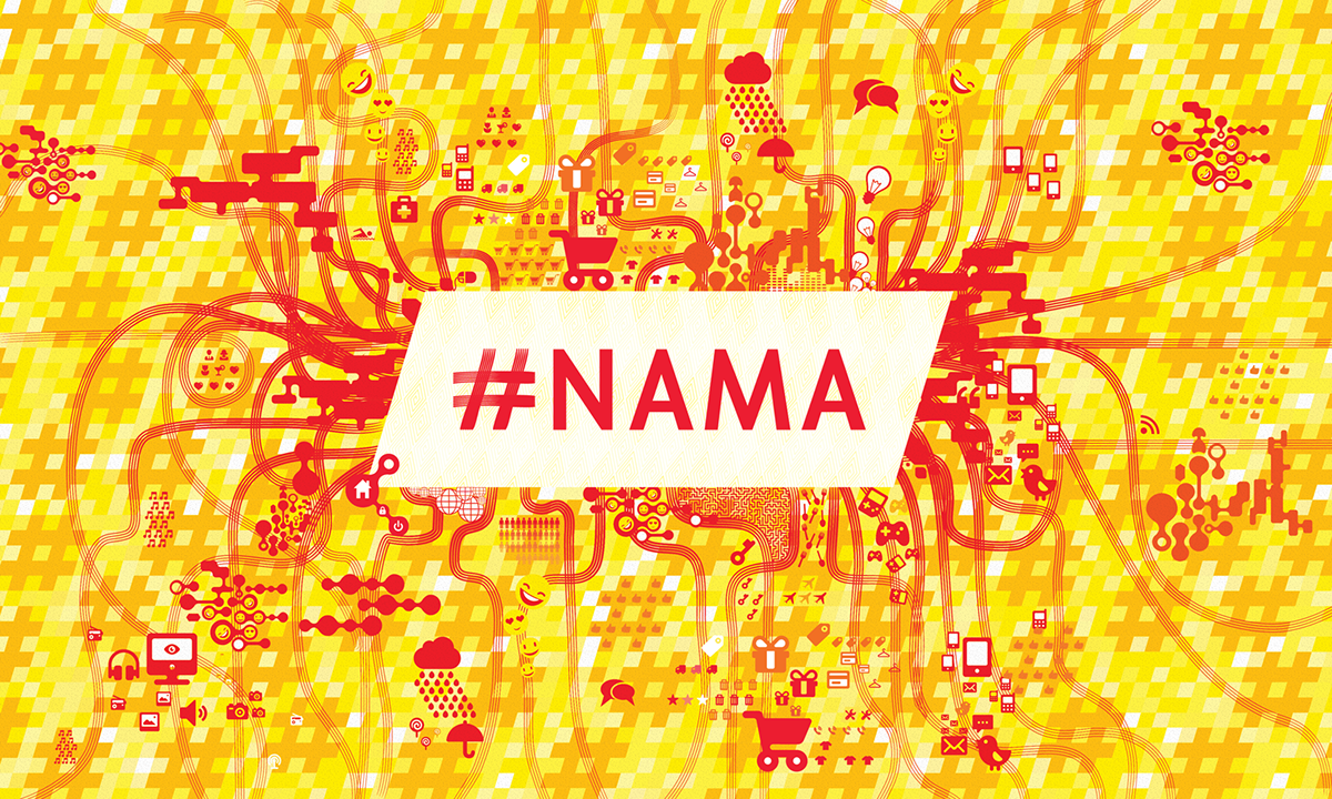
The next mammoth task was to create an interesting visual for the conference that would be memorable & would still summarize all that the conference is about.
The next mammoth task was to create an interesting visual for the conference that would be memorable & would still summarize all that the conference is about.
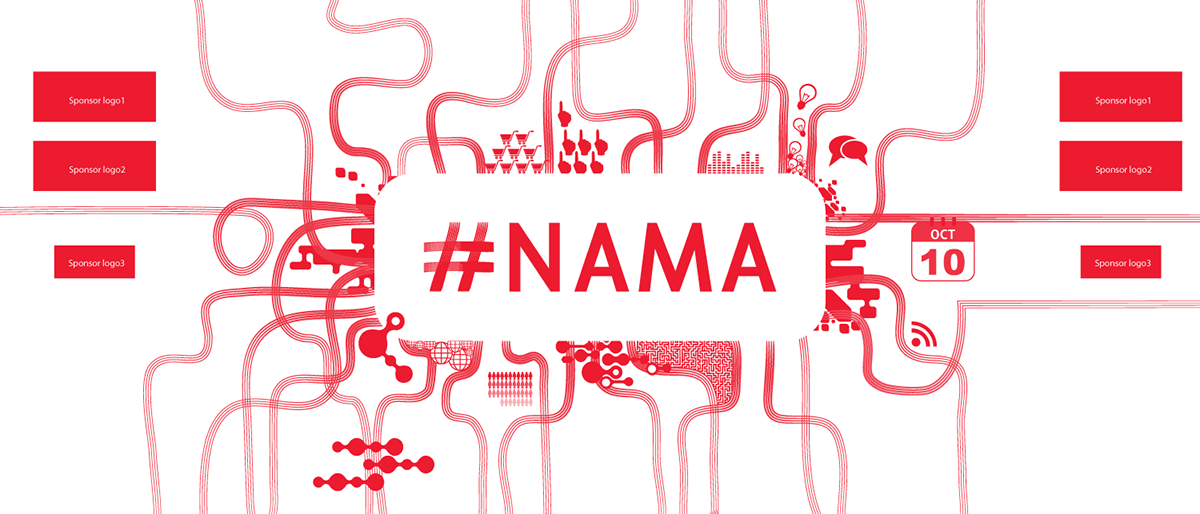


Sometimes adding sometimes subtracting; The final visual was a plethora of mini infographics covering all the areas that the conference covered.