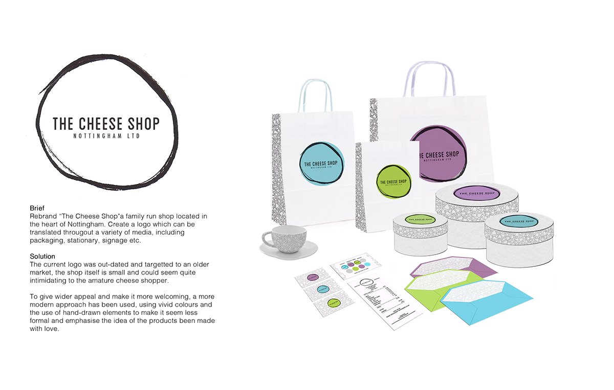
Brief
Rebrand “The Cheese Shop"a family run shop located in the heart of Nottingham. Create a logo which can be
translated througout a variety of media, including
packaging, stationary, signage etc.
Solution
The current logo was out-dated and targetted to an older market, the shop itself is small and could seem quite
intimidating to the amature cheese shopper.
To give wider appeal and make it more welcoming, a fresher approach has been used, using vivid colours and the use of hand-drawn elements to make it seem less formal and emphasise the products been made with love.
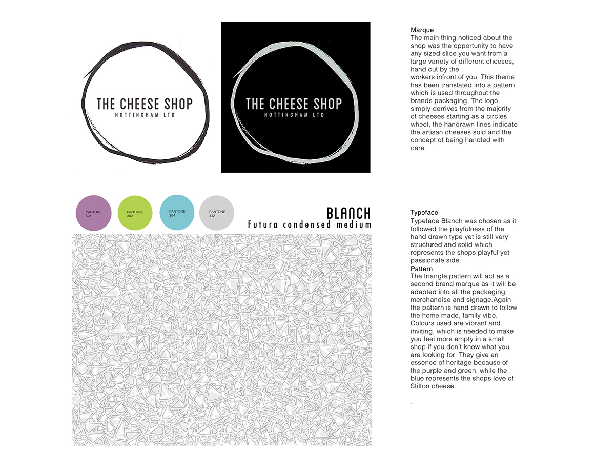
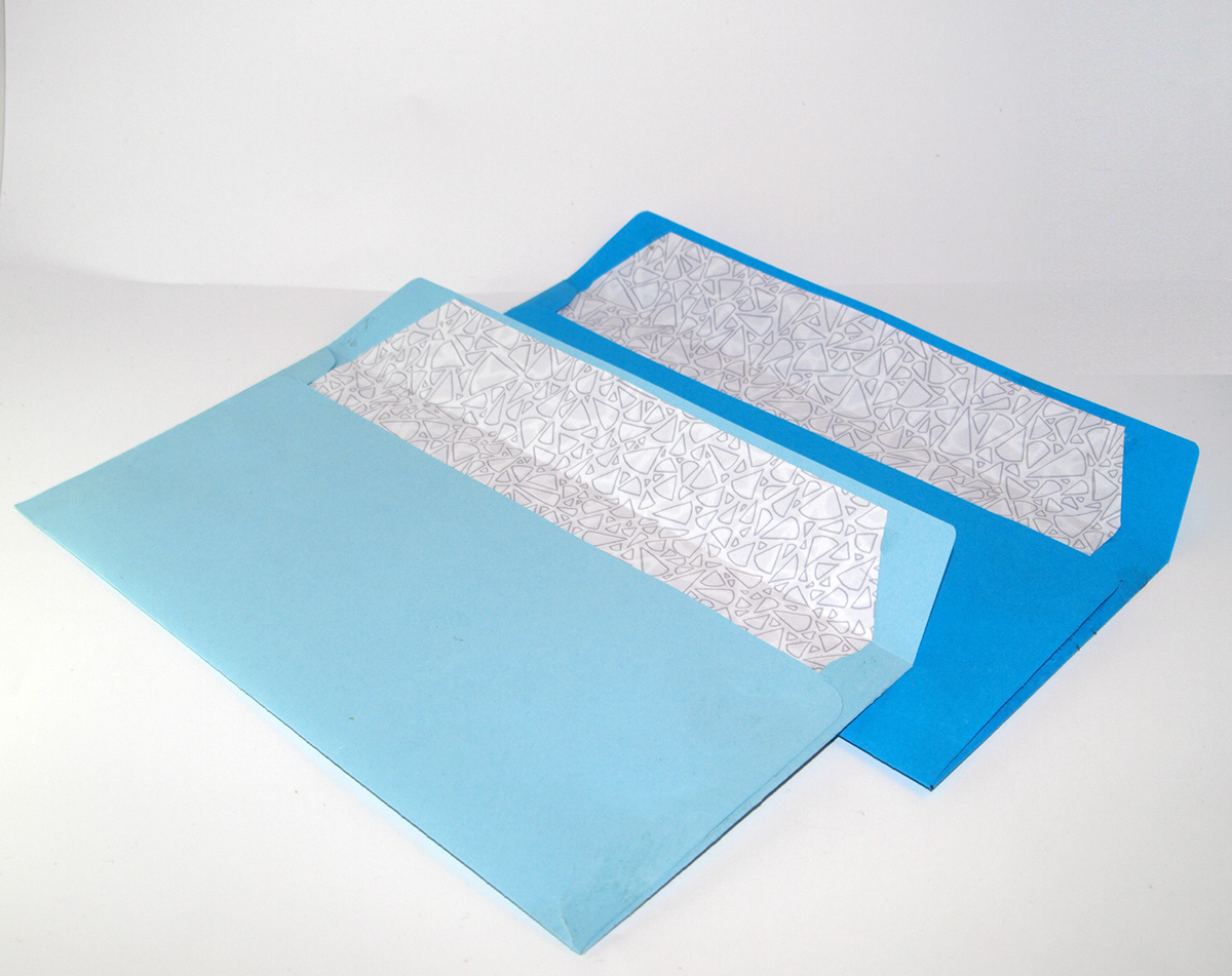
The main thing noticed about the shop was the opportunity to have any sized slice you want from a large variety of different cheeses, hand cut by the
workers infront of you. This theme has been translated into a pattern which is used throughout the brands packaging. The logo simply derrives from the majority of cheeses starting as a circles wheel, the handrawn lines indicate the artisan cheeses sold and the concept of being handled with care.


For the main packaging the minimalistic designis likely to draw attention on the streets, The large logo will help the brand get noticed around the city. The colour variation depends on the size of the bag. it aims to get people wanting to collect the whole set, resulting in returning custom.The wrapping paper stickers are chosen depending on what type of cheese you buy, Hard, Soft etc. This will help the customer identify which product is which once left the shop. There is also space for the staff to write the name of the product so there is no confusion.


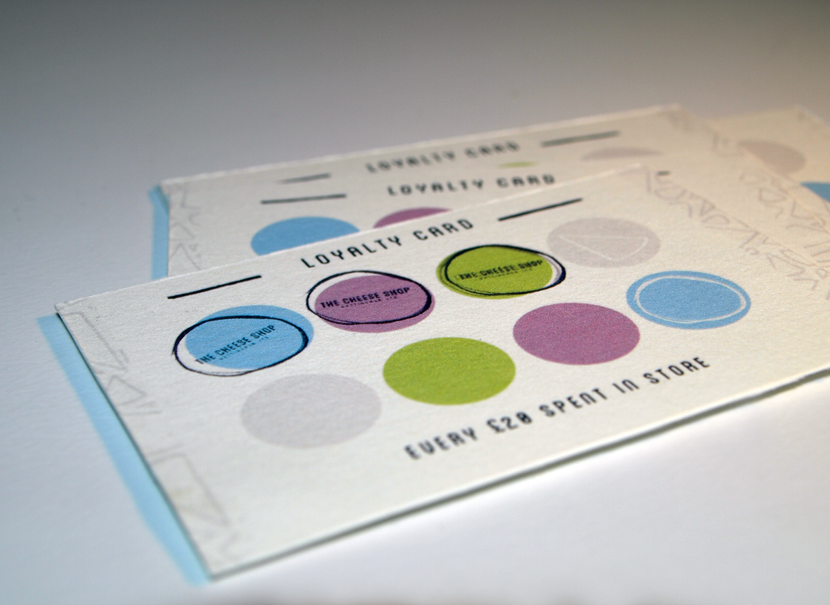


Colour coding will be used to help customers decide upon which cheese they want.The colours indicate the density a certain type of cheese is.The coding may influence the customers to ask further questions to the staff and enourage them to learn more about the cheeses avaliable.
To reiterate the brands British hertiage the main signage throughout all the shelves will be using the triangles found on all the packaging. The way the triangles hang represent bunting.
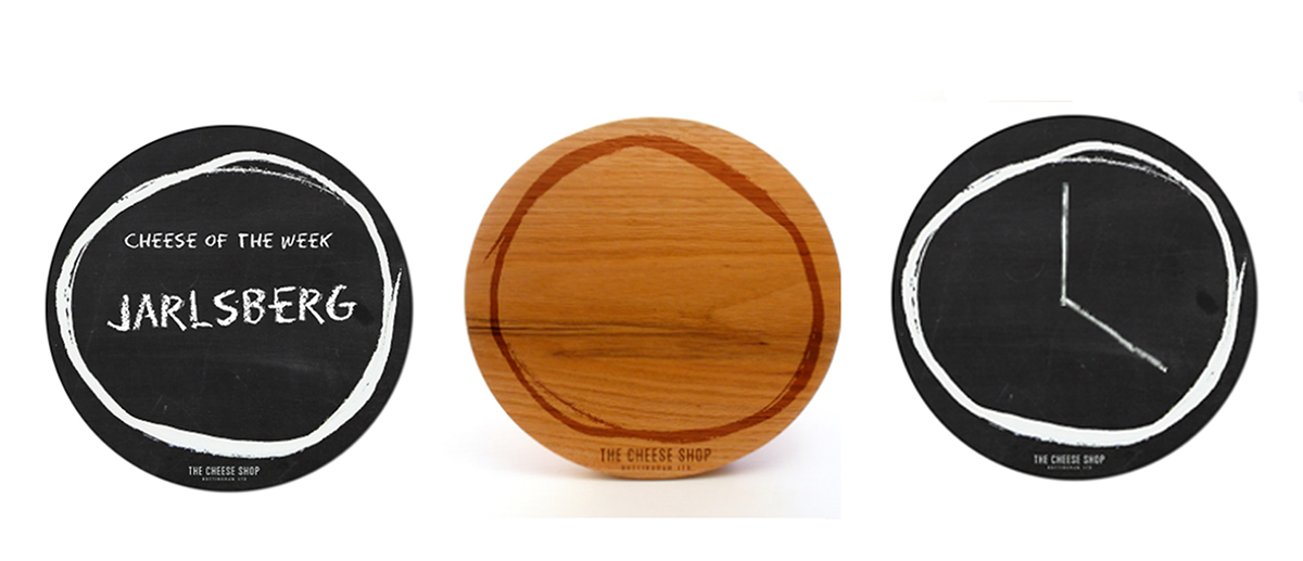
The simplicity of the brands marque means it is easily transferable onto items which could be used within the interior of the shop. The “Cheese of the week” board encourages customers to try something new and spark
up convosation between them and staff, making it seem more friendly and welcoming.

