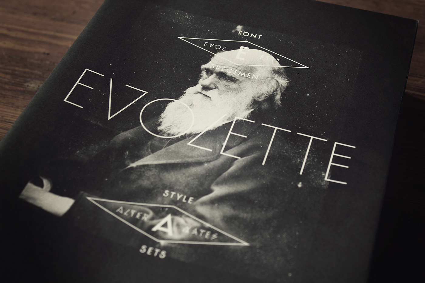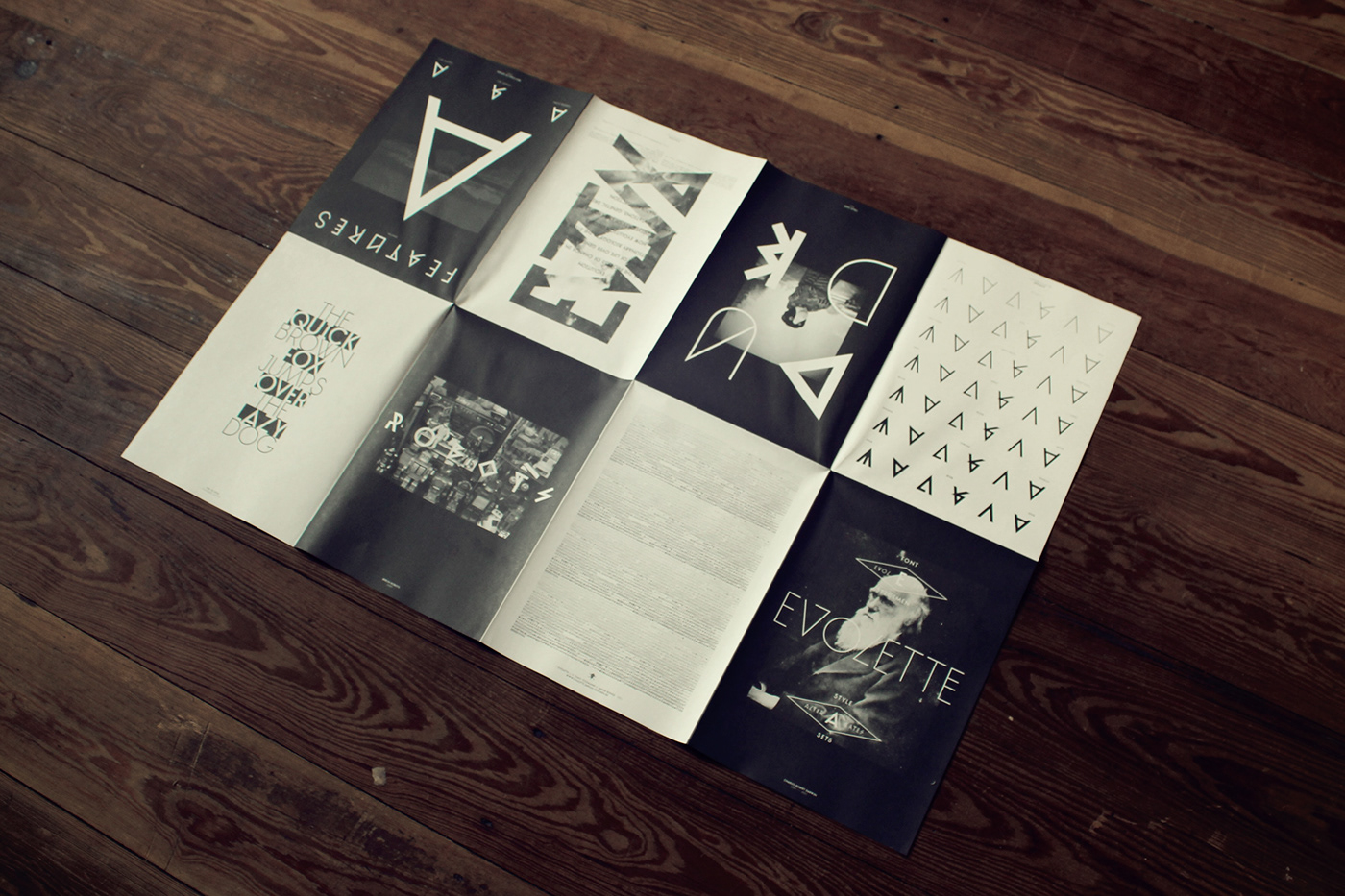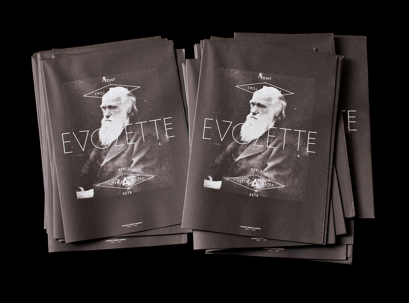
The specimen presents the qualities and characteristics of the font »TJ Evolette A« and shows how it works in different situations. The Specimen has been designed that it works as a booklet folded and spread out as a poster.
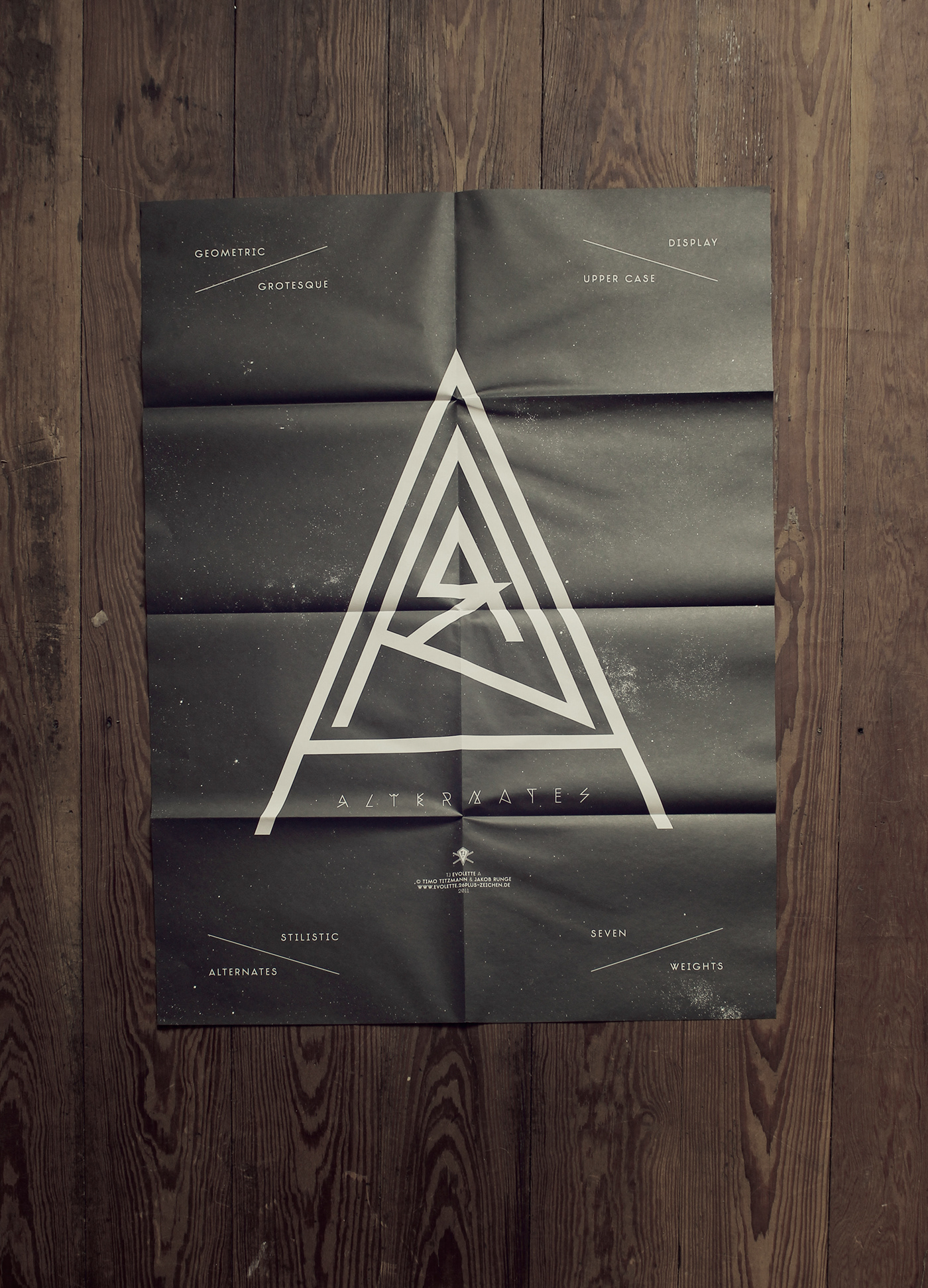
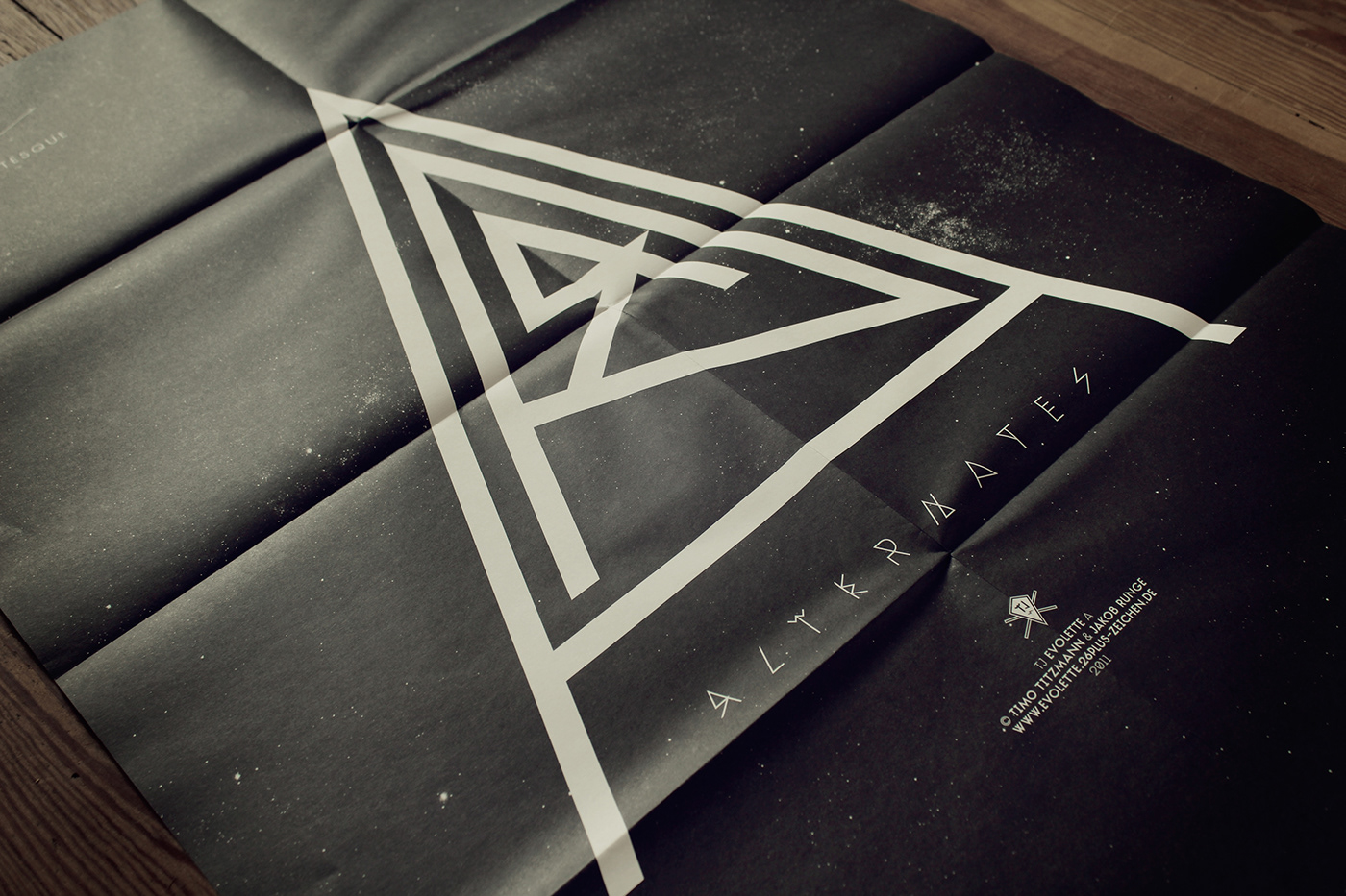
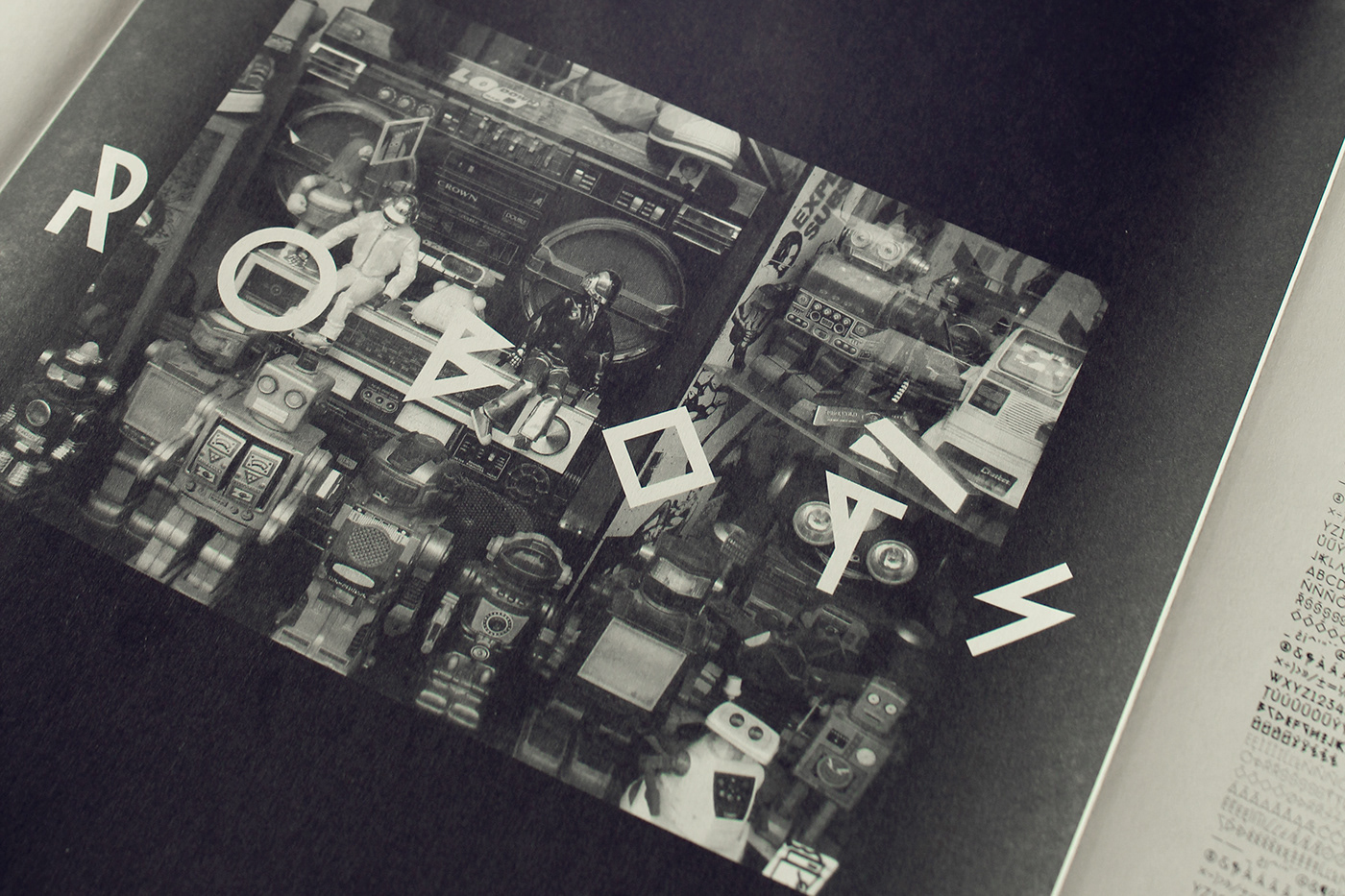
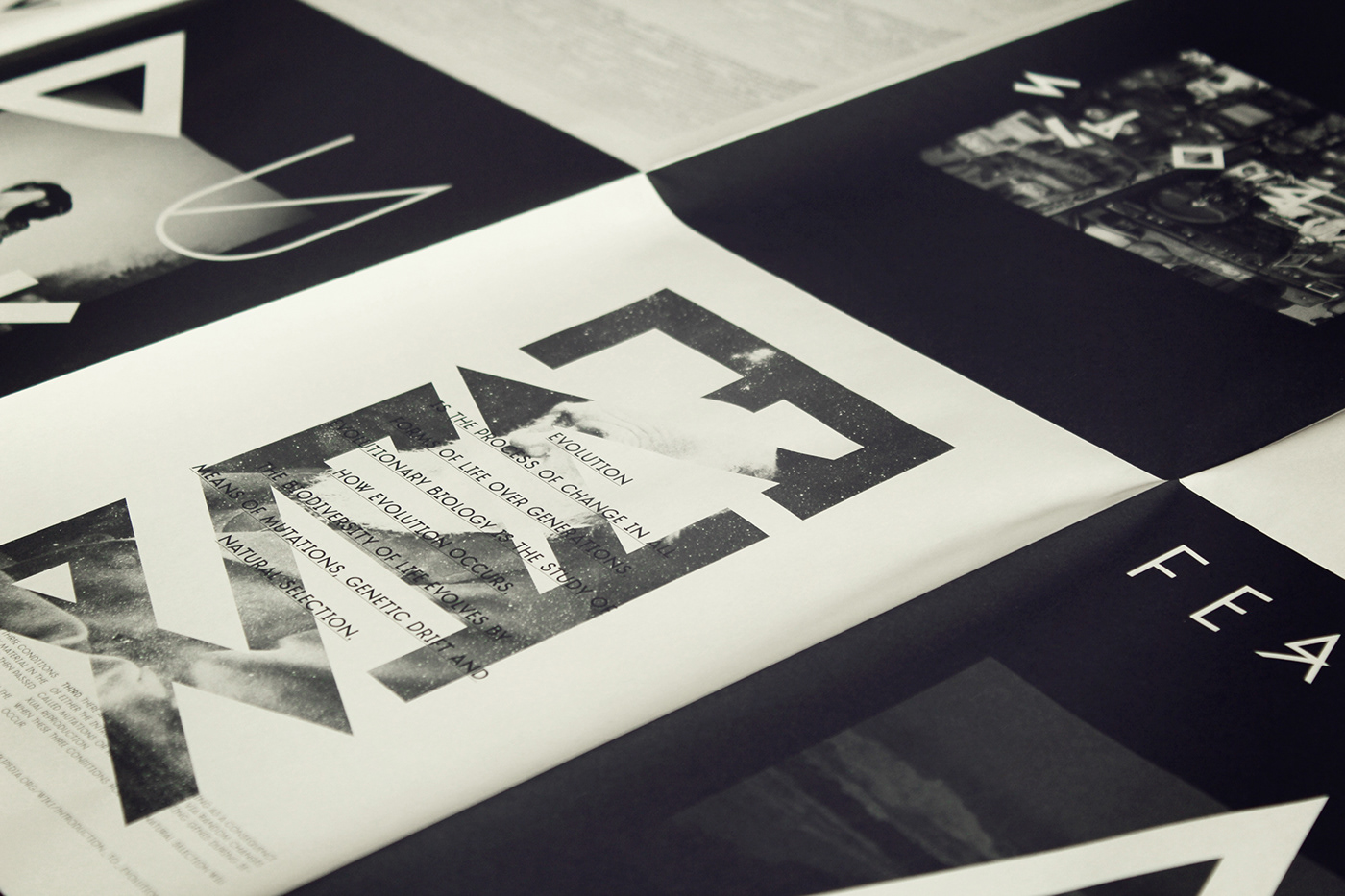
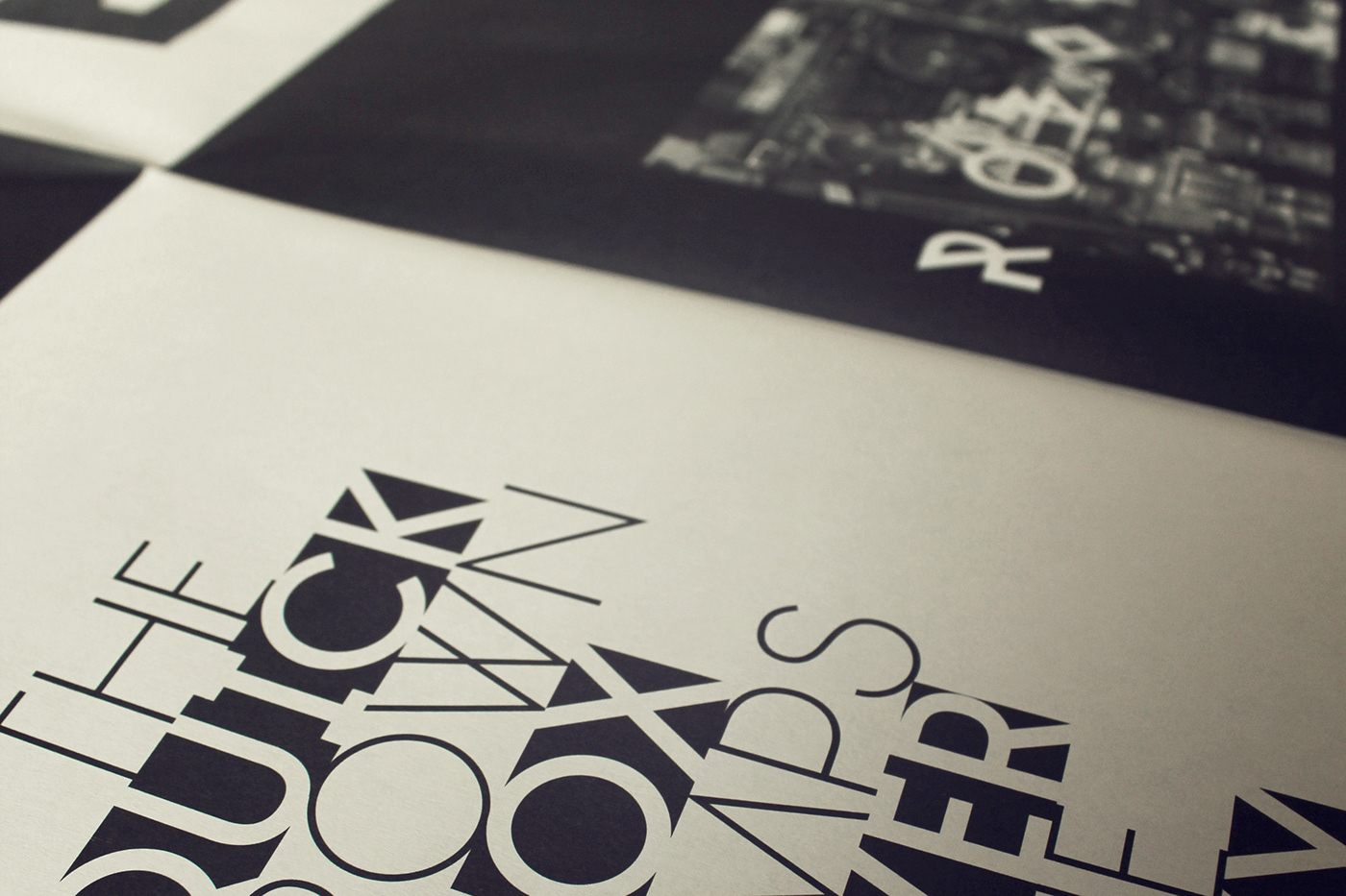
TJ Evolette A is unique, customizable, experimental, fashionable and clean. This geometric, grotesque and all-caps display family has seven weights, one basic glyph set, two integrated and extravagant stylistic sets for the whole alphabet and some astonishing special characters.
Between the basic glyph set and the two stylistic sets, the typeface offers innumerable combination possibilities. In its two sets of alternate characters interpretations of Art Deco mingle with the straight lines of ancient runes. This variety encourages striking editorial and poster design.
TJ Evolette A was designed in 2011 by Timo Titzmann and Jakob Runge. In 2014 they revisited the typeface with new characters, broader language support, runic figures, improved kerning, better weight gradation and heavier weights.
More informations about the font