


Smartmatic identity
Task
Smartmatic is a company engaged with development and installation of automated systems of building management. The old corporate identity did not corresponded to the spirit of modern, young and dynamic company, aimed at innovation and building friendly relations with clients and partners.
Solution
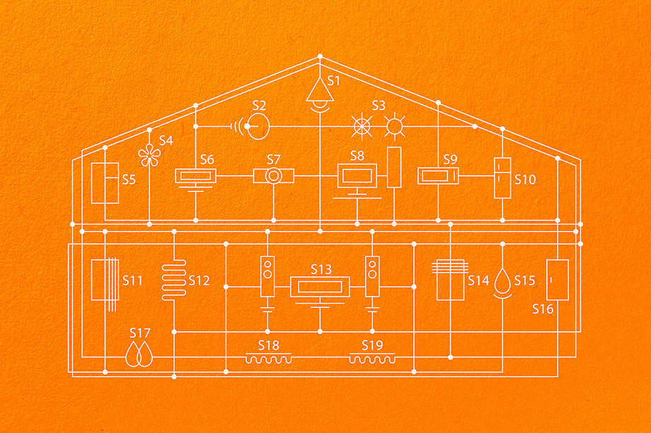
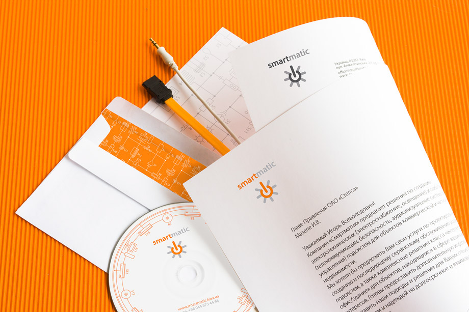
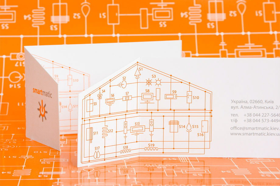
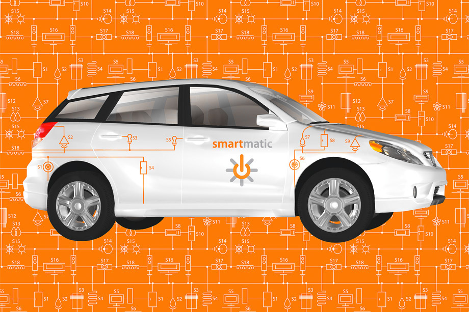
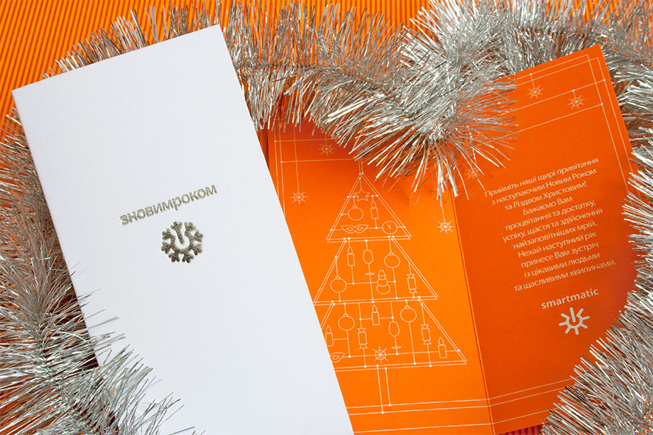
The idea of the identity is the external simplicity, but if you look deeper, it is a complex system. In each item there is the second side, which does not strike at once. If you open a visit card, you can see the complex system of smart home. The opposite side of the letterhead is the complex system too. Developed brand pattern is quite active element of the identity. It can be easily transformed in any form (for example, in a building) and vary depending on the item (auto, CD), and thus it will still remain characteristic and recognizable. Enable button, to which a variety of system devices are attached, is the main visual image, which reflects the activities of the company. Also it is a sign of the sun, the main source of energy on the Earth. Bright orange color highlighted the company in the market of engineering, where blue colors dominated, it stressed youth and innovation approach of the team. The updated system of visual identity allowed to create a vivid image of an innovative company for new clients and prove to the already existing ones, that the company constantly develops and moves forward.


Awards:
White Square / Bronze / 2009
Publications:
Design DNA: Logos / How Books / 2010
Golden Flea / Golden Flea / 2009


