
One day Vladimir from the company Sletat.ru contacted me and asked me to design a logo for their travel search engine. Everyone can find a suitable travel tour on Sletat.ru. Sletat is 'to fly' in English.
The logo design task supposed using associations with figures 1 and 0, but I thought it wasn't suitable for a traveling company, it would rather do for a soft company.
Here are some first ideas for the logo:
- a magnifying glass as a metaphor of search,
- stylized S,
- a jet flying around the Earth.

Instead of 1 and 0, I suggested using the @ symbol which is also indicating the IT sphere.
It was decided to realize this idea.
It was decided to realize this idea.

But then I decided that the realization of the idea came out to be too plain.
_____________________________________________________________________________________
The second try.
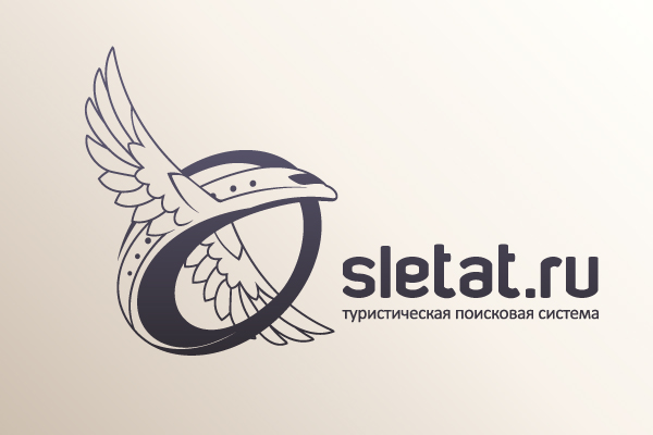
I drew some sketches once again.

I designed a type.


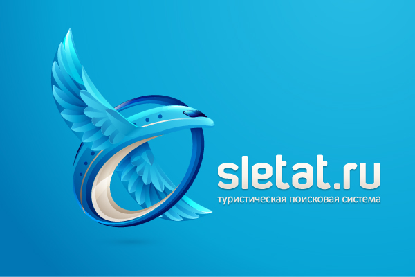
I select the corporate color palette.

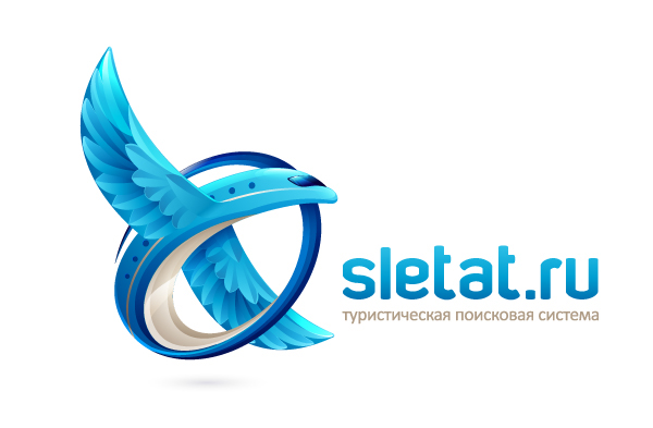
The approved logo.


Vladimir: «I like it so much! Thanks for your work!»


