
The glyphs of Siruca™ are designed as stencils with rounded terminals.
The unusual position of the stroke interruptions helps in identifying each letter, number or pictogram.
Since Siruca has been very successful (and imitated) on the market, I decided to extend the principles behind its design to an unexplored area of application: the design of playing cards.
The unusual position of the stroke interruptions helps in identifying each letter, number or pictogram.
Since Siruca has been very successful (and imitated) on the market, I decided to extend the principles behind its design to an unexplored area of application: the design of playing cards.
The graphics of playing cards, and especially of Italian ones, is a standard that goes back many centuries, as one might expect.
A beautiful graphic vocabulary, with a richness of elements but with ergonomic limits:
A beautiful graphic vocabulary, with a richness of elements but with ergonomic limits:
1. To recognize each card, the paper of the frontmost card must not cover the card below for at least one half of its width
2. Unlike Poker cards, the Italian ones don’t report ranks and suits in the upper left corners
3. Through the centuries the design has lost its medieval atmosphere which would make it more attractive
Taking into account these design limitations I have proposed a more heraldic redesign concentrated in the top left, with a mirror at the bottom right. Ranks and suits are designed to increase the recognizability through the use of design methods derived from the study of signage systems: rank at the top of the card, and black, suit on the bottom and in colors.2. Unlike Poker cards, the Italian ones don’t report ranks and suits in the upper left corners
3. Through the centuries the design has lost its medieval atmosphere which would make it more attractive
The deck of cards is now very ergonomic. The greatest comfort is in being able to move over the frontmost card very little to recognize the one below.
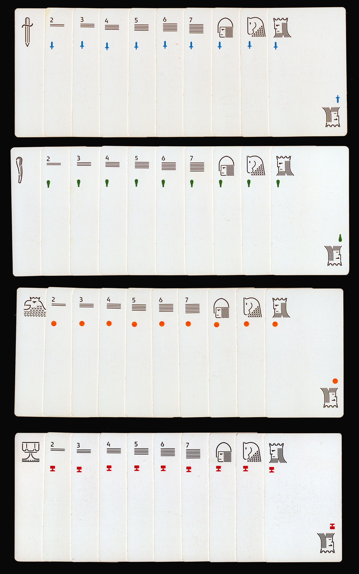


I identified a standard applicable to any type of game card deck.
Even for Poker cards (whose design is of French origin), it’s possible to remove the central suit from the paper by moving it up to the left.
A subsequent implementation of the German card deck is on the way.
Even for Poker cards (whose design is of French origin), it’s possible to remove the central suit from the paper by moving it up to the left.
A subsequent implementation of the German card deck is on the way.


