The Villa Savoye was built by french architect Le Corbusier for Savoye family between 1929 and 1931. Using the 5 rules of Modern Architecture, its look is very particular and brings it a real identity. Architecture and type design have always been very close, from their ways of conception to their complementary uses.
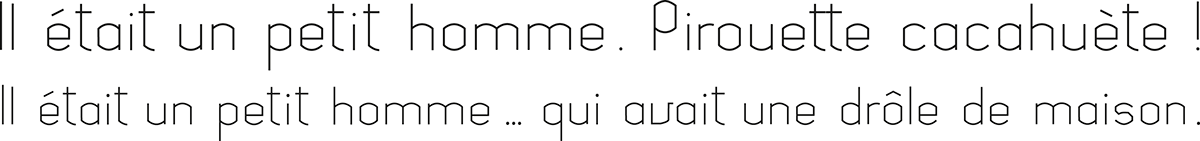
The Savoye Sans is a display type remining shapes and identity of the building giving its name.
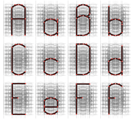
To capture the rythm and the spirit of architecture, the first thing to do was to have a look on the architect's plans. With these drawings, a grid has been designed and the type would be created following the basements of the house.

The plans have been copied and simplified on Illustrator, then overlayed.
A few mirror effects and dupplications later, the following grid was built to allow the maximum of choices to create the typeface.


The typeface was built in Light version. Then, the weight of the body was enlarged and every letter was modified to keep all their readability. The Savoye Sans is available in three versions : Light / Regular / Bold.

Savoye Sans Bold/

Savoye Sans Regular/

Savoye Sans Light/