Rebranding Sahara
Rebranding the Las Vegas Hotel & Casino...and then taking it to the next level
Rebranding the Las Vegas Hotel & Casino...and then taking it to the next level
This is a highly conceptual rebranding project, taken out of the classroom context, it could be seen as taking it too far, or to unrealistic places. But that's the beauty of the classroom...you can do things that you may not be able to do in the "real world". The project for this class was to take a dead, dying or defunct brand and to revive the brand by doing the obvious, redesigning the logo, but also to take the brand to new spaces or depths. The challenge was to take a brand outside of the expected, and to show where it could go. Be warned that my project is out of the ordinary and the places I've moved my brand may seem unnatural or unrealistic...but given the history, new story and rebranding, is it really?


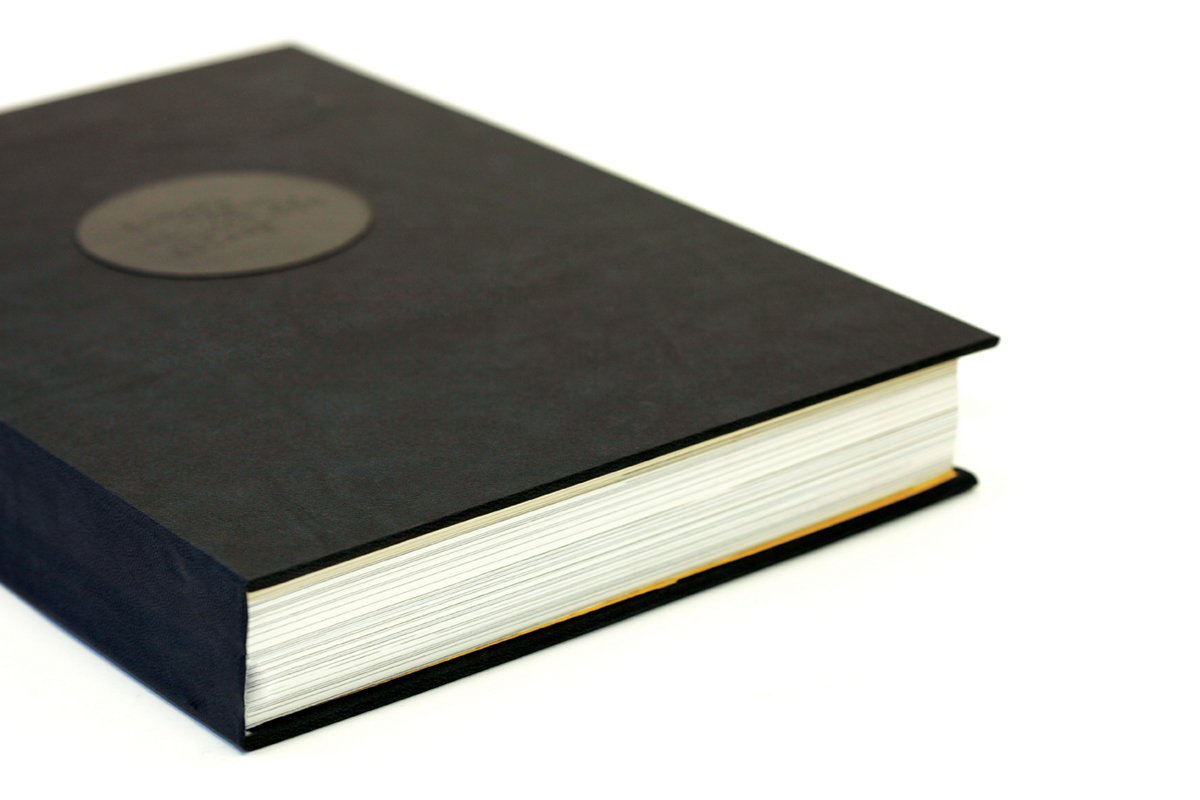
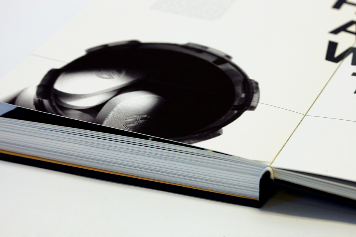
The book was printed on Hahnemuhle paper, offering a thick, luxurious feel with vibrant colors and rich texture. Hand bound and laser etched cover as well as inside spreads.


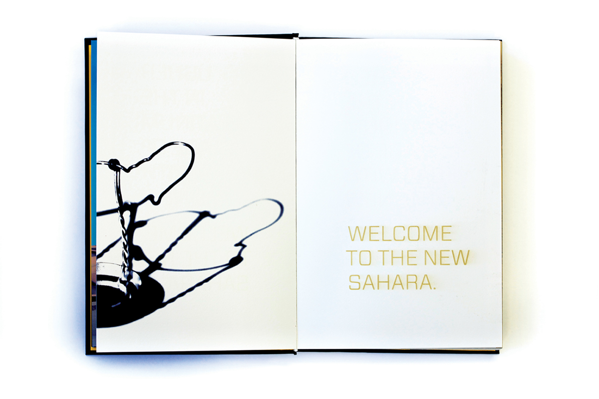

All of the spreads that you see on white pages that have this size text, the type is actually laser engraved into the page, creating yet another layer of depth and visual texture.

This spread was an exercise where I took images to reflect where the brand was at when it died.
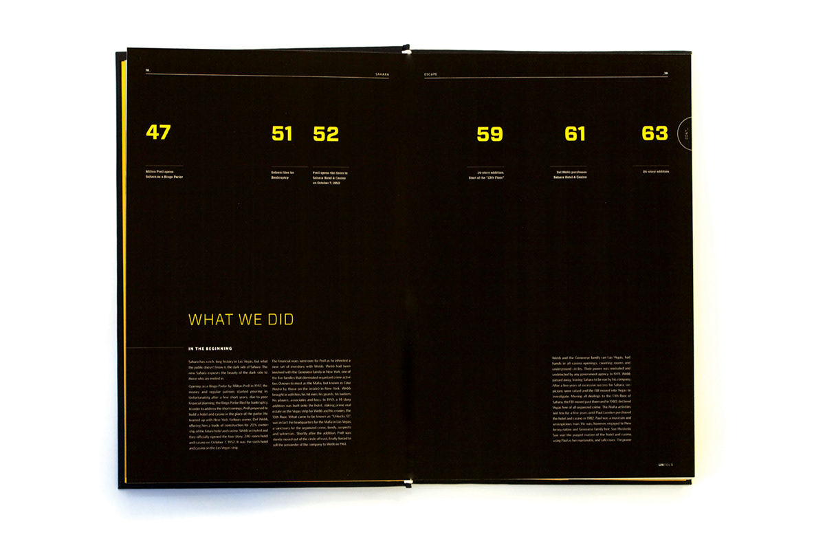
I took the liberty of expanding the timeline of the original hotel and casino. I tied in the ancient Egyptian roots with a bit of truth about the Las Vegas Mafia. The dark past comes to light.


This is the same exercise as three image above, but this time I chose images that reflected where I wanted to take the brand. It had to have a consistent look and feel as well as tone to the images' message.


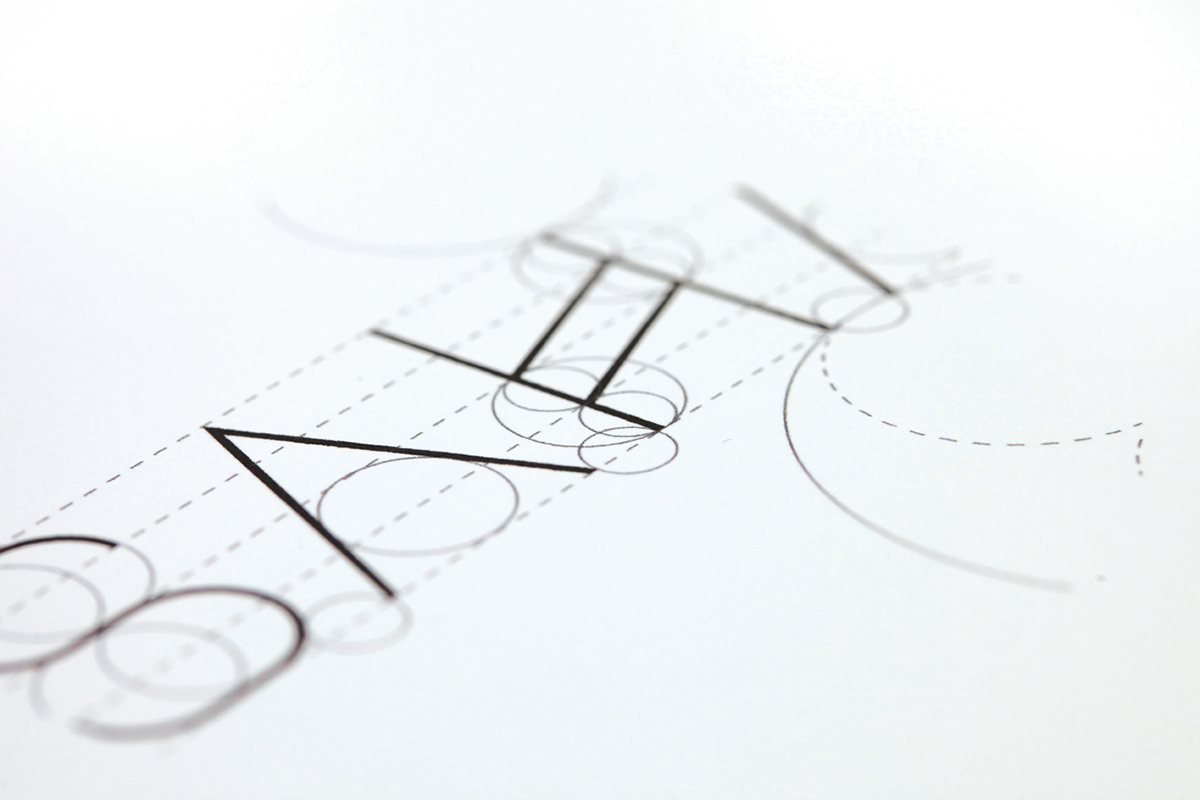
The next few images show a bit of my selection and design process in the recreation of the new logo for Sahara.

Deriving the look from ancient hieroglyphics and exploring the ancient Egyptian culture.
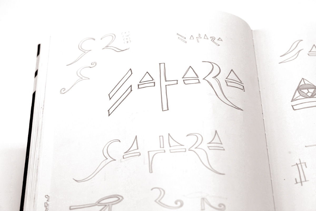
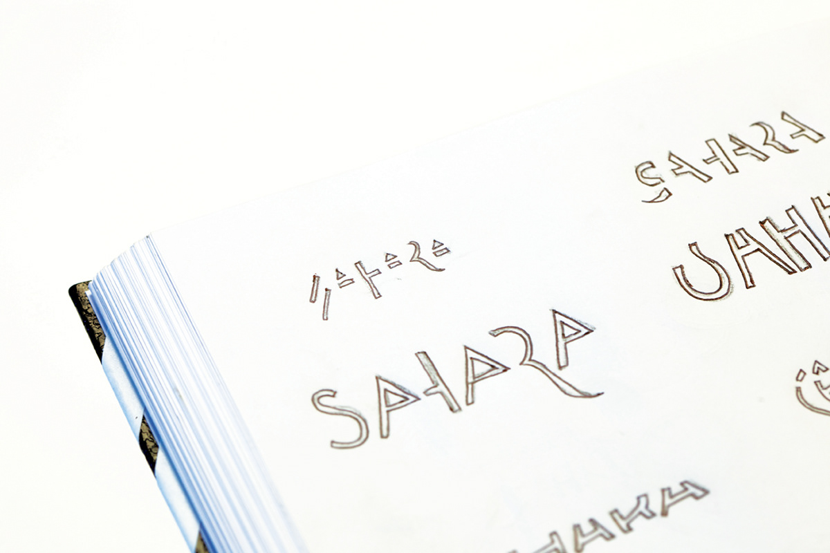
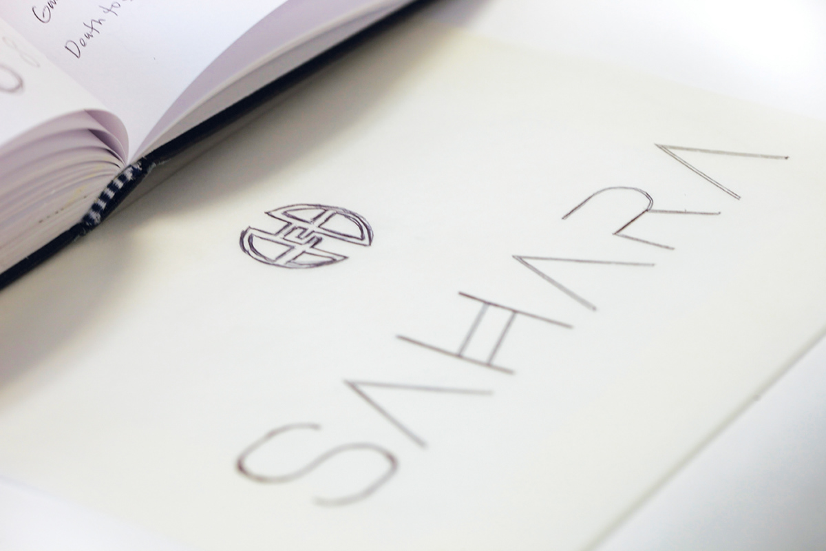
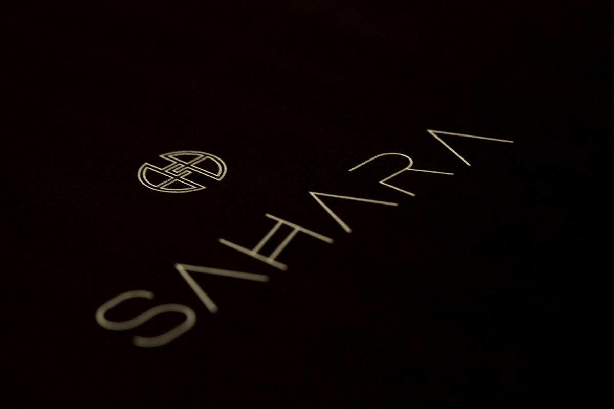


In the creation of the new logo for Sahara, I didn't simply choose a typeface and draw a doodle to accompany it. I created a custom typeface from scratch. Inspired by ancient Egyptian hieroglyphics, I created each letterform. Using the circle to represent the limitlessness, every single part of my logo was based upon the eternal nature of the circle, from the shapes to the spacing between the letterforms.

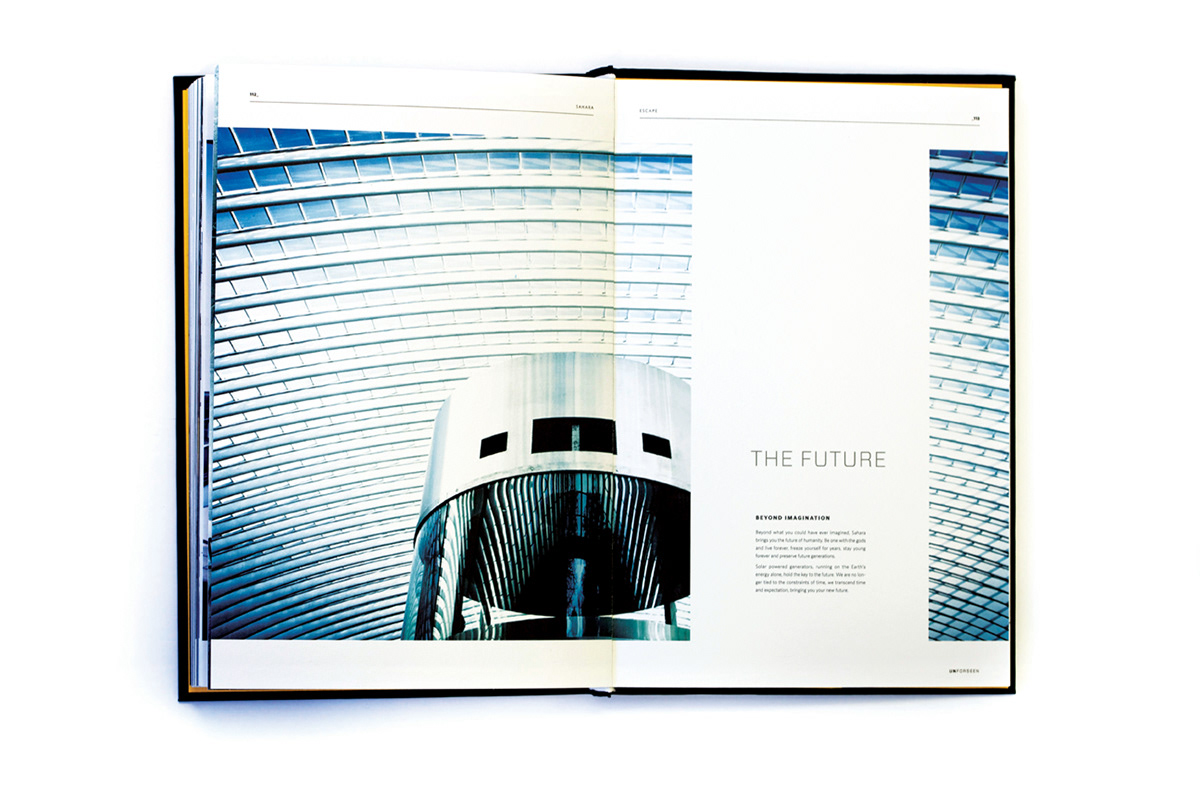
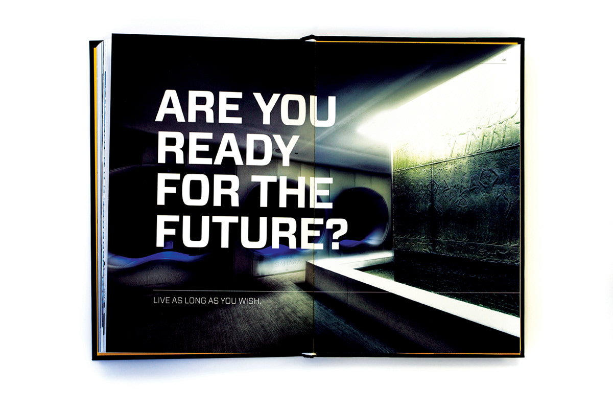
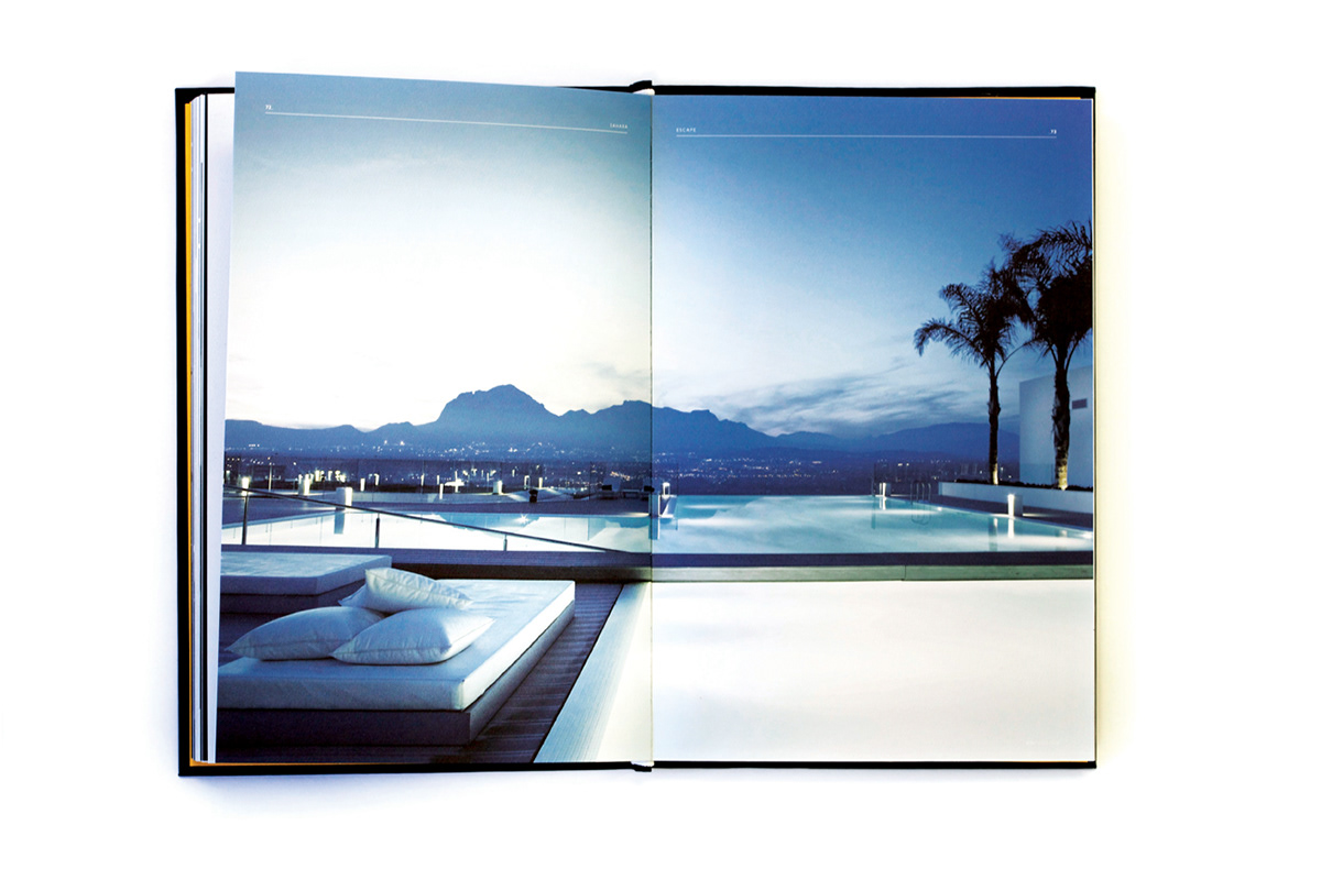
The last third of the book (in length, it's more about half), I show the new places I'm taking the brand. This spread shows the journey of the new brand. On the left page you see where the brand was...it was just a hotel and casino. On the right page you see four quadrants of expansion. Taking the mission statement to heart ("Sahara invites you to limitless escape), I created new areas of growth for the brand to express the idea of limitless escape.
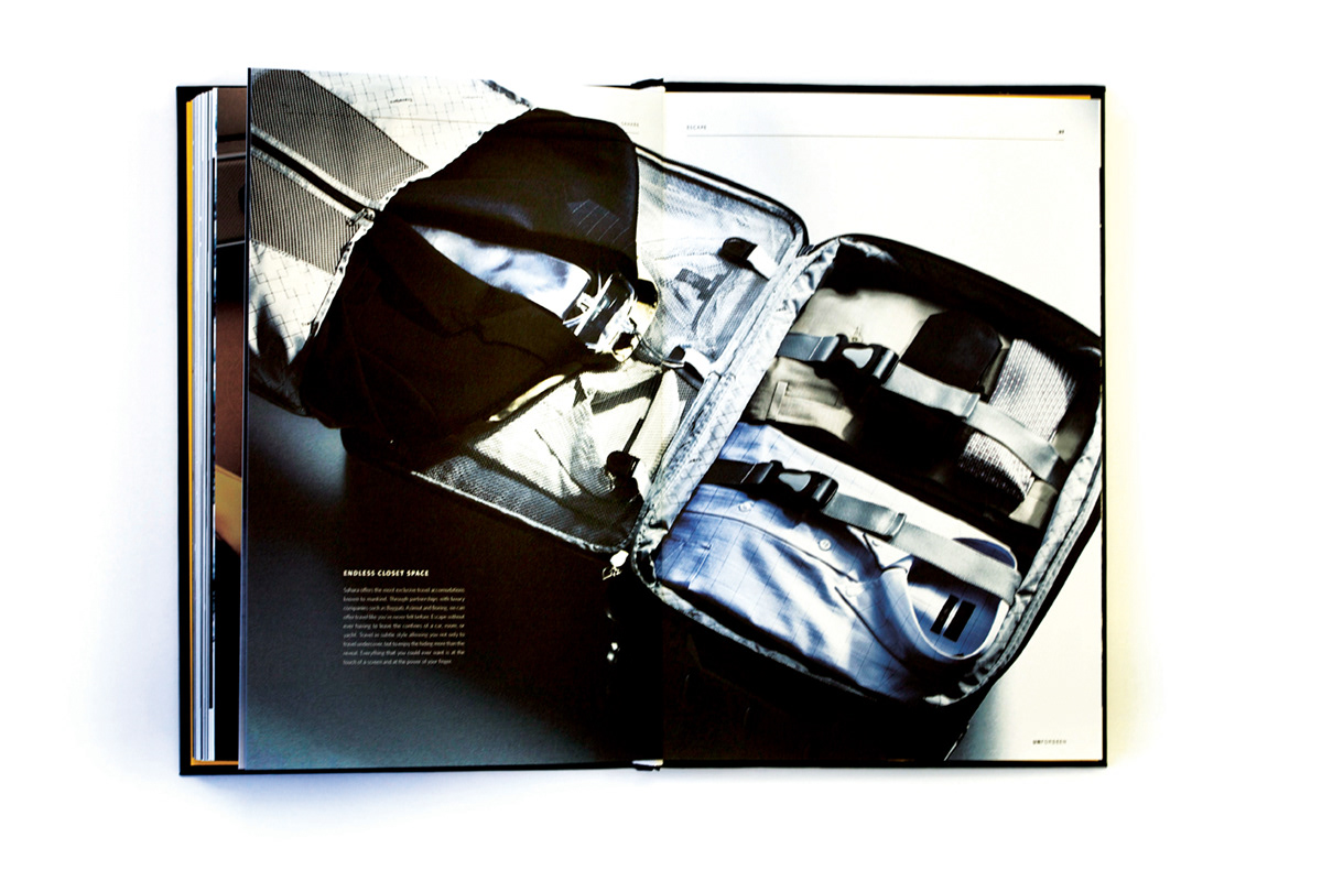
There are two sides of escape, psychological and physical. I offer services, products, environments, and more on each side of the spectrum ranging from temporary escape to permanent escape. The ideas here are what I spoke of earlier when I said I take it a bit outside the realm of "normal". I took the liberty to really take the idea of escape to the nth degree.


I created something called the "Pharmaspa", a lethal combination of a rejuvenating spa and the knowledge, control and unlimited power of a Pharmacy. In the Pharmaspa Sahara offers psychological as well as physical escape methods including yoga, meditation centers, private escape villas, anti-aging serums, memory erasing pills, mind-freeing pills and much more.


A closer look at the even the smallest detail of the rebranding, branding the Pharmaspa pills.


And of course, for those who get hooked on the pills and serums, we have the most exclusive, luxurious rehab center.