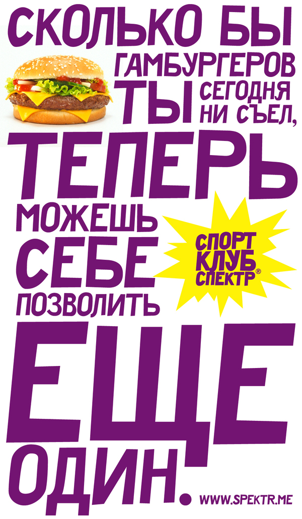
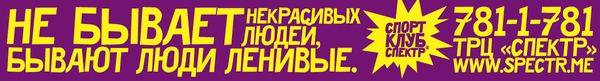
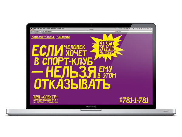
Corporate identity of the fitness club SPECTR (2009) Even people very far from sport have noticed opening of a new fitness club SPECTR. Working at its provocative branding we used the power of Russian language, active typography and a bit of sarcasm. We created the corporate identity, site, the concept and all materials for the first advertising campaign. As a result the brand compete effectively on the market and stands apart from others. http://www.spektr.me