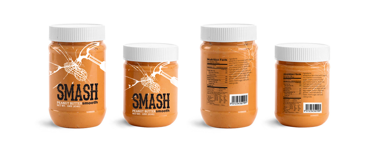
The name “Smash” comes from the reflection of a mashed peanut, the over exaggeration of the process of its production. Aesthetically designed more masculine and bold to cater to the male target audience. The breaking glass graphic on the jar is representing the word “smash”.
The graphic will be printed on the jar instead of a sticker label to help make the product stand out from its competitors such as Jib or Skippy. Also, to save production cost I minimized the color to two and it doesn't affect the outcome of the design purpose. I find that jam products are still using strawberry images for their packaging, but peanut butter is not, therefore I chose to apply that into SMASH peanut butter for a simple visual message.