Genesis
Sinus Novem merges the elegant nature of Art Nouveau with the angular properties of Urban design. Characters in the Sinus Novem prototype typeface are built on one of the three vertical segments of the grid shown above.
The font seamlessly merges both upper and lowercase glyphs to form dynamic yet consistent words or phrases. Due to the elongated nature of the typeface, Sinus Novem is perfect to be applied in branding projects or editorial headings. However, one should be cautious when using this typeface for body-text, as the font is not intended to be used for this purpose.

Sinus Novem Typographic Grid
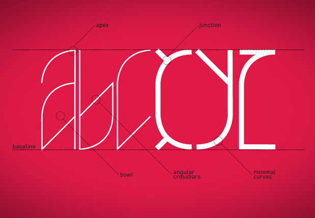
Sinus Novem Glyph Structure
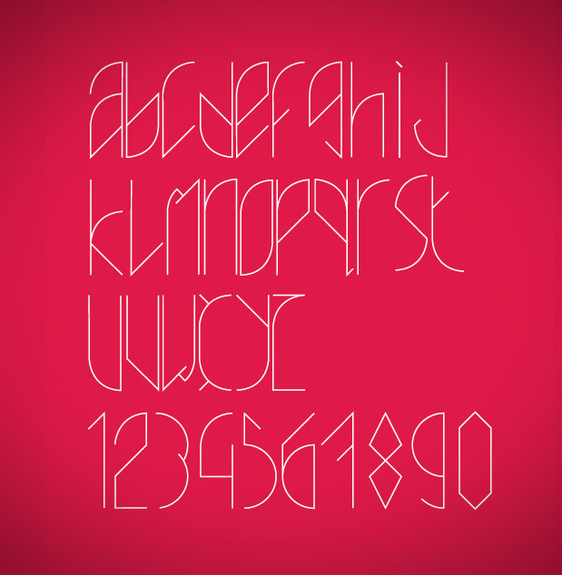
Sinus Novem Regular
Being that the foundation of Sinus Novem lies on a vertically elongated grid, the Regularcounterpart of the typeface is composed of narrow and elegant glyphs. Unlike the Bold variationin the font family, Sinus Novem Regular is sharp edged in nature that gives it a distinct look.
Being that the foundation of Sinus Novem lies on a vertically elongated grid, the Regularcounterpart of the typeface is composed of narrow and elegant glyphs. Unlike the Bold variationin the font family, Sinus Novem Regular is sharp edged in nature that gives it a distinct look.
Sinus Novem Bold
Sinus Novem Bold is a heavier development of the original Regular glyphs. The wider physiology ofthe typeface give the characters a more contemporary look, thus successfully blending elementsfrom Art Nouveau and Urban design.
Sinus Novem Bold is a heavier development of the original Regular glyphs. The wider physiology ofthe typeface give the characters a more contemporary look, thus successfully blending elementsfrom Art Nouveau and Urban design.

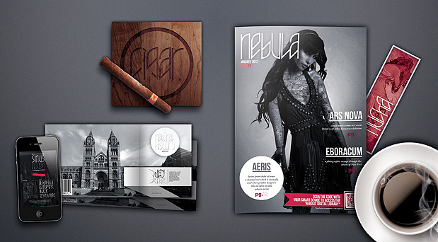
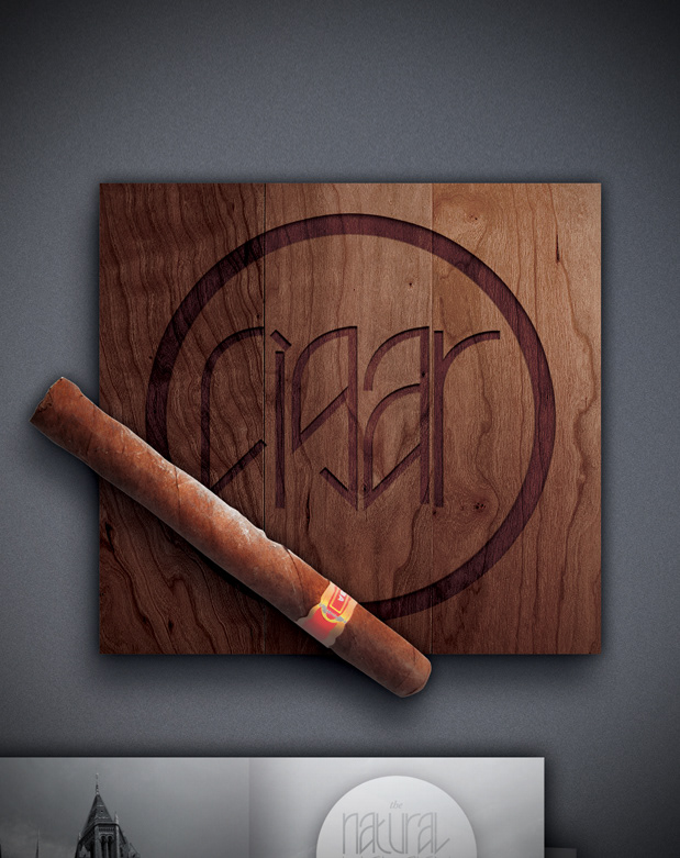
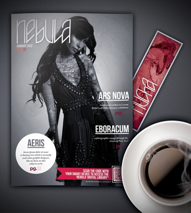
Commercial Application
Sinus Novem is perfect for any form,of visual identity, be it Editorial or Consumable branding.Be it museum tickets, lifestyle magazines or cigar cases, the Sinus Novem typeface always brings a touch of class to contemporary items.