
Rexav identity - case study.
Thought process, sketches and arrival at the solution.

I have been approached by Krisztian Gabula with the job of designing Rexav's new identity.
We design, sell and install home theater systems, whole house audio systems, security systems (alarm/video), lighting control, home automation systems, access control systems, computer networks, media servers. All these subsystems are integrated together so we can automate them and achieve a Smart Home.
“REX” comes from the Latin word meaning "king", and “AV” stands for Audio/Visual.
Briefing.
Some excerpts from my communication with Krisztian.
What should the logo be telling to your clients?
Doing business with us is a safe and easy process. We are serious about our quality of work and take pride in what we do. We love fun and entertainment and are open for new things but always show professionalism.
Logo should represent quality and security in a sophisticated way.
Do you have any ideas in mind for the Rexav logo?
We are thinking about using a lion's face/head front facing as a modern, abstract, minimalistic design that would express all of our values: secure, honest, friendly, structured.
We are not just dealing with electronics or home gadgets but we offer an experience that makes you feel secure, intelligent, bright, in-control of your environment, modern, fun and a step ahead of the crowd.
I really like minimalism and simplicity.
What keywords would suit Rexav best?
bright, smart, trust, enthusiasm, optimism, vitality, happiness, strong, secure, reliable, wise, leader
Who is the target audience?
The target market is upper-class society with a modern lifestyle or people who look at technology as a way of life.
Boiling down ideas.
Organizing information, formulating design principles, coming up with initial ideas.
Organizing information, formulating design principles, coming up with initial ideas.
1. We are looking for a simple, abstract and smart symbol.
2. Lion's head should definitely be a priority. It not only matches great with the feel of security, trust and being in-control, but it is almost irresistible with the “Rex” part of the name and its “king of the jungle” connotations.
3. There are very many lion-logos out there, so it would be great if we managed to ran away from any clichéd depictions with something really unique, clever and surprising.
4. The brandmark should look great on any piece of high-tech equipment and should stand out as a symbol of highest quality. It also ought to match well with modern interior design.
5. Krisztian has also been mentioning “fun” and “friendly” as important parts of their brand strategy.
Sketching.

You can see how each drawing evolved from the initial idea to a more refined state. Concepts that have been dropped at this stage include:
B and C - interesting geometrical form, yet feeling a bit too blocky and lacking a spark;
D - it is quite unique, but also somewhat weird (I couldn't stop seeing Iron Maiden's Eddie there);
E - well, it is very fun&friendly, unfortunately to the point that is looks like a teddy bear, not a lion on guard.
The rest - namely A, F and G - has made it to the next round, where I paired each design with lettering, tested first coloring options and presented them to Krisztian.
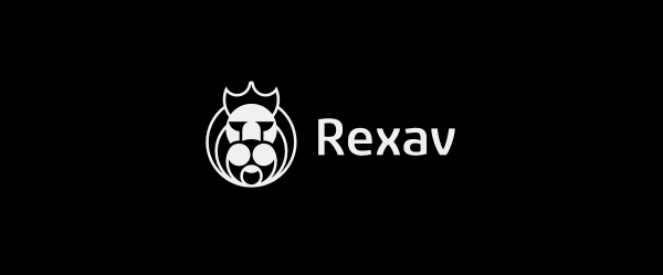
CONCEPT A.
This proposal might be considered the most conservative and traditional. It is clearly a crowned lion's head, constructed with a collection of basic shapes, although not going extreme on minimalism. It is esthetically pleasing and no-one should waste a moment wondering what it depicts. It has "trustworthy, honest, proud, secure and professional" written all over it. This concept is also quite memorable and unique and should be able to deftly work on its own, even without the company name.
This proposal might be considered the most conservative and traditional. It is clearly a crowned lion's head, constructed with a collection of basic shapes, although not going extreme on minimalism. It is esthetically pleasing and no-one should waste a moment wondering what it depicts. It has "trustworthy, honest, proud, secure and professional" written all over it. This concept is also quite memorable and unique and should be able to deftly work on its own, even without the company name.
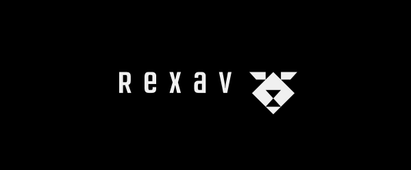
CONCEPT F.
Could be called an exercise in minimalism - it can't get much simpler than that. In fact, it is so abstract and cut down, that it may not be obvious what it is. This might be considered its greatest strength and disadvantage at the same time. Therefore, it might require some further tweaking.
Could be called an exercise in minimalism - it can't get much simpler than that. In fact, it is so abstract and cut down, that it may not be obvious what it is. This might be considered its greatest strength and disadvantage at the same time. Therefore, it might require some further tweaking.
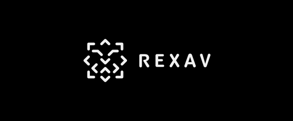
CONCEPT G.
Clearly the best fit for the briefing provided by the client. Also, the most intriguing and unique concept of them all. The symbol is very abstract, minimalistic and unconventional. Simple to the bone, yet able to make people see the lion. Extremely structured in such a way, that it should invoke feelings of quality, professionalism, security and trustworthiness. It would make the company look very modern and self-confident.
Clearly the best fit for the briefing provided by the client. Also, the most intriguing and unique concept of them all. The symbol is very abstract, minimalistic and unconventional. Simple to the bone, yet able to make people see the lion. Extremely structured in such a way, that it should invoke feelings of quality, professionalism, security and trustworthiness. It would make the company look very modern and self-confident.
Final thoughts.
I don't think I am going to spoil anything by saying that G has been my heavy favorite from the very beginning. This symbol is so original and memorable, that it should easily stand out in the crowd and there is no way that it would feel like another repetition of the same lion-head logo cliché. Another bonus of this design is that it could be very potent at generating follow-up graphic elements, that would be clearly associated with the brand. I had no doubt that this would be the right choice for Rexav.
There has been only one issue with all of the above proposals - none of them had much of a friendly feel. It has been clear to me from the start, that it is going to be very hard to get that impression along the feelings of security and trustworthiness. Especially with minimalistic and abstract form. At the same time, it was essential to make sure that the lion is clearly recognizable and that it does not seem childish or silly.
My priority was to make the lion respectable and worthy of the king title, so I have decided to downplay the “fun and friendly” part a little bit. In A, I tried to use as much round shapes as possible, so that the final design could inherit some soft and warm impressions attributed to such forms. In the case of F and G I would call my approach "fun and easy, thru bright and smart". I meant to arouse these notions with an abstract and surprising construction of the lion. I have hoped that this would make people think "wow, that`s clever, I enjoy it!" (hopefully, followed by "I wanna be part of this!").
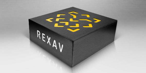
Hail to the king!
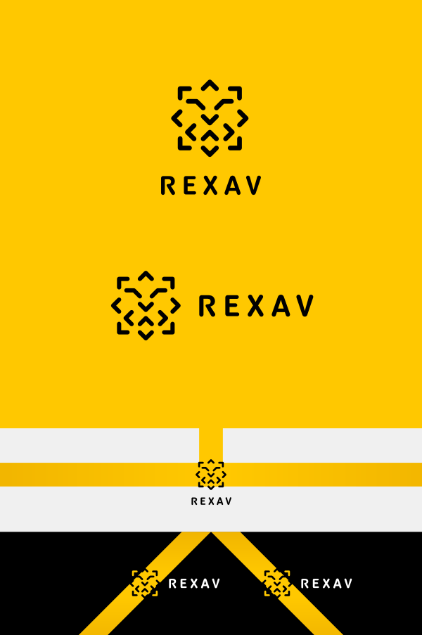
Final results.
Final results.
We have tried out a few modifications to the initial design, but in the end decided that the original logo is the best choice.

Please let me know what you think and whether this case study is too much text to handle :-)
If you enjoyed this story, you can find more of my case studies here.
If you enjoyed this story, you can find more of my case studies here.


