P22 Dada Font by RIchard Kegler and Colin Kahn
History of the P22 Dada Font
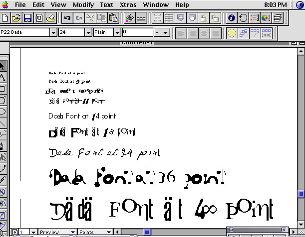
Version 1 - 1995-1996. Made initially as an experiment and then in a limited quantity for one or two Museum gift shops. Not included in P22 catalogs, this font P22 Dada (menu name P22 Dada UltraDemiBoldMediumObliqueCondensed) took a Dadaist approach to font design. Using the Postscript bitmap limitation to its fullest (where in then contemporary Mac OS, the screen font featured bitmaps for each size of the font. This way 10 or 12 point fonts could be hand modified to be more readable). The Dada font has 10 sizes of bitmaps. Each size rendered the font in a different way. Some substituted letters or images some shifted the position up or down. If something was set in 12 point and zoomed in 200%, the 24 pt. bitmaps would take over. More mischievous than most fonts, this could prove frustrating to a designer intent on actually using it to design with. The original read me file stated "Macintosh users who use PostScript fonts will have an especially amusing/frustrating time with this font. The on-screen bitmaps may not coincide with what prints out. Do not call technical support-they are instructed to hang up on you."
and "There is no need to design a page while using this font. Just type and print. Chance will design your page."
The packaging for this limited edition mimicked the original P22 font packaging in dimensions, but used a random shipping carton with some printing, cut into a 7" x 7" square and then attached an AOL solicitation floppy disc with the Dada font overwriting the AOL data held onto the board with a rubberband.
Version 2 - 1998. Same font as version 1, but packaged as a bonus font with the Futurismo soundtrack Audio CD. By this time, individual point size screen bitmaps had become somewhat obsolete and the randomness of the screen font was downplayed.
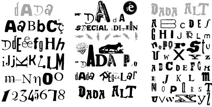
Version 3 - 2006. The original idea of the Dada font and randomness was given new life with the introduction of OpenType programming. The new version includes over 500 glyphs of letters and images and can be used to create Dada inspired typography by simply selecting various features such as:
Contextual Alternates: Replaces Glyphs in sequence from largest to smallest
Ligatures: When proceeded by a space character lowercase letters will ascend and rotate indefinitely (best used with small caps feature)
Discretionary Ligatures: Similar to Ligatures features only letters randomly rotate and baseline shifts after each word
Small Caps: Changes upper and lower case to Smaller Upper and Lower Case Glyphs
Titling: Changes Uppercase to Condensed Tall Uppercase and Lowecase to Square Heavy Uppercase
Swash: Changes Lowercase to Ornate Upper and Lowercase letters
Oldstyle Figures: Replaces Numerals and ! @ # $ to ornaments
Fractions: Random assortment of Opentype substitutions meant to confuse and complicate word processing.

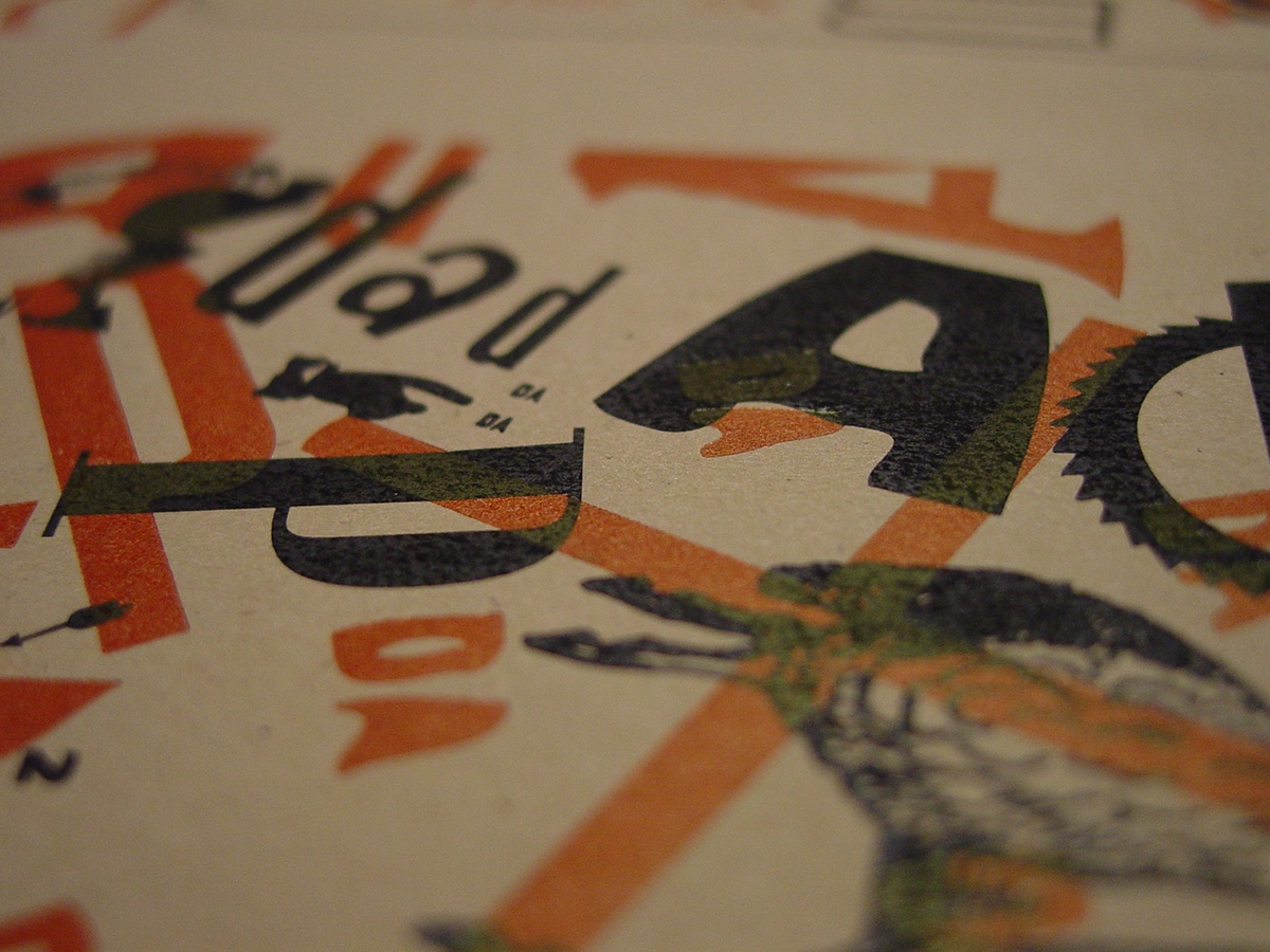
The Dada "Special Edition" packaging and expanded font was made to coincide with the "First Major International Dada Museum Exhibition in The United States" which opened at the National Gallery of Art in 2006. 1000 copies are produced with partially transparent/partially metalized CDs with a wrap that is printed with both laser printer and hand letterpress.

First mockups envisioned the half-metalized CD, but with additional type from the font. The final version used a Bicycle wheel as a tribute Duchamp's "readymade".

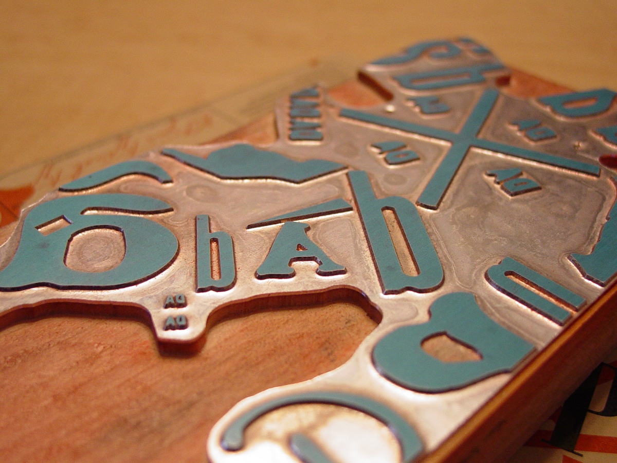
Magnesium printing blocks were made to print red color letterpress on a Vandercook proof press over laser printed black on kraft colored paper.


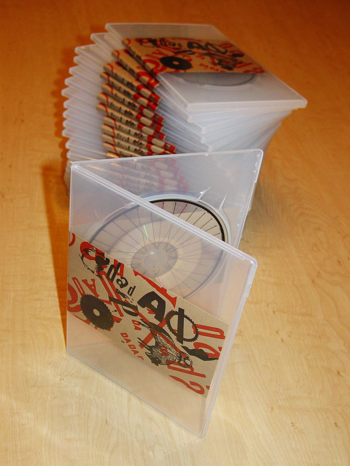
Final version of packaging for Dada SE
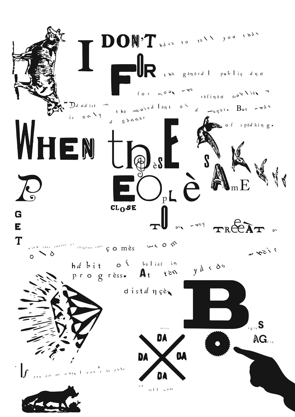
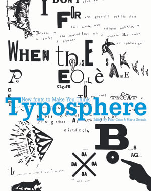
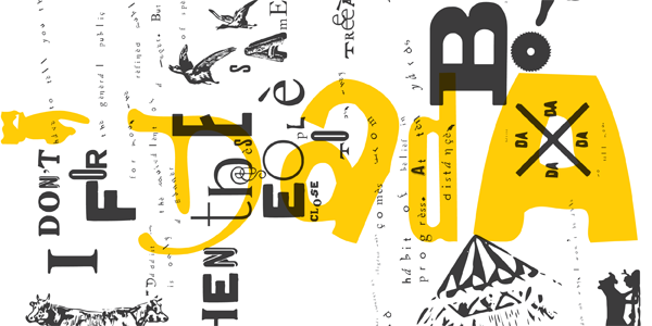
Specimen of Dada font was used as cover image for Typosphere book.