Modhera is a Gujarati-style Gurmukhi/Punjabi font that provides characters in the Unicode range as well as mapped versions to the ASCII range.
The ASCII-mapped characters provide the basic characters but the real gold with this font is the Unicode range characters with the programming code that makes this font easy to use.
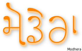
In the example above, you can see a sample of the sort of work this font is capable of producing - many features of which will be gone over on the rest of this page.
As always, you get the best out of a fully-featured font by using programs - image/word processors - that are able to utilise the font's features. To date, I notice that Adobe Photoshop still fails to produce even basic proper Indic character order whereas the free programs - such as The GIMP - do and have done for many years. Until Adobe fix this bug, the saying; 'you only get what you pay for' still rings totally hollow.

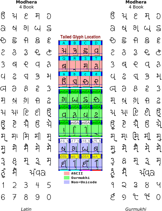
Above, you can see Modhera's alphabet. The basic character set is the same as that of another font of mine called 'Dwarka', although there are some distinct differences:
# Like Dwarka, the full-height, straight verticals on the right of characters has a curl at the bottom, except that this is much bolder in Modhera;
# The aunkard and dulaunkard slope down to the right in Modhera and are not mono-linear;
# The starting point on all of the open-starting characters (ie, not ਥ, ਧ, ਬ and ਯ) is characterised by an emboldened point; and,
# There are a number of different types of sihari and bihari.
# The aunkard and dulaunkard slope down to the right in Modhera and are not mono-linear;
# The starting point on all of the open-starting characters (ie, not ਥ, ਧ, ਬ and ਯ) is characterised by an emboldened point; and,
# There are a number of different types of sihari and bihari.
Like Dwarka, the tails are dropped when a paer character is used.
All of this goes into making a very stylish, fluid font that possesses: the general top-left to bottom-right visual flow; the line-free look; the small serifs; and the rounded look that Gujarati has.
The font also has such a consistent appearance that it is very easy to read and as such, can take on the role of a body font as well as a display font.
One thing to notice is that the Modhera ਥ looks a little like a Devanagari ब but without the top line. If you are familiar with Devanagari, you might find that to start with, you are reading it as a 'b' but this passes quickly. Likewise with the Modhera ਧ and the Devanagari व.
This is not a problem with real Gujarati because the Devanagari and Gujarati versions of the Gurmukhi ਬ are ब and બ respectively, so, you can see that they could not be confused.

Modhera possesses a number of types of sihari and bihari, enhancing the fluidity of the font whilst maintaining its legibility.
The biharis come in four sizes, depending upon the characters that they follow:
The characters with the full-height, straight verticals on the right have a simple bihari that runs over the top and straight down again, making the resulting loop continuous as in type one on the right; and,
The other characters have different amounts of space in the top-right and this results in a choice from the other three biharis available, as you can see on the right - 2, 3 and 4.
There is a similar situation with the siharis where the bottom of the sihari extends to take advantage of the available space under the left hand side of the character. You can see this in sihari types 1, 2 and 3.
In types: 4; 5; and, 6, the top of the sihari extends to take advantage of the extra space over the top of the wider characters with type 5 also taking advantage of the extra space under the ਚ as well.
In summary, you can see that the tops of the siharis all push up into the top left corner and the bottom slope down and to the right. The biharis slope down to the bottom right to varying degrees. Together, these two characters, which would normally make up an upright-standing block, add to the top-left to bottom-right feel of the font.

The ASCII part of the font has two variants of the adhak so you can choose whichever you like depending upon the space available. However, the Unicode part of the font will do this automatically for you so there is no need to worry about that.
Not only that but as the available space changes with the bihari, the adhak moves into the available space, making for a more evenly spaced font.
You can see this clearly in the artificial examples in the image above.

Above, you can see what happens to the tail-flick on the bottom of the long-straight vertical that is a part of some of the letters in the Modhera font.
When a paer character is used, the paer character replaces the tail-flick - it does this whether there is a bihari there or not.

Another feature that I have programmed into this font is that it can extend the tippee part of the oorda of the Ek Onkar so that it is able to reach over some of the following text.
Instead of using the normal Ek Onkar character, use a Gurmukhi one - either in the ASCII range or the Unicode range - and then follow it by either the horda form of oorda, or the aunkard or dulaunkard forms of oorda as in the image above.
So, can you get away with using just the ASCII characters?
Above, you can see the main character sets for ASCII (Latin) and the Unicode Gurmukhi range in the font 'Modhera'.
You can see from the character layout (left) that the characters in the Gurmukhi part of the Unicode range are also lacking the flicks in their tails.
These are put on by the coding in the font so that you see them in the font that is presented to you in your word/image processor - this being done by replacing them, where appropriate, with glyphs that have the tails.
This is done so that if your image/word processor does not support the coding - this has been around for years now so there really is no valid excuse from the program manufacturer as to why it should not - the paer characters will still form properly, without overwriting the tail-flicks.
So, in order to take advantage of the more advanced features of the font, you really need to use the Unicode keyboard layout, along with a program that will do the job.
Previous solutions to the problem of typing Indic characters into a computer system involved the use of a font that had the Indic characters in the ASCII range and these fonts support that still.
However, many of these layouts are incompatible with each other so if you change font, you get nonsense.
In addition, with these ASCII-based fonts, the sihari has to be typed before the character it is attached to instead of typing it the way you would write it down.
Now, though, modern computer systems support the Unicode fonts and you can type siharis the natural way because the coding in the font itself, sorts out the arrangement on the screen - this being the case with other Indic scripts such as Devanagari and Gujarati for example.
Modhera comes in a number of weights and as always, with my fonts, it is free for you to download and use, whether that is for commercial or non-commercial use.


You can get a copy of the font, with all of its weights from my Billie the Cat site, where you can also learn how to read and write Gurmukhi in a variety of styles or download many other fonts, all for free.
Click here to go to the Billie the Cat website.


