

Mind the Type
Experimental Typography
brief.
I was asked to produce a piece of experimental typography for one of my last university projects before
degree show 2013 based on a famous quote taken out of its context and presented in a creative style.
quote.
I chose a well known slogan by British supermodel Kate Moss said back in 2009 in an interview with
fashion website WWD as one of her favourite life mottos namely "Nothing Tastes As Good As
Skinny Feels" with which she caused an outrage and was immediatelycondemned by critics and
campaigners including the groups Say No to Size Zero and Beating Eating Disorders (BEAT)
fighting to abolish the cult of stick-thin models. Theyclaimed that as a role model to millions of girls
and young women her words could lead to more instances of eating disorders.
solution.
So I played around with every single letter from the quote using various materials and methods
to form and build them in a creative, understanding experimental way to finallycompose a typographic
poster turned into an eating disorders awareness campaign featuring the logo of the famous British
association dealing with eating disorders BEAT.I went for this kind of approach to be able to both
experiment with type as much as possible but at the same time produce smth that
can be practically used for advertising for example.
target audience.
being easilly affected by such carelessly said words saidespecially by role models like Kate Moss.
possible poster locations.
schools, universities, female public and school toilets, food courts in shopping malls, cafes, some night clubs
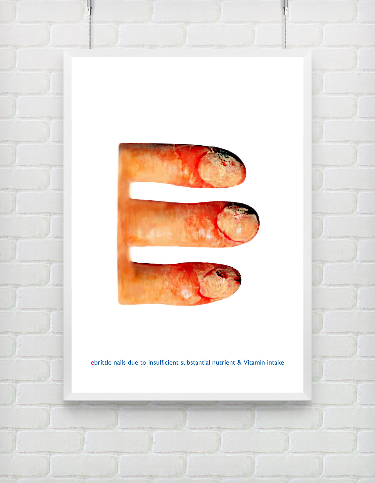
with each letter of the quote I am expressing.
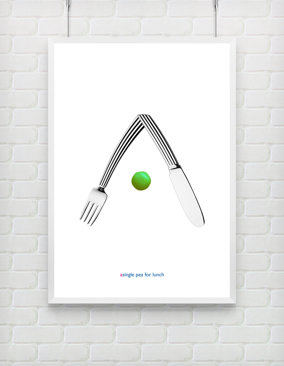
1.things people with eating disorders typically eat
2.general knowledge, well-known facts, habits and basic objects visually associated in one way or another with such disorders
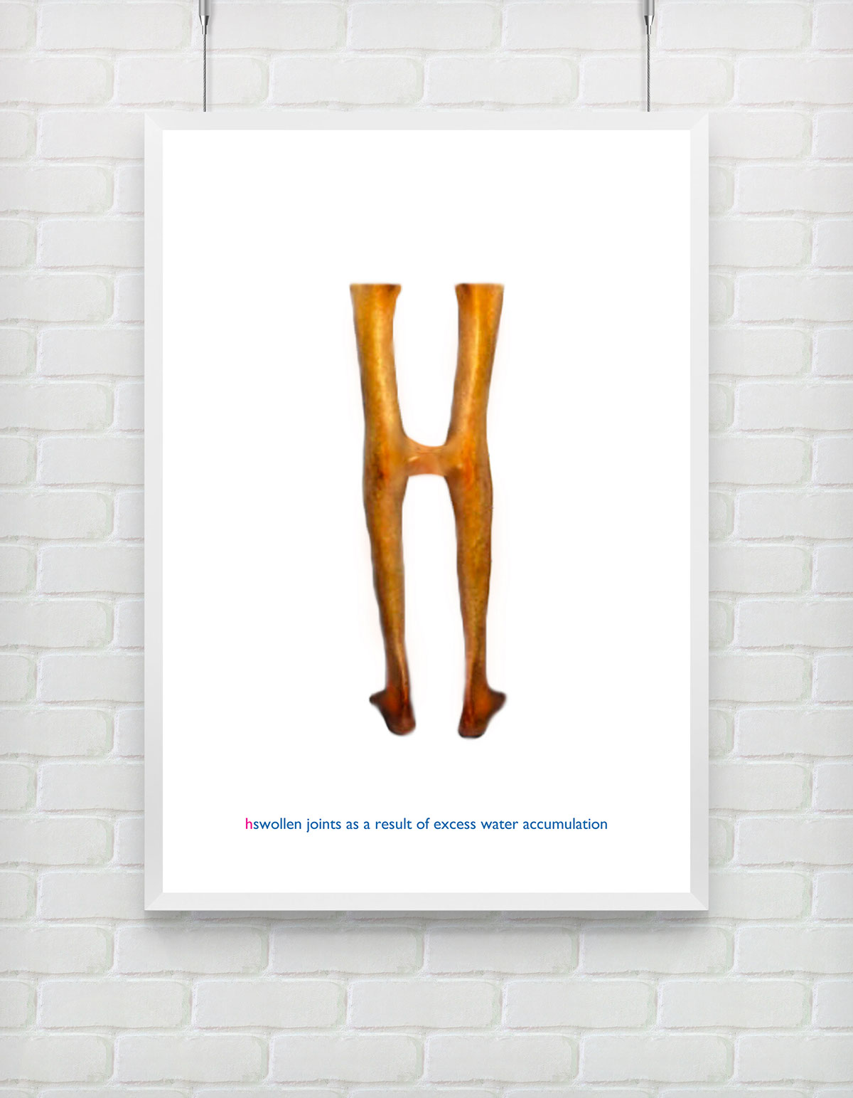
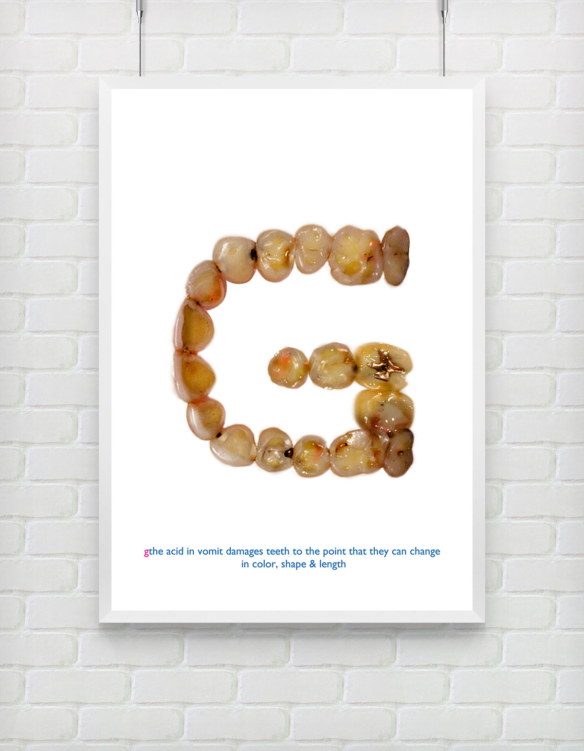
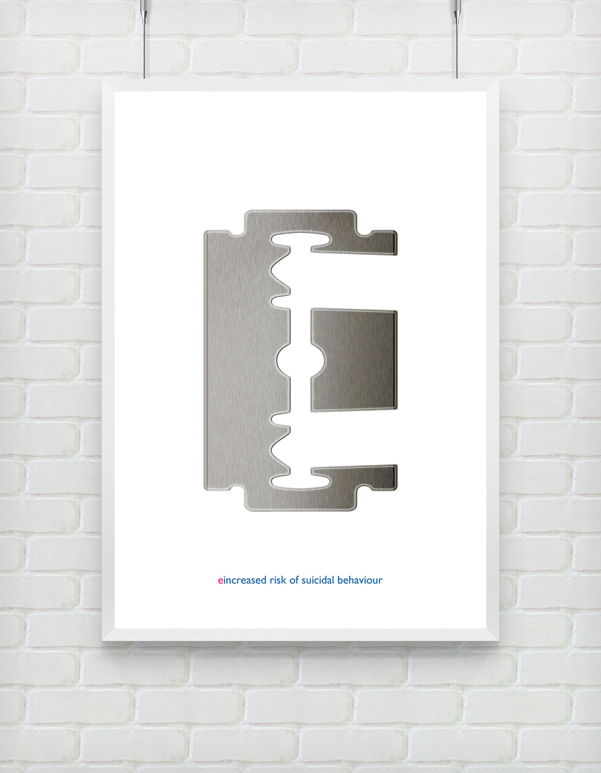
3.physical and pshychological consequences and damages as a result of them
2.general knowledge, well-known facts, habits and basic objects visually associated in one way or another with such disorders
3.physical and pshychological consequences and damages as a result of them
intended reaction.
Mind the thin line between a normal diet and an eating disorder and be disgusted by the brutality of some of the
representations of the letters especiallythe health damage ones that are inevitable if you have such a disorder.
So the letters follow as first in their order in the final poster in ''nothing'', then ''tastes'', ''as good as'',
''skinny'' and ''feels'' with explanation of the idea behind the style of the letter


Thank You!


