Mayrah Wine
–
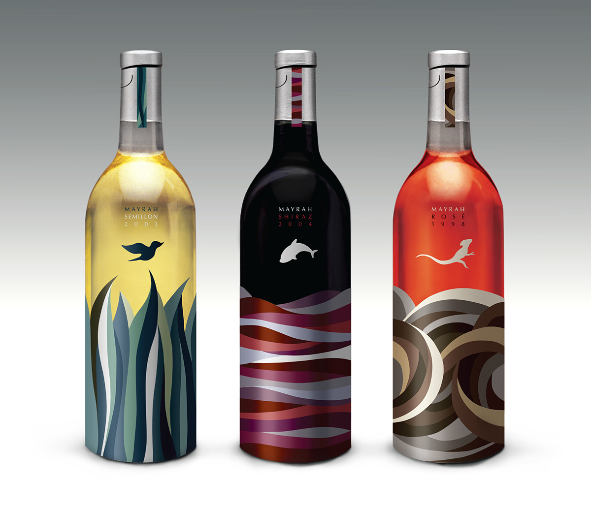
Packaging: The wine is from Australia, and "Mayrah" means "Spring" in the aboriginal language.
The animals are jumping up because they are so happy that spring has finally come.
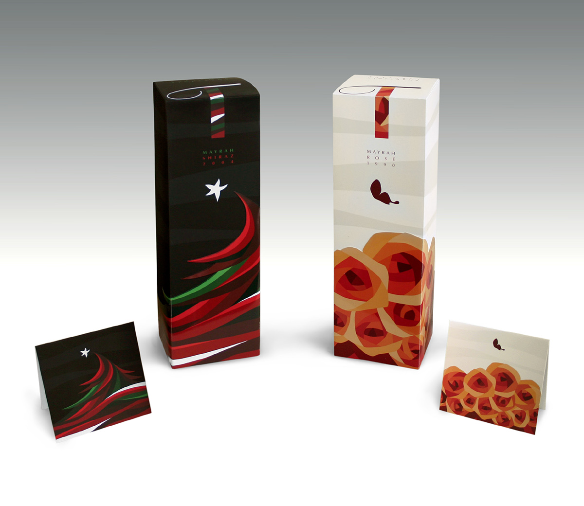
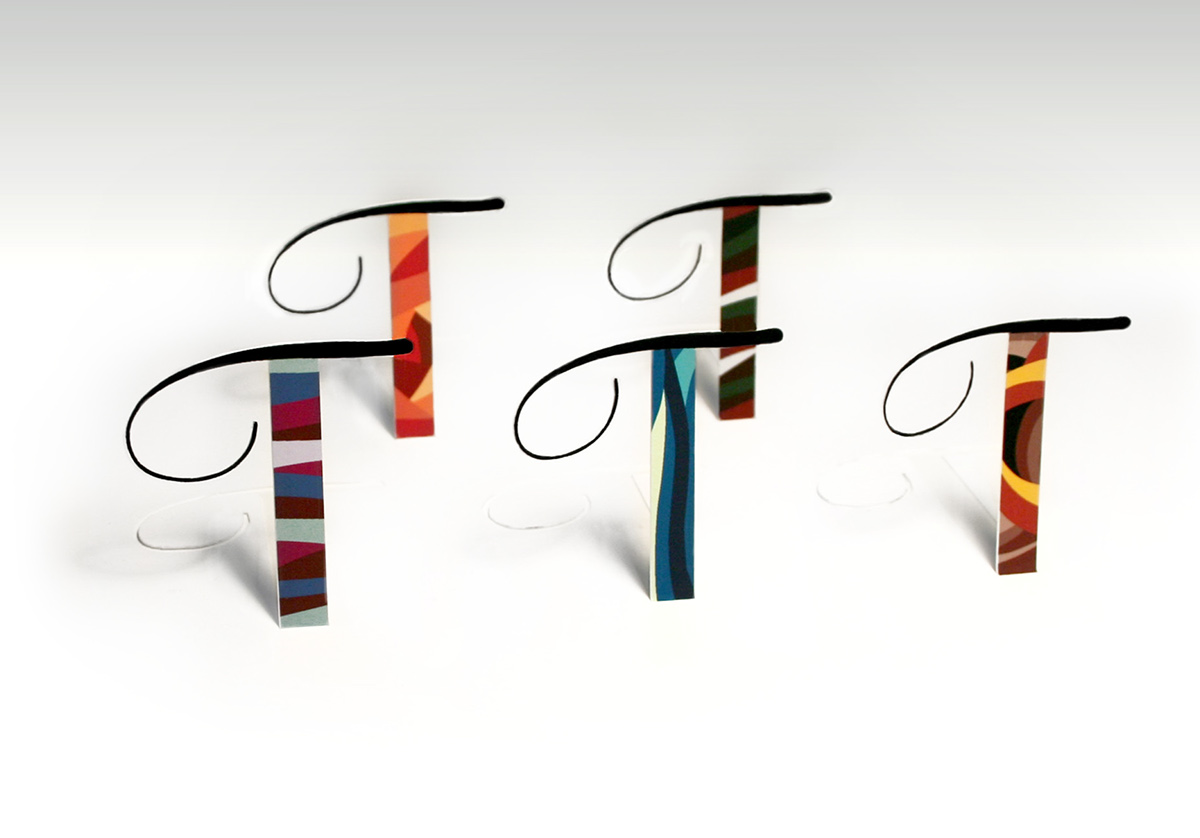
Visual Identity: The T-shaped logo represents the name of the vineyard, Taltarni. The logo is variable in its colors and patterns to work best with different wine packagings, such as Christmas and Valentine's Day special packaging.
Adobe Design Achievement Awards, Finalist
Graphis New Talent Annual, Gold Winner
How International Design Awards, Merit Award
The Dieline's Latest Top 10 Package Designs
The animals are jumping up because they are so happy that spring has finally come.
Visual Identity: The T-shaped logo represents the name of the vineyard, Taltarni. The logo is variable in its colors and patterns to work best with different wine packagings, such as Christmas and Valentine's Day special packaging.
Adobe Design Achievement Awards, Finalist
Graphis New Talent Annual, Gold Winner
How International Design Awards, Merit Award
The Dieline's Latest Top 10 Package Designs
*Personal Project