

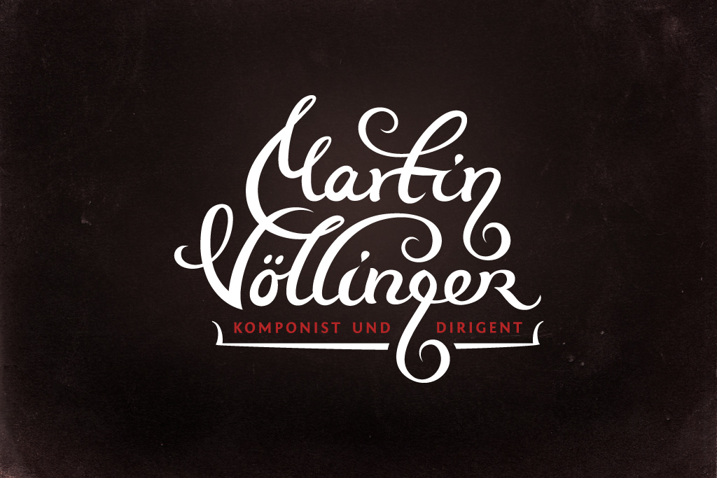
Martin Vollinger
Logo Design Process
Logo Design Process
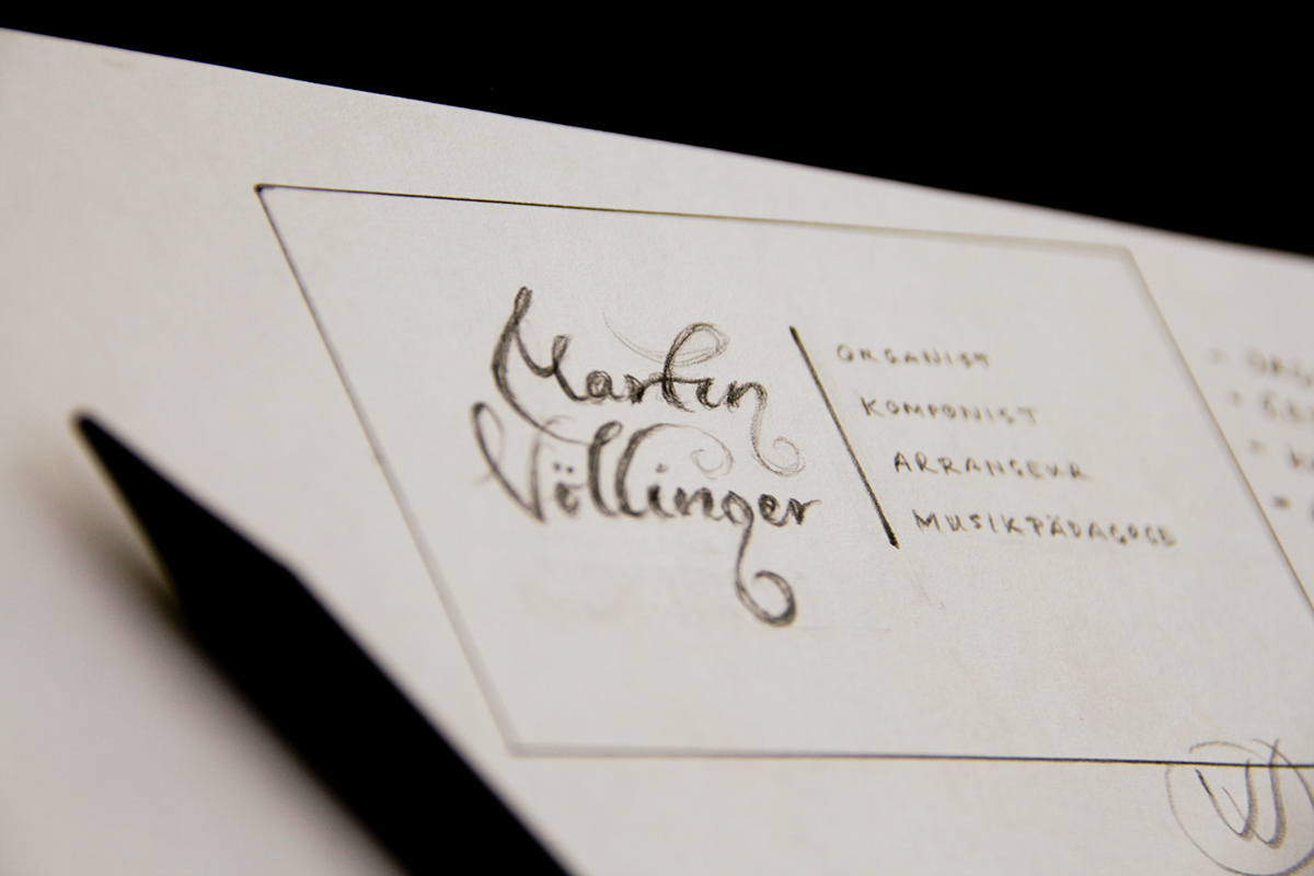
Martin Vollinger is composer, music pedagog, organist and conductor. He enjoys composing by combining classic and modern music styles such as jazz, salsa and pop which results in unique, refreshing and inspiring melodies. He wanted happy and joyful look but still to represent proffesional musician.
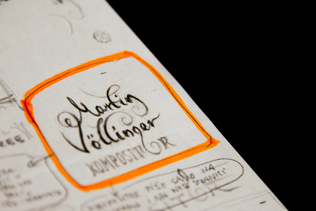
For the recognizable branding element I decided to create "g" letter in shape of a violin key. From that idea I started the quest for the perfect type which will represent the professional with all wanted attributes and look natural with this unusual "g".
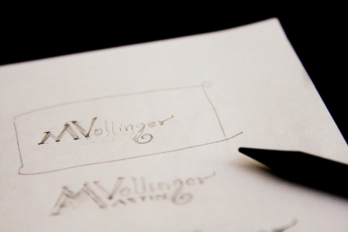
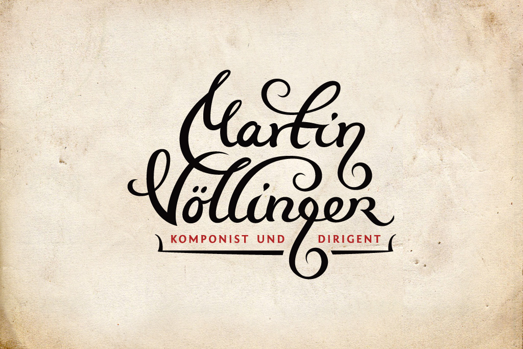
The whole name seemed too long standing in one line so I played with "M.Vollinger" but either the type didn't work well or the curly M (below) wasn't recognizable.

This one put a smile on my face. I scanned it and started drawing paths.
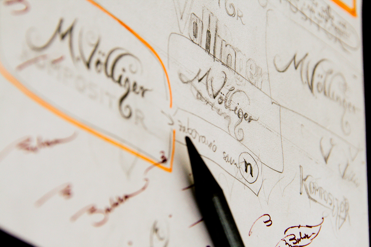
Through many revisions I kept having trouble with "r" in "Vollinger" because it left annoying gap below and on the right. I tried ligatures and curles to fill it somehow but nothing looked right. Than I decided to make it small cap "R" and it worked like a charm!

- Featured on -
- Publications -
Logopond V1, 2012
Logo Nest 03 B&W Special Edition, 2014
* * *
Thanks for watching, commenting and appreciating!


