+More, Fruit Juice Packaging
Logo, Digital İllustration and Packaging Design
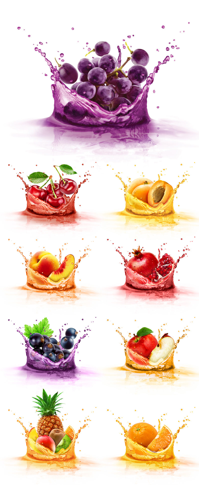
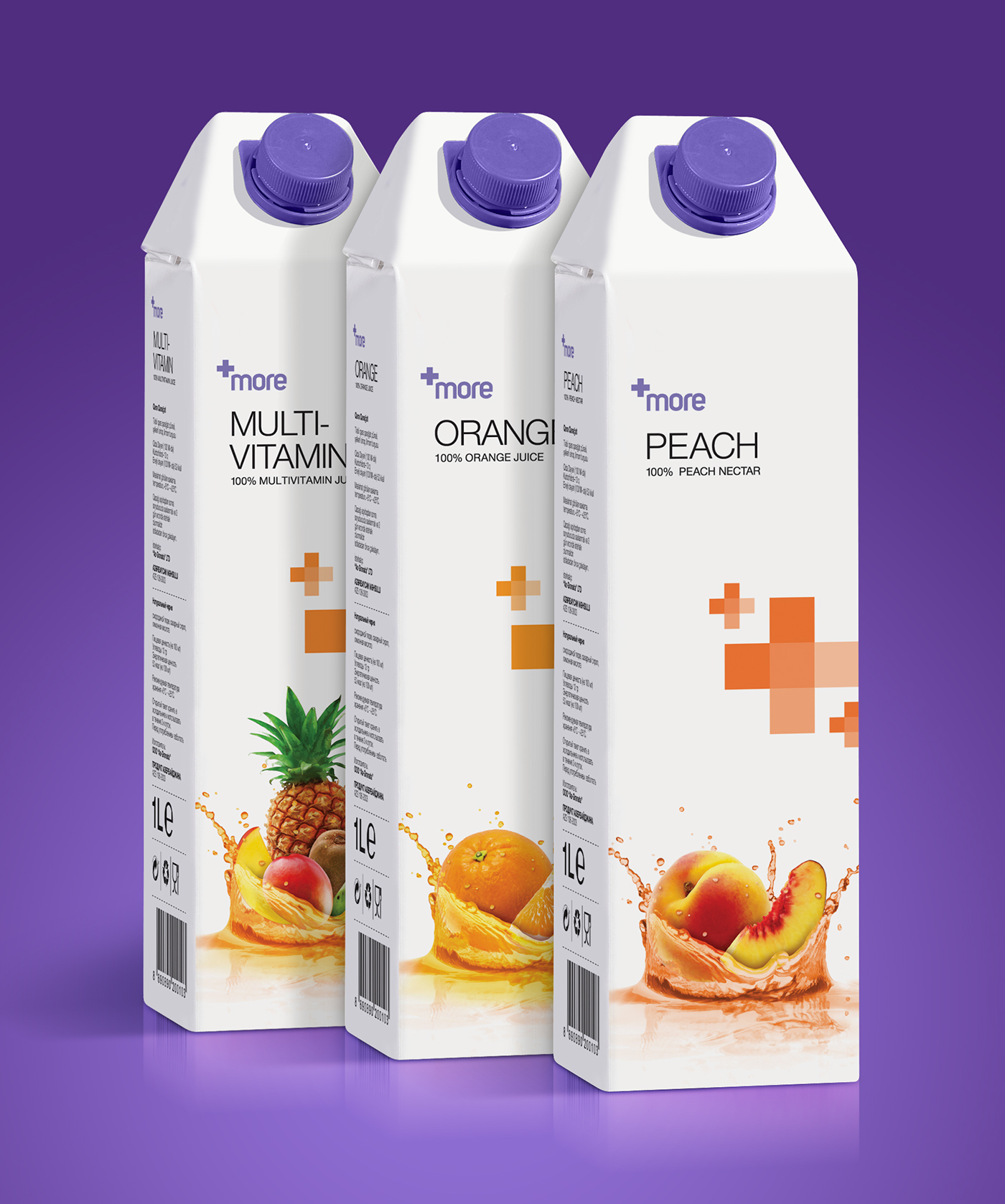
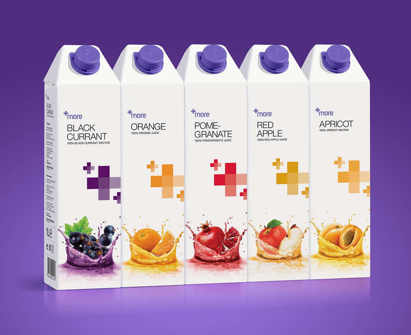
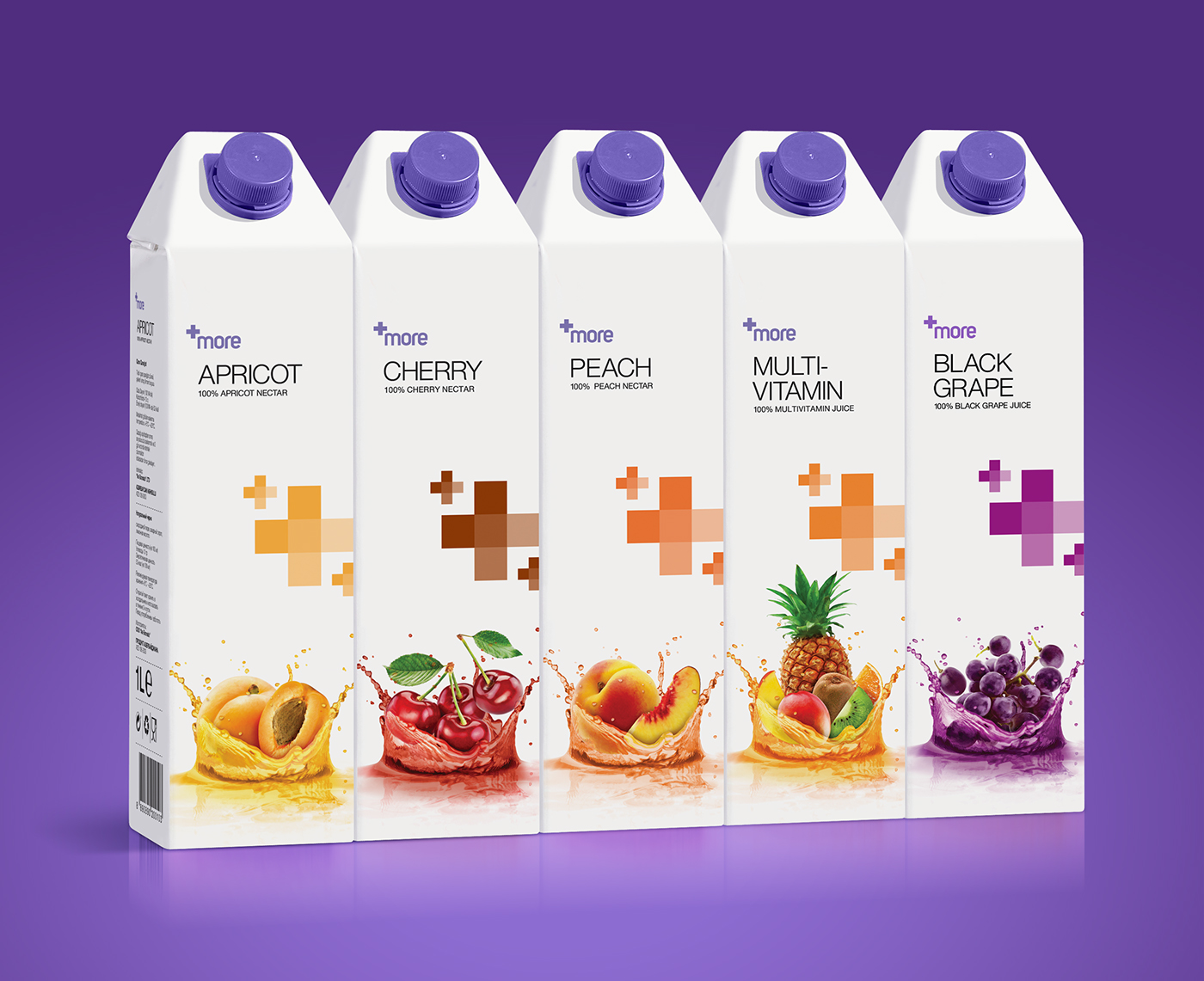
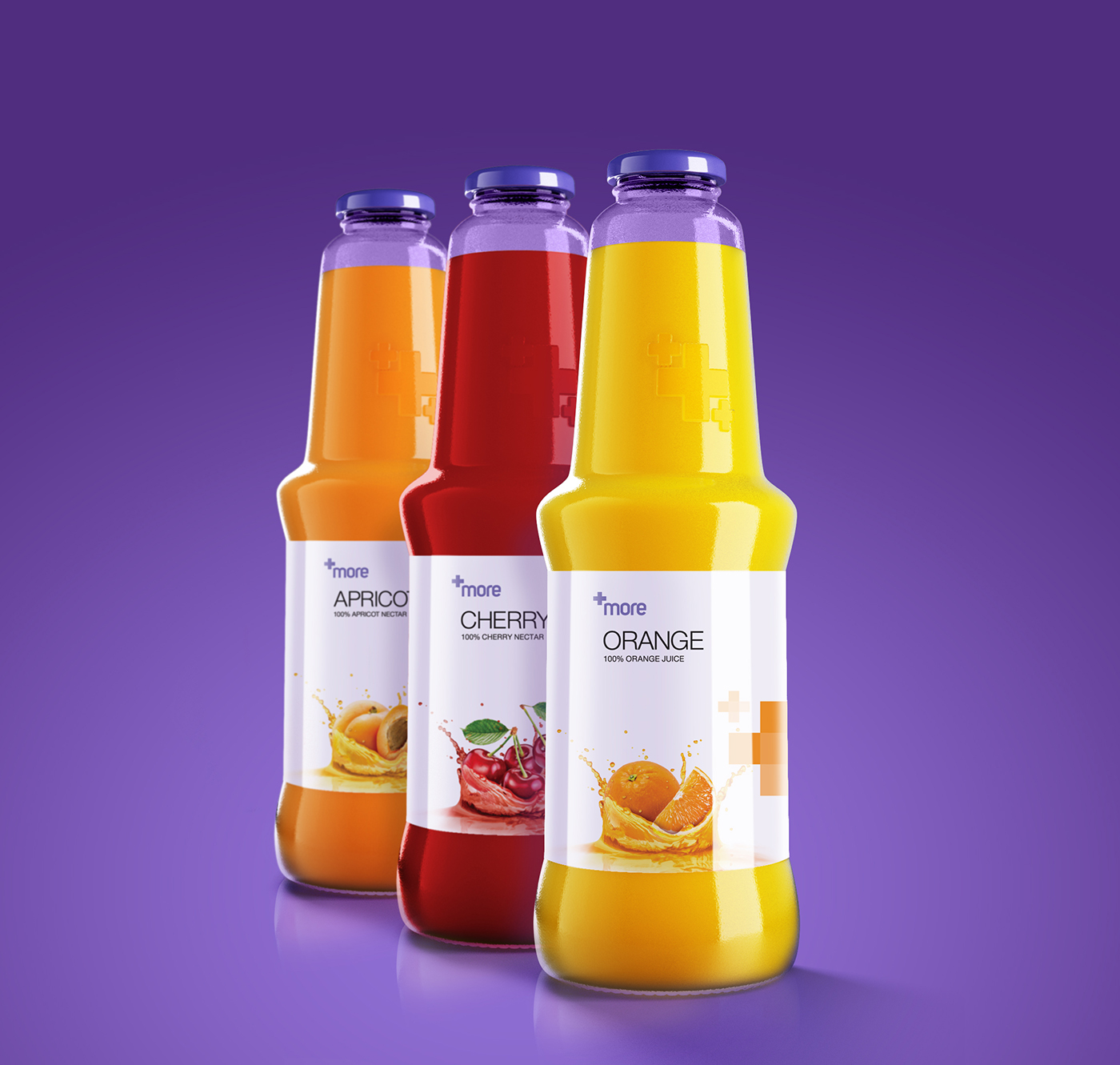
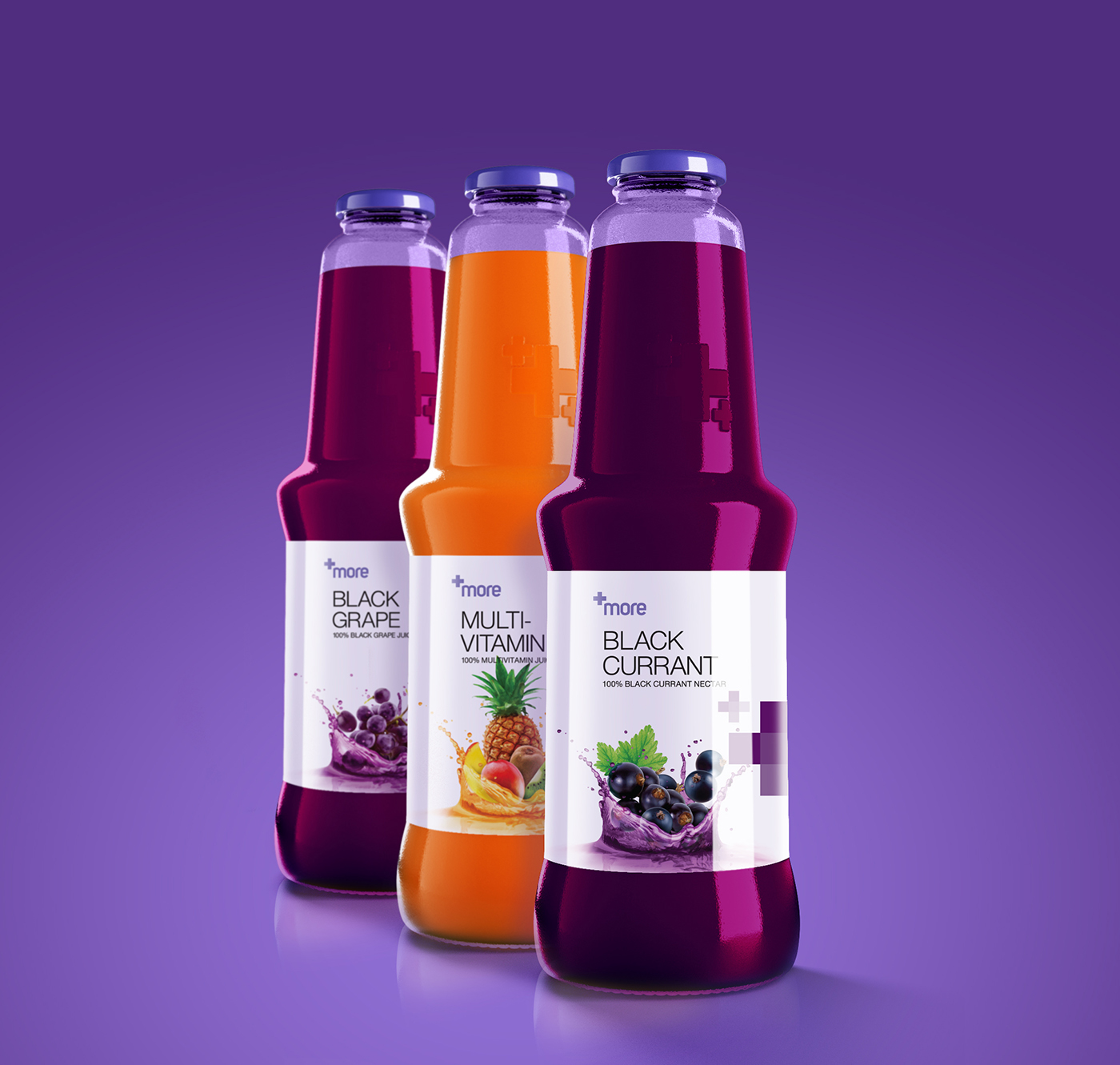
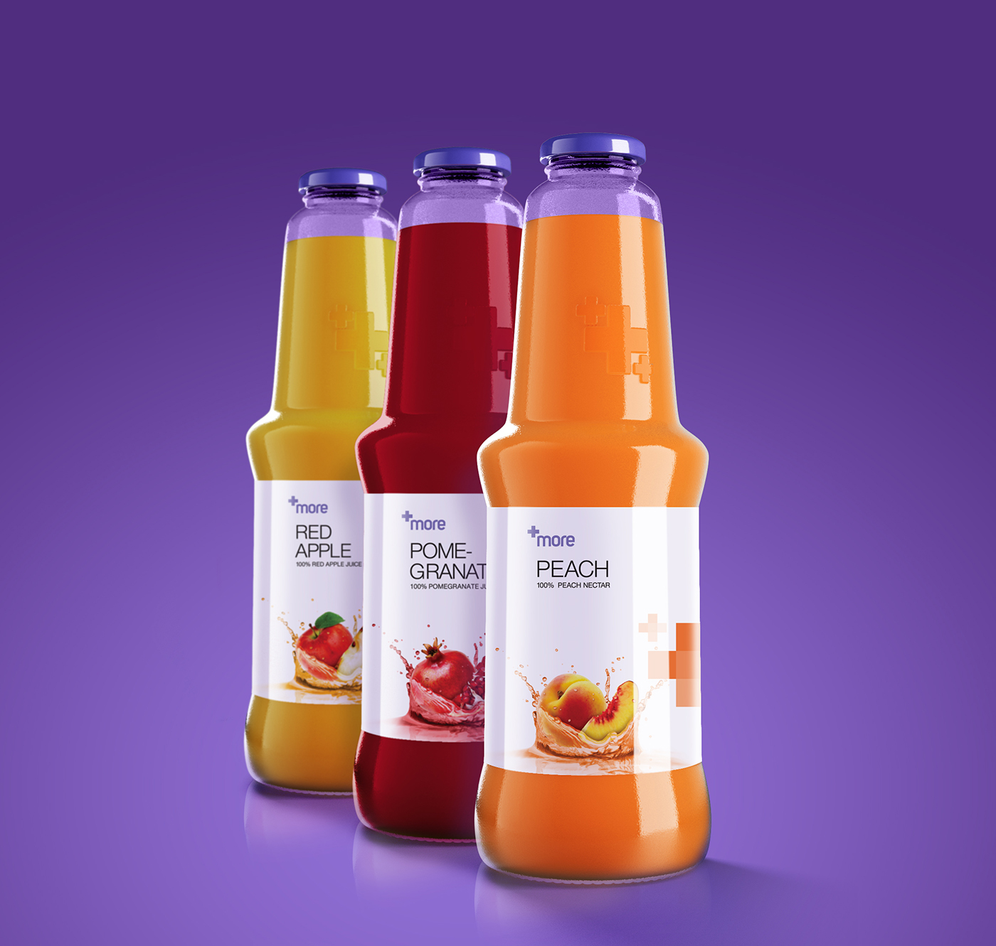
More is a premium fruit juice which contains high percentage of real fruit extracts, therefore the name “More” was selected for the brand. The plus (+) icon on the package is used as a symbol to indicate the rich fruit ingredient of More. The plus changes color according to the flavor. White is used all over the package. Plus and white emphasizes the health and triggers the perception of hygiene. White is also differentiating the package of More from the other fruit juices on the market shelves and putting it forward. The simplicity of the package is an advantage. Illustrations on the package are effective but not distorting the simplicity.
Design by Kayhan Baspinar for Genna Baku, Azerbaijan.