Laand
Branding & Stationery
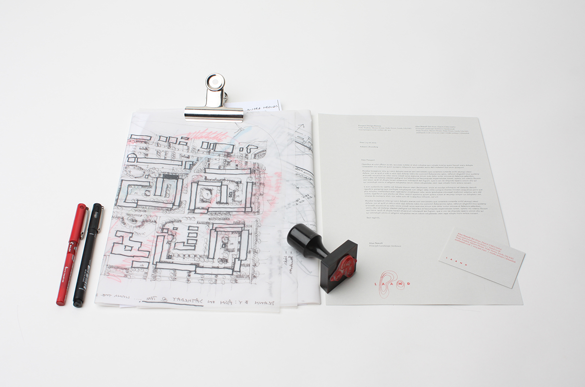
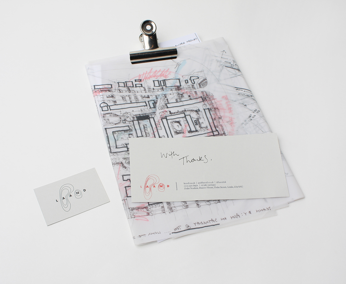
Laand is a landscape architecture studio with a passion for creating playful yet practical spaces; collaborating with clients and communities to deliver sustainable landscapes across the public and private sectors. The company needed to rebrand in order to create an identity that would better reflect its growing reputation and to also help promote itself to new clients.
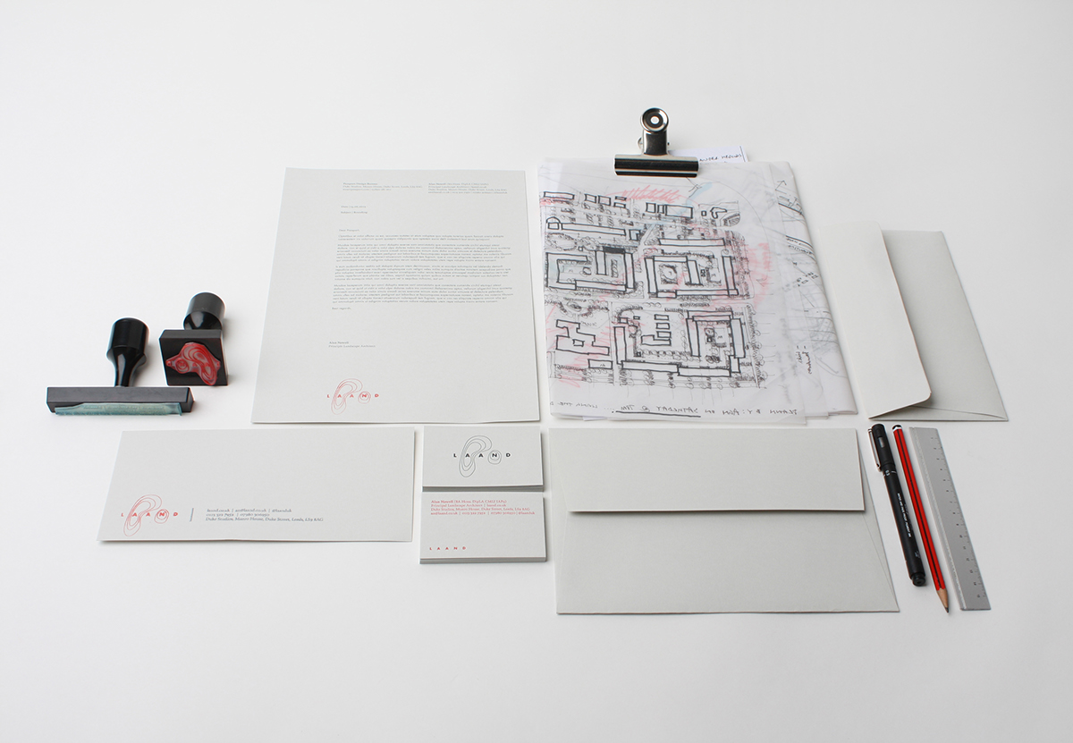
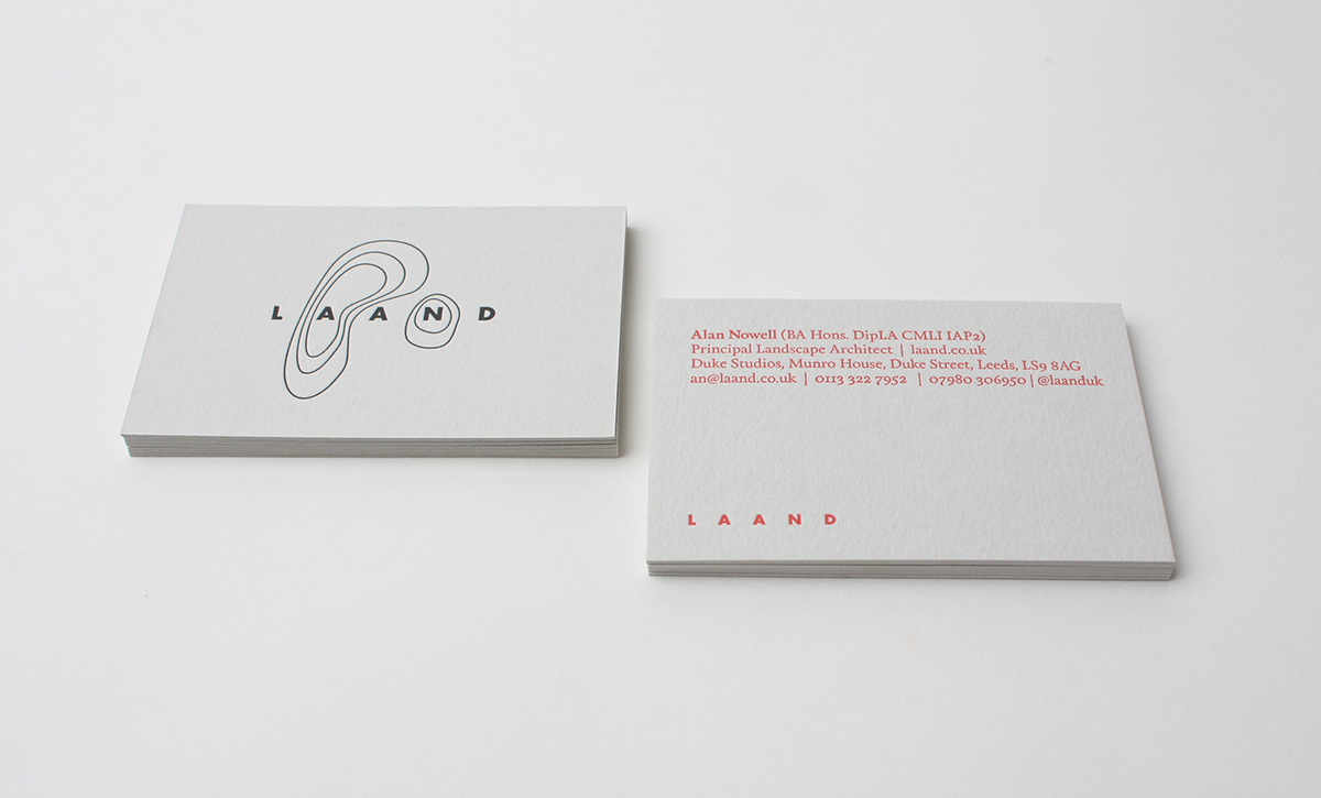
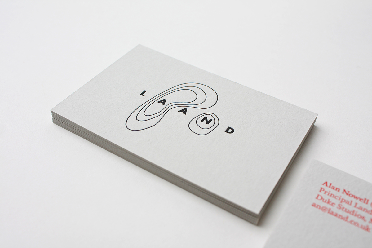
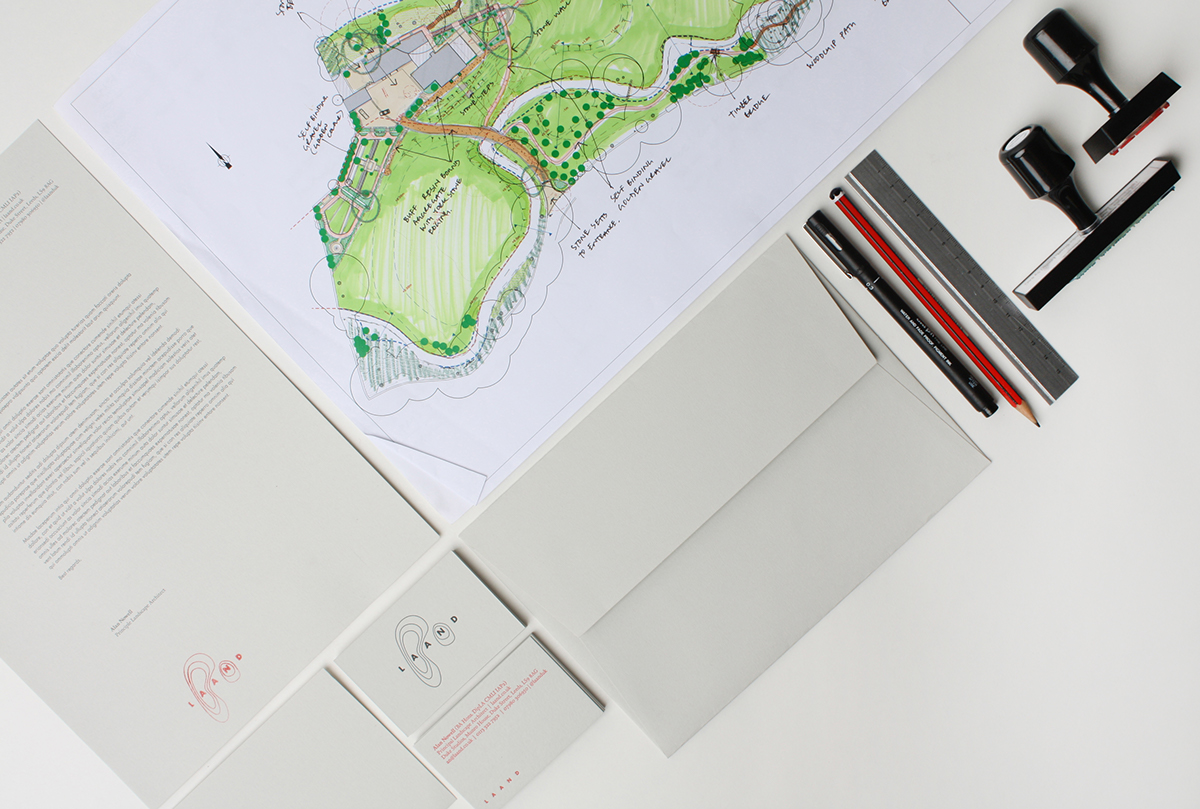
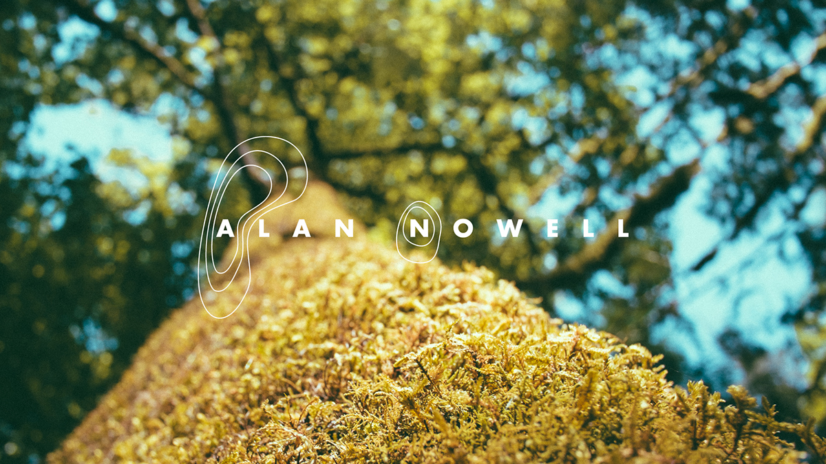
The brand that we developed is centred on the simplicity of contour lines – something that explicitly links to any kind of landscape and is therefore an element that takes an important role in Laand’s day-to-day practice. To give an added personalisation, the contours have been strategically ringed around the ‘A’ and ‘N’ – the proprietors initials – Alan Nowell. Simple, bold typography has then been used to contrast against the contour lines. The colour palette uses a neutral pale grey so as not to tie the brand to a particular sector of work whilst the bright coral accents clash effectively with the array of green tones often found in Laand’s technical plans and drawings.


