Kopenhagen Fur
When the Copenhagen Fur Center disbanded itself from the joint Nordic marketing collaboration, Saga Furs of Scandinavia, the company needed a new name, a new visual identity and a new labeling system for classification of fur skin qualities.
One of the main challenges concerning the new name and communication strategy, was to preserve recognizability among existing local and international clients, while developing a new platform for the Copenhagen Fur Center's marketing activities, which previously had been handled through Saga Furs.
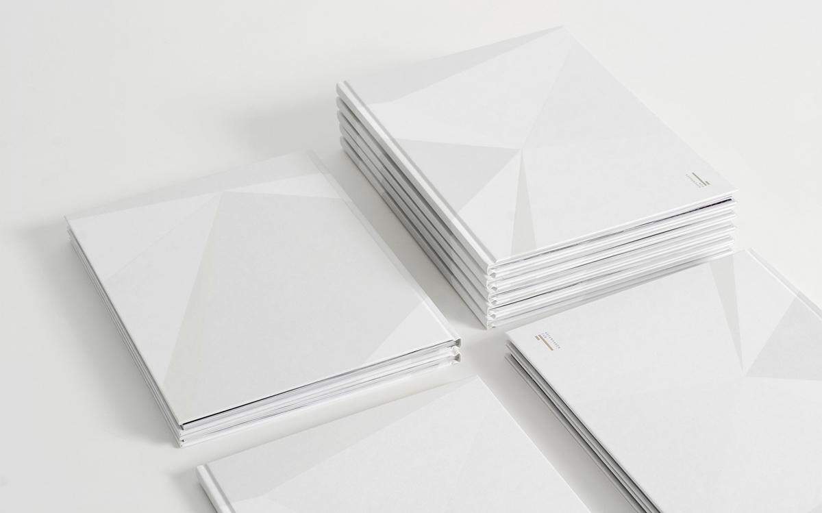
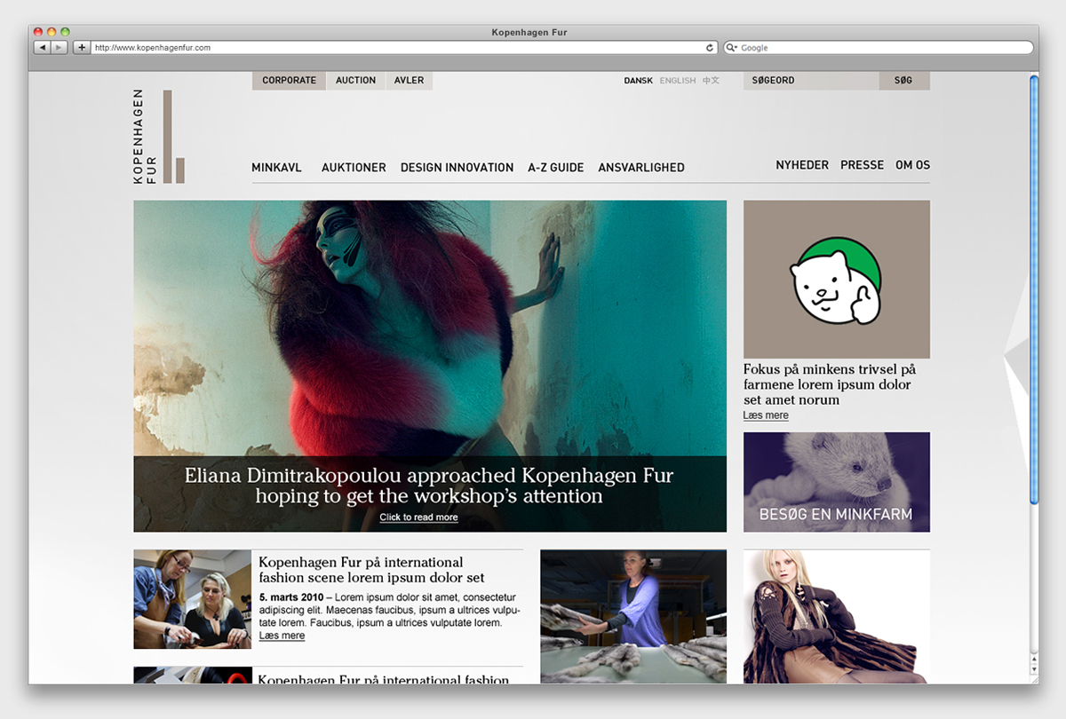
The solution introduces a single common name for both the auction and marketing unit. The name KOPENHAGEN FUR was chosen to underline the Danish origin, as Danish quality is synonymous with the world's finest mink fur. To set the brand name apart from the name of the city, the letter K was introduced in place of the common C. This unusual spelling gives the name character and a distinctive visual expression.
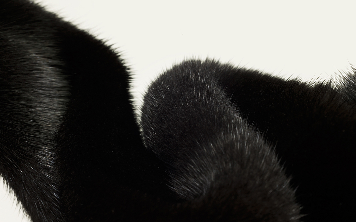
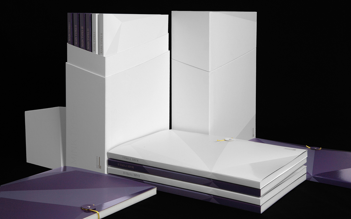
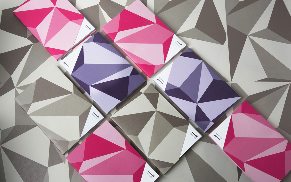
The Kopenhagen Fur logo represents the core business of the company; to produce, classify and trade mink fur. When establishing the quality of the fur, the density of the undercoat and sheen of the topcoat are two of the most important parameters. As a reference, the logo features a wordmark combined with a stylized illustration of the two layers of mink fur coat; the short-haired undercoat and long-haired topcoat. The visual identity’s purple color palette is chosen to symbolize the special status of mink fur as the fashion industry’s ultimate luxury material.
Kopenhagen Fur is today the world's largest auction house of fur skins, and is considered the leading center for the global fur industry.
One of the main challenges concerning the new name and communication strategy, was to preserve recognizability among existing local and international clients, while developing a new platform for the Copenhagen Fur Center's marketing activities, which previously had been handled through Saga Furs.
The solution introduces a single common name for both the auction and marketing unit. The name KOPENHAGEN FUR was chosen to underline the Danish origin, as Danish quality is synonymous with the world's finest mink fur. To set the brand name apart from the name of the city, the letter K was introduced in place of the common C. This unusual spelling gives the name character and a distinctive visual expression.
The Kopenhagen Fur logo represents the core business of the company; to produce, classify and trade mink fur. When establishing the quality of the fur, the density of the undercoat and sheen of the topcoat are two of the most important parameters. As a reference, the logo features a wordmark combined with a stylized illustration of the two layers of mink fur coat; the short-haired undercoat and long-haired topcoat. The visual identity’s purple color palette is chosen to symbolize the special status of mink fur as the fashion industry’s ultimate luxury material.
Kopenhagen Fur is today the world's largest auction house of fur skins, and is considered the leading center for the global fur industry.