corporate identity
KAVIART is a small interior design firm based in Budapest, Hungary. Their main focus is exhibition and interior design. They came to us to get a fresh, straightforward visual identity that they can use on a variety of surfaces.
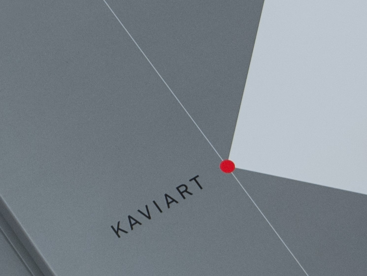
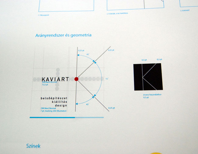
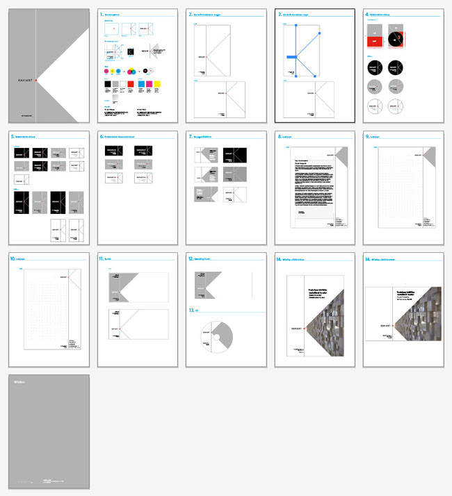
My intial concept was to find a connection between the name of the company and the work of KAVIART. I thought there must be a simple way to convey this. After a lot of doodling and sketching I found out that in interior design there is always a main focus-point — a point that attracts most attention (e.g., in a hotel lobby the main focus is the receptionistʼs desk).
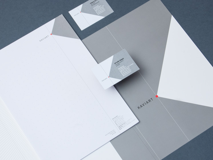
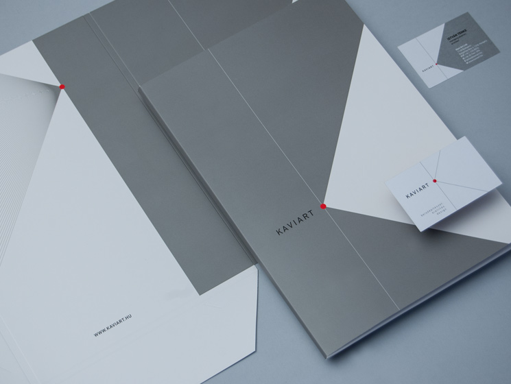
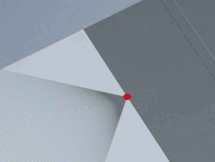
The concept starts with an available surface. If we take a surface, for example a sheet of paper, we can set a focus-point on it. From there we can draw the letter K with lines: one horizontal line and two lines at 45 degrees. This way we can fill the whole available space (how an interior design works) and also get a strong but fine K sign, with the letter K being the first letter of the studio name.
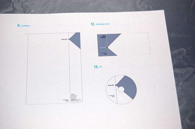
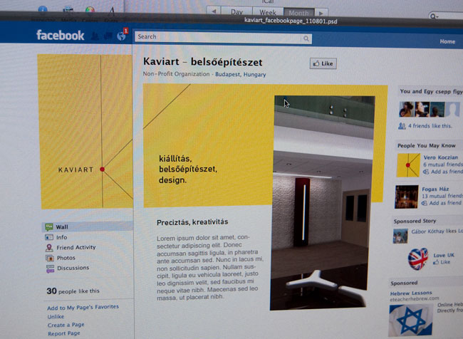
The visual sign can differ from surface-to-surface, as the focus-point can be moved from one location to another, but it should always be adjusted to the size, ratio, and content of the surface. We set tight rules, how the K lines and typography should appear. This is how we reach consistency between different sizes and size ratios.
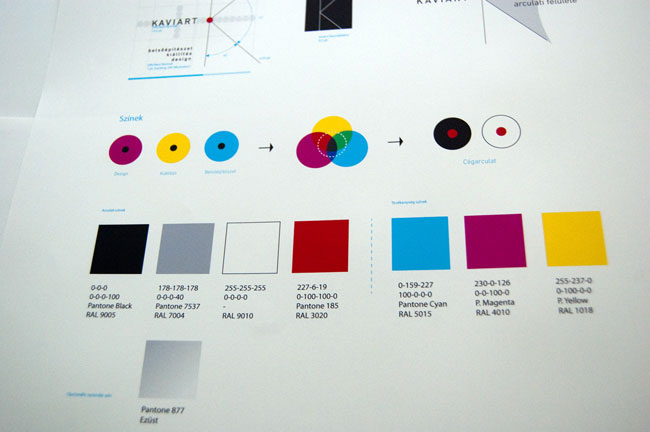
We also designed colour-coding for each of KAVIARTʼs work disciplines (design, interior design, event design).
The final result is an identity system rather than a word or graphic mark. It has great potential and possibilities in itself which can hopefully extended in the near future.
My intial concept was to find a connection between the name of the company and the work of KAVIART. I thought there must be a simple way to convey this. After a lot of doodling and sketching I found out that in interior design there is always a main focus-point — a point that attracts most attention (e.g., in a hotel lobby the main focus is the receptionistʼs desk).
The concept starts with an available surface. If we take a surface, for example a sheet of paper, we can set a focus-point on it. From there we can draw the letter K with lines: one horizontal line and two lines at 45 degrees. This way we can fill the whole available space (how an interior design works) and also get a strong but fine K sign, with the letter K being the first letter of the studio name.
The visual sign can differ from surface-to-surface, as the focus-point can be moved from one location to another, but it should always be adjusted to the size, ratio, and content of the surface. We set tight rules, how the K lines and typography should appear. This is how we reach consistency between different sizes and size ratios.
We also designed colour-coding for each of KAVIARTʼs work disciplines (design, interior design, event design).
The final result is an identity system rather than a word or graphic mark. It has great potential and possibilities in itself which can hopefully extended in the near future.