Innowacyjna Firma Branding
Branding, 2013
Branding, 2013


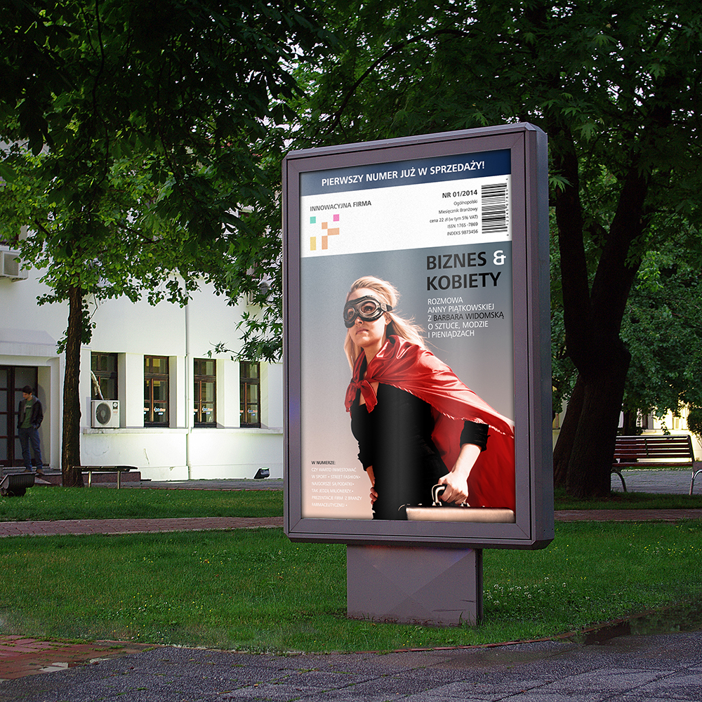
Emptypage create a strong branding for new magazine about business, marketing and R&D.
In recreational mathematics, a magic square is an arrangement of numbers (usually integers) in a square grid, where the numbers in each row, and in each column, and the numbers that run diagonally in both directions, all add up to the same number.
In 1514, Albrecht Dürer created an engraving named Melancholia that included a magic square. Dürer's magic square and his Melencolia I both also played large roles in Dan Brown's 2009 novel, The Lost Symbol. The sum 34 can be found in the rows, columns, diagonals, each of the quadrants, the center four squares, and the corner squares.
The Passion façade of the Sagrada Família church in Barcelona, designed by sculptor Josep Subirachs, features a 4×4 magic square: The magic constant of the square is 33, the age of Jesus at the time of the Passion. Structurally, it is very similar to the Melancholia magic square, but it has had the numbers in four of the cells reduced by 1.
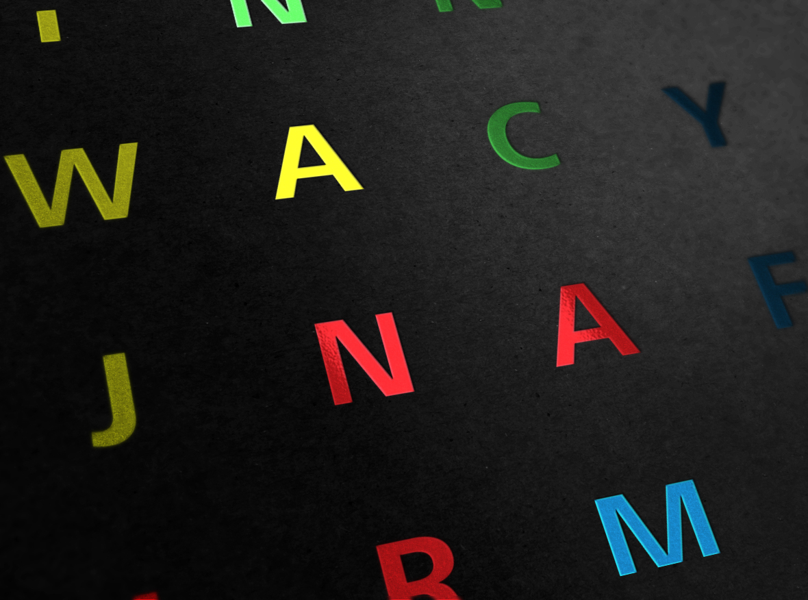
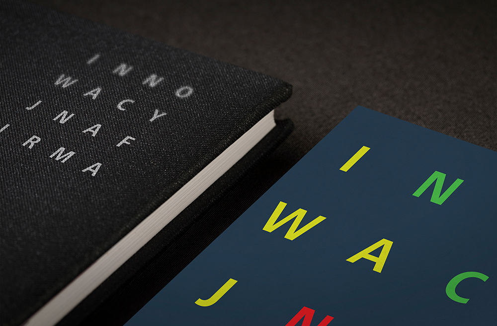
We decide create a logo based on the same design assumptions. In all the 25 fields is a number between 1 and 25. In a magic square, all five numbers of a horizontal, vertical and diagonal row ad up to 65. Additional inspiration were the blocks and cubes, which are a perfect fit and complement each other. Just as in a game Tetris: (It is a puzzle game developed by Atari Games and originally released for arcades in 1988. Based on Alexey Pajitnov's Tetris, Atari's version features the same gameplay as the computer editions of the game, as players must stack differently shaped falling blocks to form and eliminate horizontal lines from the playing field. The game features several difficulty levels and two-player simultaneous play.) Logo represents dynamism, union, strength, intelligence, competitiveness, and challenge.


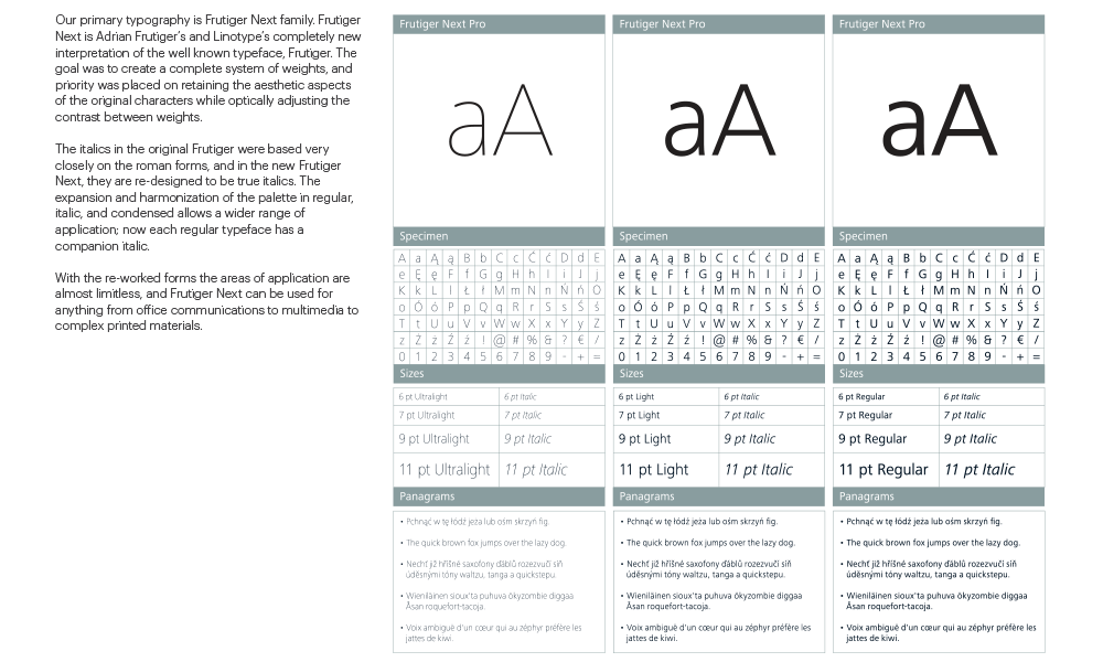
Our primary typography is Frutiger Next family. Frutiger Next is Adrian Frutiger’s and Linotype’s completely new interpretation of the well known typeface, Frutiger. The goal was to create a complete system of weights, and priority was placed on retaining the aesthetic aspects of the original characters while optically adjusting the contrast between weights.
The italics in the original Frutiger were based very closely on the roman forms, and in the new Frutiger Next, they are re-designed to be true italics. The expansion and harmonization of the palette in regular, italic, and condensed allows a wider range of application; now each regular typeface has a companion italic.
With the re-worked forms the areas of application are almost limitless, and Frutiger Next can be used for anything from office communications to multimedia to complex printed materials.