NAO. Nenents Autonomous region
territorial branding
territorial branding
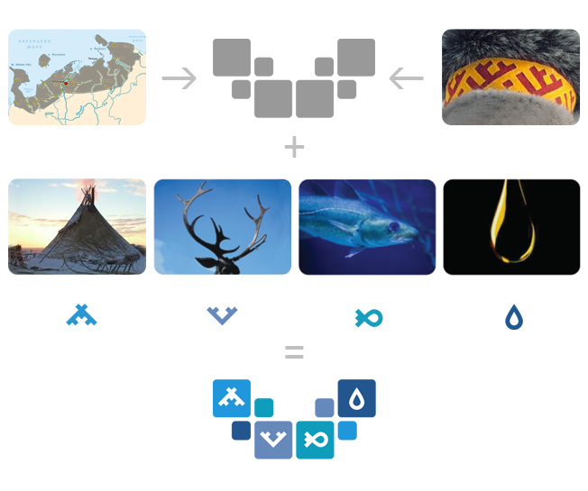
The idea of the logo is based on the cultural characteristics of the district, the key and the most typical regional trends of economic activity: the tent represents concern for people's welfare, the horns of a deer symbolizes deer, stylized image of a fish means fishing and the drop of oil stands for crude oil production. The direction icons features traditional Nenets folk ornaments. The shape of the logo not only matches general pattern but resemble the district’s territory shape, the horns of the deer and a flying bird at the same time. The identity proved to be dynamic and friendly: these symbols could be easily used to implement any idea within the limits of original style.


White Square 2011 - silver
Idea! 2011 - bronze
12 Kyiv International Advertising Festival 2011- short list
Idea! 2011 - bronze
12 Kyiv International Advertising Festival 2011- short list
