Punjabi fonts have tended to be limited to just one style and as a result, there has been little to be expressive with when it comes to less formal posters, tee-shirts and so on.

I had already produced the Karmic Sanj font (a Gurmukhi take on Comic Sans) which was even used in the film 'Lucky di Unlucky Story' (above). Earlier on this year (2013), I had also produced the Gubara font (below).

The Gubara font (Gubara' means 'Balloon') allows you to produce lettering that looks as though it is made from balloons that are tied together with string and held down with weights. The font family comes as a set of fonts with string and one without any string - the latter allowing you to have different coloured balloons/weights to the string without making it too difficult to colour it all in - as you can see in the image above - there are no 'fiddly bits' that take ages.
There are several thicknesses of string so if you are making a design for something that is going to end up small, you can use a font with thicker string so that it doesn't get lost in the background.

In this way, a banner such as 'Happy Birthday, Jasdeep' can be made very quickly and easily using this font.
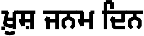
However, there are a number of fonts that were around in the last decade or so that had potential for their essence to transform the basic Gurmukhi/Punjabi character set.
We already had Comic Sans, now it was time to extend the international coverage of 'Adamski', 'Party' and 'Curlz'.

'MFF Adami' (the Gurmukhi/Punjabi take on 'Adamski') is fairly easy to produce and the results are in keeping with the bold font with the angular internals that Adamski is noted for.

'MFF Jashan' (the Gurmukhi/Punjabi take on 'Party' - 'Jashan' means 'party' or 'celebration') also keeps the sketchy boldly painted, slightly italic strokes with sketch lines and serifs that give each letter its characteristic shape.

'MFF Julaf' (the Gurmukhi/Punjabi take on 'Curlz' - 'Julaf' means 'Curly') like Rupe, Modhera and Dwarka uses the lineless form of the characters that can bee seen in the handwritten font GHW Dukandar. It also has its own version of the internal fills that GHW Purani Primer PDL has.
LIke Jashan above, it uses contextual substitution to produce paer versions of characters by taking off the foot on the right where needed.
Finally, we get to Rangdar ('Coloured' in Punjabi).

As children, just about all of us have held the coloured plastic sheet from sweet wrappers up to our eyes and marvelled at the way that the colours have changed, especially when we placed one colour over another. I wondered what it would be like to have a font that recreated that effect, only forming letters from the coloured, partially overlaid strips instead.
Rangdar simulates characters made from different coloured lines by overcoming a restriction that is currently (and sensibly) in contemporary fonts - they only produce text in one colour.
In order to get around this limitation (feature), I have divided the characters up into various separate lines so that no line overlaps another with the same colour. This means that where the font is divided up so that three colours are used, there are three fonts and where four colours are used, there are four fonts.

Of course, it would be difficult to position and size words if you only had a partial presentation of the letters that you were going to use so in addition to the seven fonts, there is an eighth that has all of the lines in it so that you can achieve the goals of sizing and positioning easier.
So, the procedure for using this font would go something like this:
1. Use the Rangdar 1 1 font to type in your text, position it and size it.
2. If you want to use a three colour font then change the font to Rangdar 3 1 (if you are going to do it with four colours, use the Rangdar 4 series of fonts and add the extra layer in the following step).

3. Choose a suitable colour for the font and whilst you are at it, change the layer mode to 'Multiply' so that the text layers you will be using will act as transparent filters.

4. Duplicate the layer you have just made so that you have three (four if you are using a four coloured font).
Change the fonts in the new layers so that, in the case of three colours, the fonts in the layers are: '3 1', '3 2', and '3 3' (in the case of four colours, you need to have four layers with the fonts '4 1', '4 2', '4 3' and '4 4').
5. Change the colours of the other layers so that they filter out the light in the way that you want.
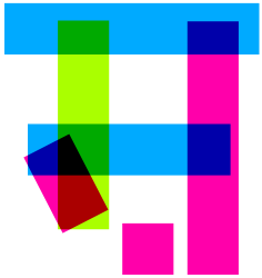
Here, you can see the 'sh' ('ਸ਼') character using three colours and how, at the loop (or knot in many fonts), you have three layers (filters) overlapping so that you get colours close to the primaries where there are two filters and black where there are three.
The three colours I chose to use were 20 degrees out from pure secondary colours (80, 200, 320) so that the yellowest colour was not too bright.

Of course, you can abandon the text information in these layers, preserve the transparency and then do what you like with them. Here, I have made primary to primary radial gradients using three ranges for each layer but there is nothing to stop you from using patterns or picture - anything you like.
You can download these fonts from the Miscellaneous Fun Fonts page at the Billie the Cat website by clicking here.
Have fun.


