This work is a student assignment to modernise a tavern in the swedish archipielago in order to attract a younger target group.
SOLUTION
Furusunds inn is a place for both activity and tranquility. We propose to build a stage for concerts and collaborations with galleries that may have exhibitions at the inn and, no doubt enticing people out of town but also in people from the archipelago during the peak season.
We chose the target group young, culturally interested, DINKys. Being connected is important and awareness is a part of the target image and characterize the choice of destination, food and consumption.
TONE OF VOICE
Activity meets tranquility. Modern meets soft and personally. Playful and creative, but not wishy-washy.
A project together with Art Directors Amanda Ström and Jessica Lundén Johansson.

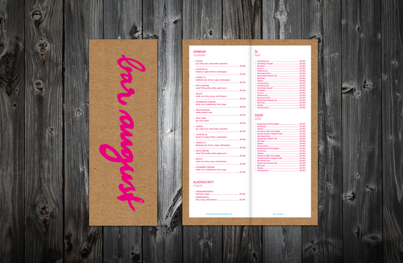
The modern typeface meets the hand-painted in the logo and different text elements.
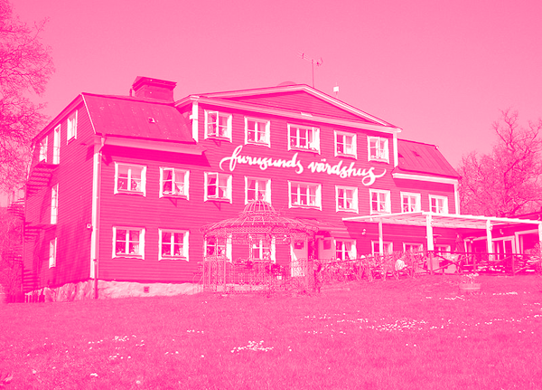
We were inspired by the red barn paint from the house but changed in to a a more modern version, magenta. There is also a flirtation with the creative print designer industry that the target group has strong associations with. To increase dynamics we also added cyan.
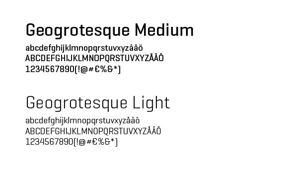
Geogrotesque, signed 2009, is a geometrically, modern "technological" typeface but at the same time soft and friendly.


The events are marketed with e g posters in the archipelago harbors.

The strong bright colors are set against the earthy Kvist to communicate the contrast between activity and tranquality.