Furtiva Lagrima
Label Design "Graphis 100 Best In Design 2013"
Label Design "Graphis 100 Best In Design 2013"
In the Fall of 2011, we were invited by a wine producer from Alentejo, South of Portugal, to visit and taste the combination of six wine varieties, which would result in a wine range to be sold on the national and international markets.
A reputable judge, great wine lover, decides to start his own production in an old family farm. A wonderful field with a great landscape over a lake hosted us. A gourmet dinner with six main courses and six different wines awaited an entourage composed by a well known wine producer, an expert cook which turned out to be a poet, an engineer which was a winemaker and a teacher that was a designer - myself. The goal of this dinner was not only to taste each wine in combination to the high end cuisine of the poet who was after all an internationally renowned chef, Milles Davis personal friend, but also to be able to understand the scope and positioning of the wine in a blind test.
The best wine was easily picked by all the presents, an "Elixir" with an exquisite touch in its body, flavor and incomparable finish.
The owner's passion by Donizetti's work, mainly the "Aria" "Una Furtiva Lagrima", came up to name the elected wine.
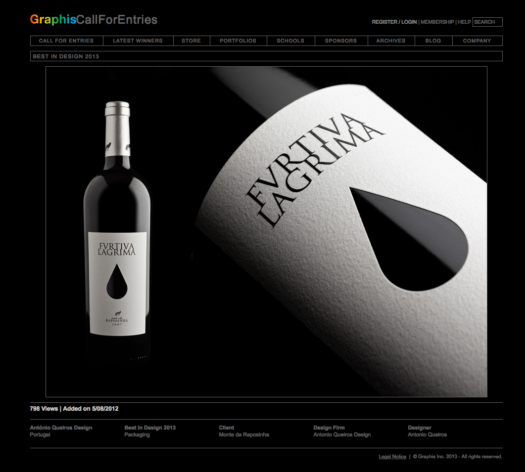
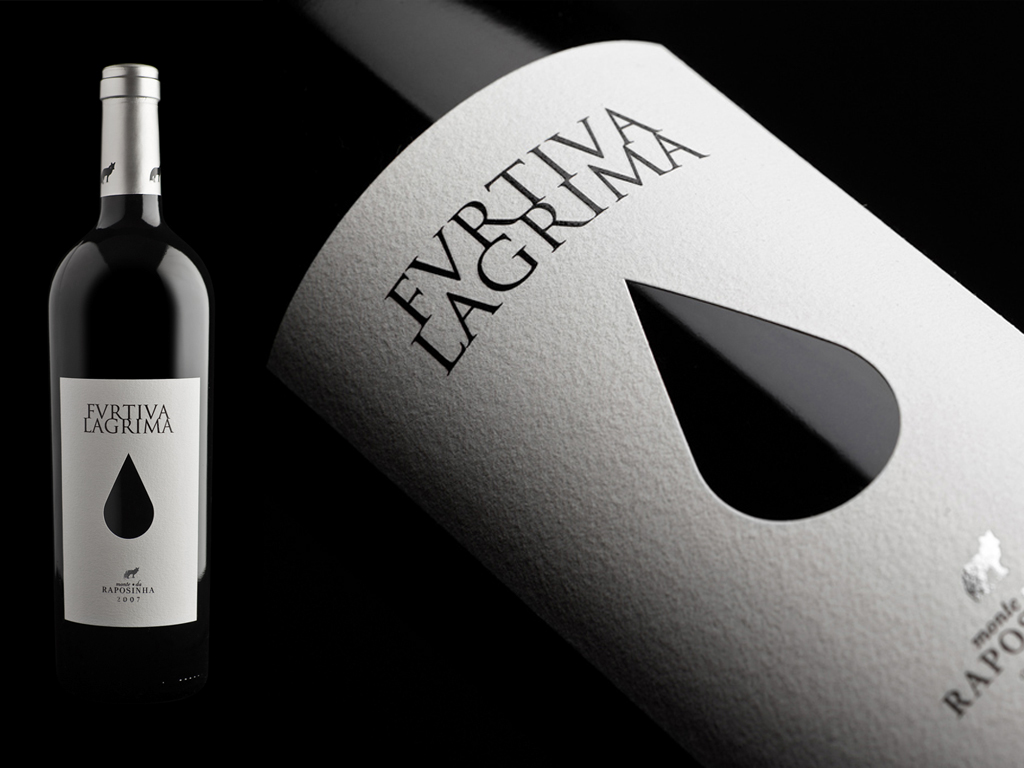
The productor's passion for the "Aria" "Una Furtiva Lagrima" of Donozetti (l'Elixir d'Amore) was the most eloquent way to express the delight, affection and devotion that we gave to the elaboration of this label, a Red Wine full of fragrances, with great balance of colour, richness, aroma and finess, bulky and fresh in the mouth, dense fruit, vigorous, fine spicy character, and good length.
After some research we thought that maybe a tear should be in the label. But not a simple tear, it should be different, perhaps mystical. After several experiences we thought that it could be cutted out of the paper (label) to bring some life to the "love potion". When the wine is in the middle of the bottle, the light goes through the glass, the liquid, and the colors change like magic. This poetic approach results in something that you should experience as something very special.
The typographic solution "Trajan", reveals the heritage of the Roman culture and spirit.
The typographic solution "Trajan", reveals the heritage of the Roman culture and spirit.