+ Renault Discours typeface@Renault 2011
The Renault Discours typeface was created [Brandimage] to express the brand on various supports [cars, communication, web, IHM]. It was the basis of the extensive typographic
trategy we planned to develop with the brand signature as a flagship. It was supposed to adopt eight alphabets, three weights, true italic and a manual kerning for screen approach.
trategy we planned to develop with the brand signature as a flagship. It was supposed to adopt eight alphabets, three weights, true italic and a manual kerning for screen approach.

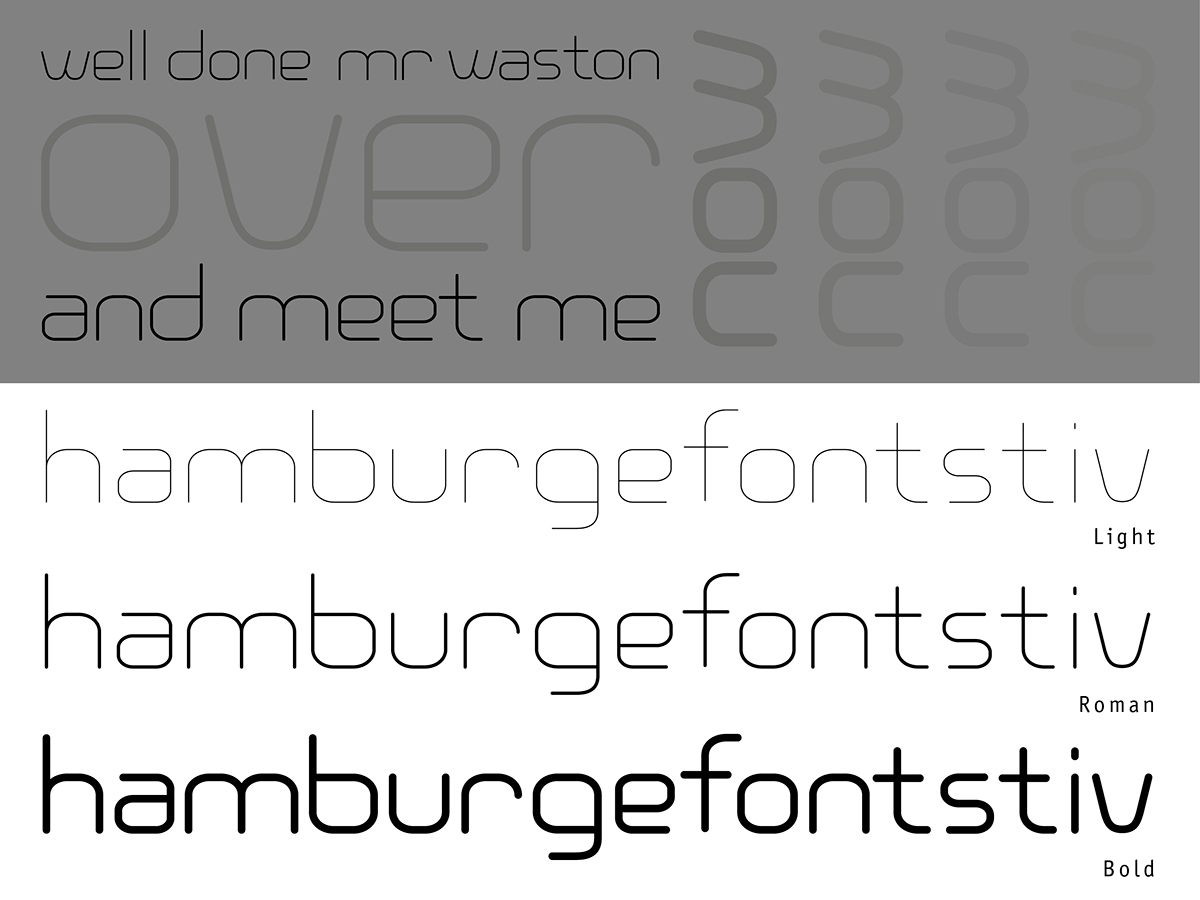
+ Veronica typeface@Jean-François Porchez workshops 2004
The Veronica typeface is my first complete font design. I worked for four months on this modular sans serif font to produce a multi-weight character that I still use.
+ Renault People typeface@Renault 2011
Like the Discours typeface, the Renault People is a part of the Renault typographic strategy we are trying to develop. The design aims to give Renault communication greater warmth and make it more "people centric". According to the latest trends, we can adapt this font for claims and title whilst maintaining the brand font.

+ Cooker black typeface@Jean-François Porchez workshops 2004
The idea was to work as a group on Cooper black typeface redrawn to integrate modernity and humanism. Though some glyphs are missing, the result is quite convincing.


