


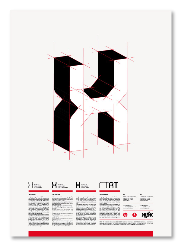
The FTRT typeface is the result of a 3-month research and design.
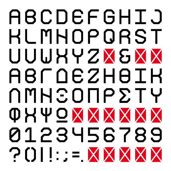
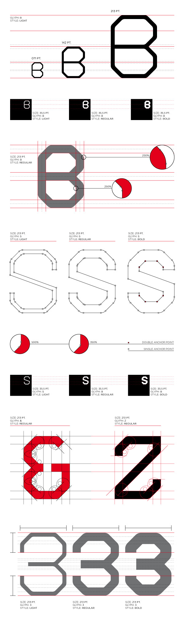
It is constituted by capital latin and greek letters, numbers and symbols, in three different weights and a total of 251 different glyphs. It is characterised as a modular typeface, in which all the glyphs have exactly the same height and weight, in order for the typesetting to be easier in a grid environment or for lettering - the letters being either in a landscape or a portrait setting.
The inspiration during research were the posters and the wider work of Dutch designer Willem Hendrik (Wim) Crowell, known also as gridnik, who propagated his love for typographic grids, typography and visual order in general.
_________________________________________________________________________________
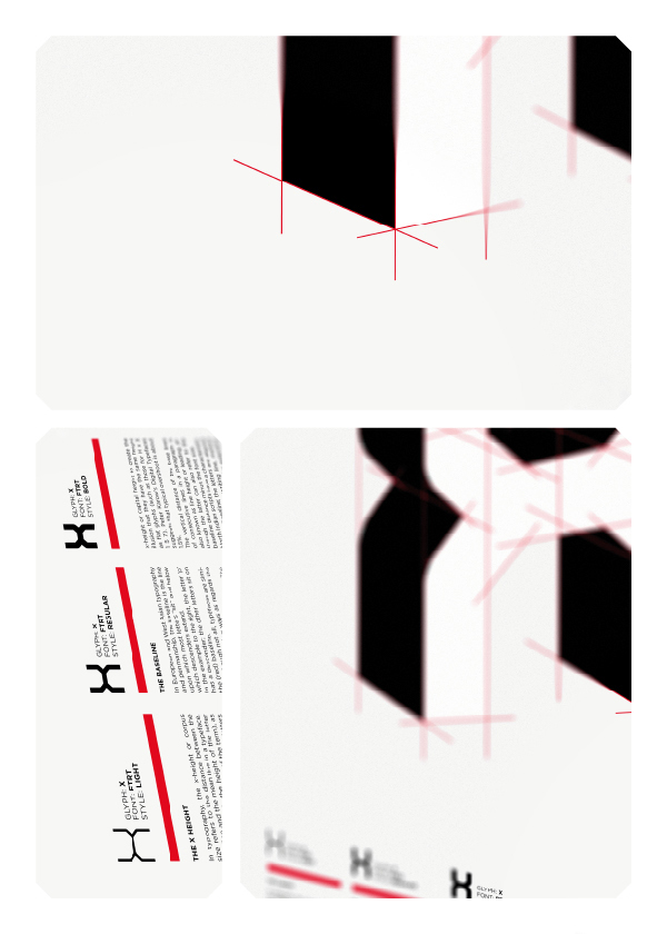
The FTRT weights (light / regular / bold)
FTRT Light: 48,45%
FTRT Regular: 100%
FTRT Bold: 137,11%
_________________________________________________________________________________
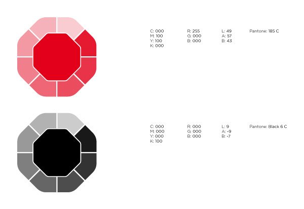
The colour schemes that compliments the typeface the most
Red C: 000 M: 100 Y: 100 K: 000R: 255 G: 000 B: 000
L: 49 A: 76 B: 43
Pantone: 185 C
Black
C: 000 M: 000 Y: 000 K: 100
R: 000 G: 000 B: 000
L: 9 A: -3 B: -7
Pantone: Black 6 C
It is constituted by capital latin and greek letters, numbers and symbols, in three different weights and a total of 251 different glyphs. It is characterised as a modular typeface, in which all the glyphs have exactly the same height and weight, in order for the typesetting to be easier in a grid environment or for lettering - the letters being either in a landscape or a portrait setting.
The inspiration during research were the posters and the wider work of Dutch designer Willem Hendrik (Wim) Crowell, known also as gridnik, who propagated his love for typographic grids, typography and visual order in general.
_________________________________________________________________________________
The FTRT weights (light / regular / bold)
FTRT Light: 48,45%
FTRT Regular: 100%
FTRT Bold: 137,11%
_________________________________________________________________________________
The colour schemes that compliments the typeface the most
Red C: 000 M: 100 Y: 100 K: 000R: 255 G: 000 B: 000
L: 49 A: 76 B: 43
Pantone: 185 C
Black
C: 000 M: 000 Y: 000 K: 100
R: 000 G: 000 B: 000
L: 9 A: -3 B: -7
Pantone: Black 6 C


FTRT TM (MS=MONOSPACED). DESIGNER: GEORGE STROUZAS. COPYRIGHT: 2012. ALL RIGHTS RESERVED.NOTIFICATION: TYPEFACE INCLUDES 210 CHARACTERS/GLYPHS (CHARACTERS - & SYMBOL - SET UPPERCASE ONLY). INDIVIDUAL KERNING BY HAND.VENDOR: THEBIRTHDAYSDESIGN.COM


