Rebrand
Eclipse Skin Institute
Eclipse Skin Institute
Rebrand for Eclipse Institute, their vision is to be a national leader in Esthetic Skin Treatments. Their brand needed to represent that. Also compared to their competition, they did not appear like a major competitor.

Old Brochure design and Logo.

New Logo Concept


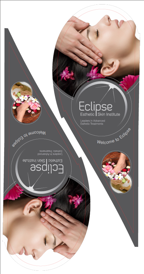
Teardrop Banner (Outside Signage)
Reviews of this Concept by Professionals
The silver logos are quite beautiful and work so well with the circles throughout the rest of the advertising. IMO, the message being conveyed is "professional", "well established" and "polished".
well done.... — Rebecca
Agree with Rebecca, the new stuff is a huge improvement and really accomplishes your goals. Everything looks high-quality and professional. You use the circle shapes very well, and it really ties everything together nicely. — Patrick
I really like this for a number of reasons:
-Clean, fresh and modern design:The colours and spacious layout really create a strong modern and professional look.
-Brilliant Photos:On the whole, the photos are great: They show people enjoying the treatments. You've done a good job of letting the photos do much of the selling. The result is a captivating the design.
I must stress that the font is only a minor quibble, as the work you have done is excellent! — Madhu
Really like the grey/silver colour combo - very classy. And the new logo is a league ahead of the old one on image 1. A great re-brand which should propel the company into the head of their field. — Billy
