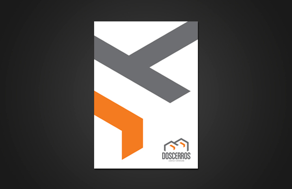
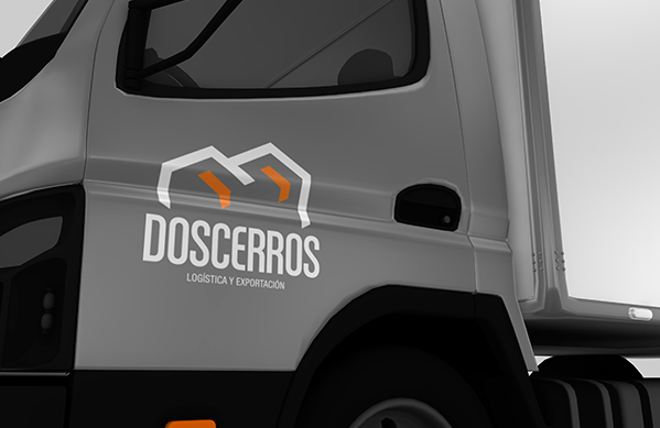
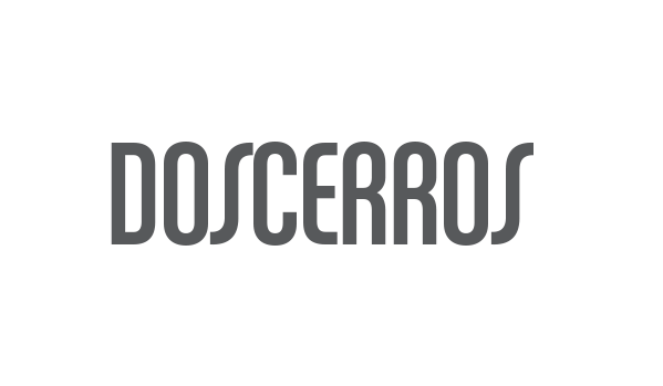
DosCerros
Visual identity created for a customs and logistic business in Chile.
Visual identity created for a customs and logistic business in Chile.
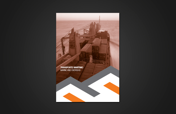
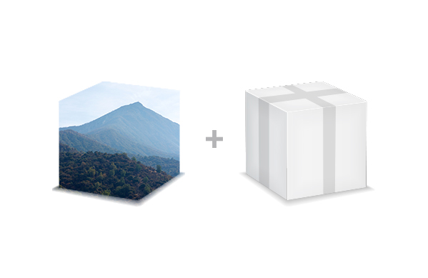
I conducted a preliminary study to determine which factors needed to be considered in the creation of a visual system for a company in charge of a logistics and customs handling. Harmonizing the relationship between identity and intangible contents was crucial during the entire project. In addition, the client requested that the image of the hills were considered while designing the brand as they are characteristic of the area and also the main reason for naming the company "Dos Cerros" (Two Hills/Mountains).
My first approach led to create a very literal proposal using a mountain as an icon. Nevertheless some company services such as transportation and security were not aligned in this organic rounded-shape figure I was aiming for.
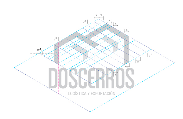
This final proposal manages to meet all of the qualities mentioned above and representing two of the strongest content: the mountains and boxes, as a symbol of what is mainly transported. The brand incorporates vertical and diagonal lines very marked, based on geometry forms, as a first generator of remembrance.
The project was developed over an eight-month period.

Sketches
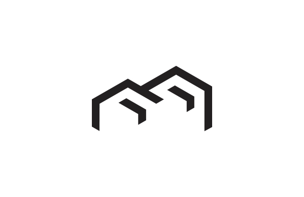
Iconographic solution
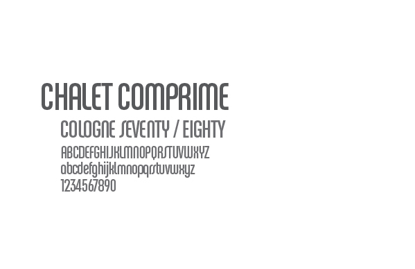
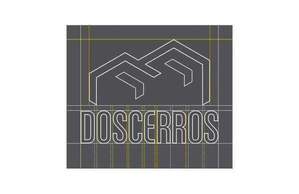
Selected typography
Based on investigation and brand intangible contents.
Chalet Comprime Cologne '70 - Cologne '80 mix
Focus on letter S and R
Focus on letter S and R