
Don’t Panic Interview:
London based creative Franck Trebillac is a very busy man. A designer and director of extraordinary caliber, Franck specializes in an unusually wide range of creative outputs from experimental film and motion graphics to complex illustration, typography and beyond – a rare trait by any standards.
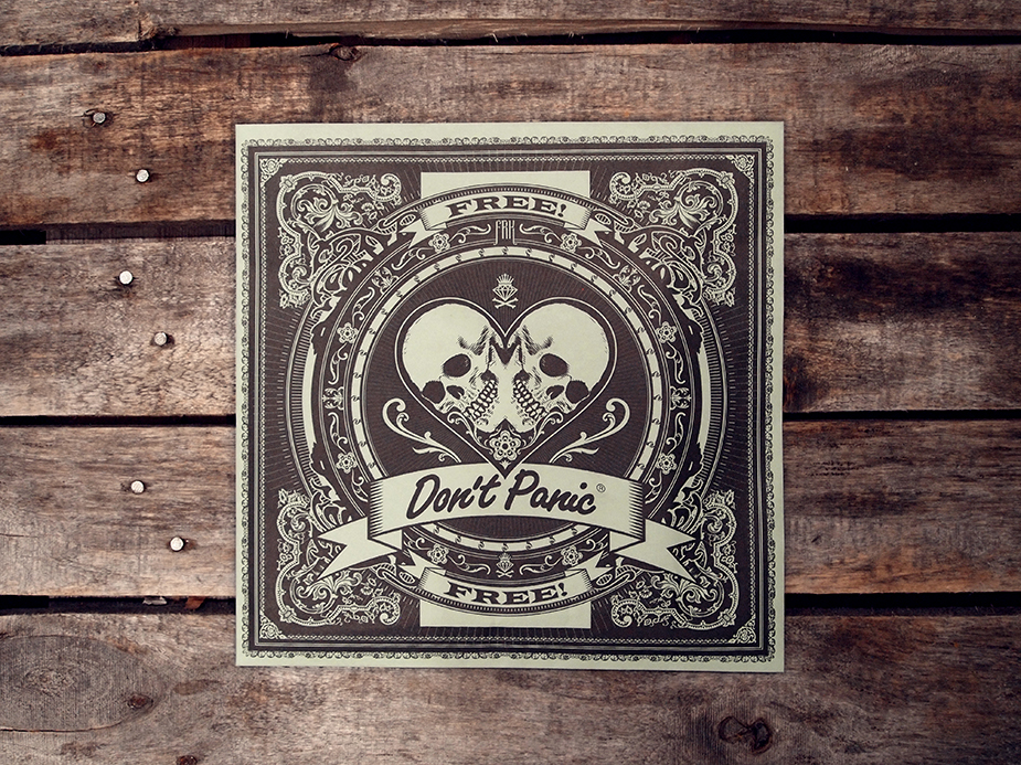
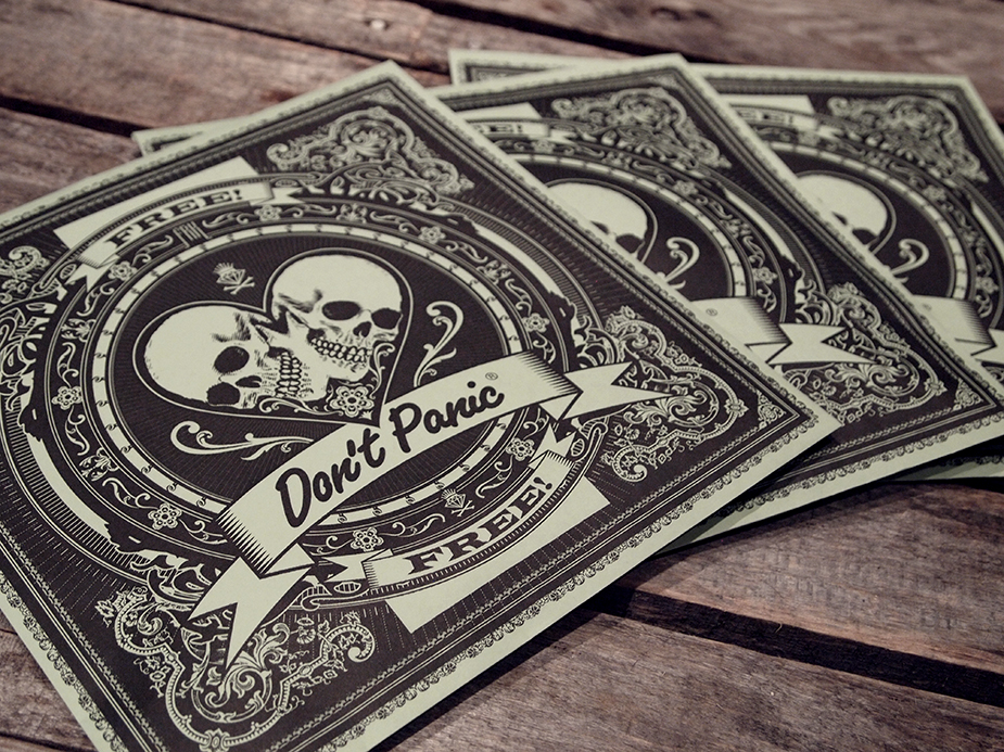
Franck is responsible for the stunning design on our latest flyer pack. We caught up with him to find out a bit more about his work, influences and why vectors get him a little hot under the collar...
> Firstly, we would like to start with your beginnings as a designer/director. How did you get into design?
My background is in graphic design. I suppose I got into it the same way as most designers: as a kid I used to stare at record covers for hours while listening to the music. I was also obsessed with typography and lettering. I went to the Fine Arts in France and then to a design school. I then worked into advertising and print design for years and to an early stage I expanded to motion graphics. As a director I'm entirely self-taught. It became a normal evolution from motion graphics. At first it was a way to experiment with new things and see how I could blend different skills and media together.
> Your work spans over a really diverse range of media. From Avant-Garde film to highly detailed digital illustrations and unique typography. It is rare to find a designer these days who specializes in so many different outputs. How did you develop such a wide range of skills?
This is coming from the fact that I find everything interesting. I can spark a deep passion about anything within seconds. The way I see it is that the media is only a tool used to shape a higher purpose which is expression through creativity. It's always more fun to use multiple tools. I wouldn't say I have a preferred media. All of them have their own flavour and limitation. I find film making quite complete as it has so many levels of communication with the viewer: the narrative, the atmosphere, the visuals, the technicality, all working together to achieve a specific emotional impact. But I also love print design for the hands-on aspect. It's like telling a story in only one frame. It works in waves, after some times spent on moving images I feel the need to go back to print projects, and likewise.
> our work (both design and film) has a very consistent style across the board, what or whom would you site as your influences?
I could make you a list that goes on forever, but to name a few I would say Vaughan Oliver, Dirk Rudolph, and French designer Stephan Muntaner who was a major influence when I started. For moving image I love the aesthetic of the new wave of Korean films. Directors like Chan Wook Park, Kim Jee Woon and Joon oh bong. But also people like Leos Carax, Darren Aronofsky, Chris Cunningham, Digital Kitchen, Kyle Cooper, the list goes on...
> The flyer pack design you produced is beautiful. What was the design process behind it?
Many thanks. This is all made in Adobe Illustrator. I think 'vector' is a very sexy word. I'm very inspired by Victorian graphics and old apothecary design. I also love symmetry and detailed compositions.Sometimes I start with a sketch, other times I experiment with shapes on the spot and let the design come to life as I work on it.
> What are your plans for the future?
Working on as many projects as I can, both for moving image or print. I have a few music video projects in preparation as well as my first short film. I also want to get more into making title sequence for film as it blends together everything I love: film, design and typography.
London based creative Franck Trebillac is a very busy man. A designer and director of extraordinary caliber, Franck specializes in an unusually wide range of creative outputs from experimental film and motion graphics to complex illustration, typography and beyond – a rare trait by any standards.
Franck is responsible for the stunning design on our latest flyer pack. We caught up with him to find out a bit more about his work, influences and why vectors get him a little hot under the collar...
> Firstly, we would like to start with your beginnings as a designer/director. How did you get into design?
My background is in graphic design. I suppose I got into it the same way as most designers: as a kid I used to stare at record covers for hours while listening to the music. I was also obsessed with typography and lettering. I went to the Fine Arts in France and then to a design school. I then worked into advertising and print design for years and to an early stage I expanded to motion graphics. As a director I'm entirely self-taught. It became a normal evolution from motion graphics. At first it was a way to experiment with new things and see how I could blend different skills and media together.
> Your work spans over a really diverse range of media. From Avant-Garde film to highly detailed digital illustrations and unique typography. It is rare to find a designer these days who specializes in so many different outputs. How did you develop such a wide range of skills?
This is coming from the fact that I find everything interesting. I can spark a deep passion about anything within seconds. The way I see it is that the media is only a tool used to shape a higher purpose which is expression through creativity. It's always more fun to use multiple tools. I wouldn't say I have a preferred media. All of them have their own flavour and limitation. I find film making quite complete as it has so many levels of communication with the viewer: the narrative, the atmosphere, the visuals, the technicality, all working together to achieve a specific emotional impact. But I also love print design for the hands-on aspect. It's like telling a story in only one frame. It works in waves, after some times spent on moving images I feel the need to go back to print projects, and likewise.
> our work (both design and film) has a very consistent style across the board, what or whom would you site as your influences?
I could make you a list that goes on forever, but to name a few I would say Vaughan Oliver, Dirk Rudolph, and French designer Stephan Muntaner who was a major influence when I started. For moving image I love the aesthetic of the new wave of Korean films. Directors like Chan Wook Park, Kim Jee Woon and Joon oh bong. But also people like Leos Carax, Darren Aronofsky, Chris Cunningham, Digital Kitchen, Kyle Cooper, the list goes on...
> The flyer pack design you produced is beautiful. What was the design process behind it?
Many thanks. This is all made in Adobe Illustrator. I think 'vector' is a very sexy word. I'm very inspired by Victorian graphics and old apothecary design. I also love symmetry and detailed compositions.Sometimes I start with a sketch, other times I experiment with shapes on the spot and let the design come to life as I work on it.
> What are your plans for the future?
Working on as many projects as I can, both for moving image or print. I have a few music video projects in preparation as well as my first short film. I also want to get more into making title sequence for film as it blends together everything I love: film, design and typography.


